| Author | Thread |
|
|
11/17/2005 03:42:26 PM |
Greetings from the Critique Club!
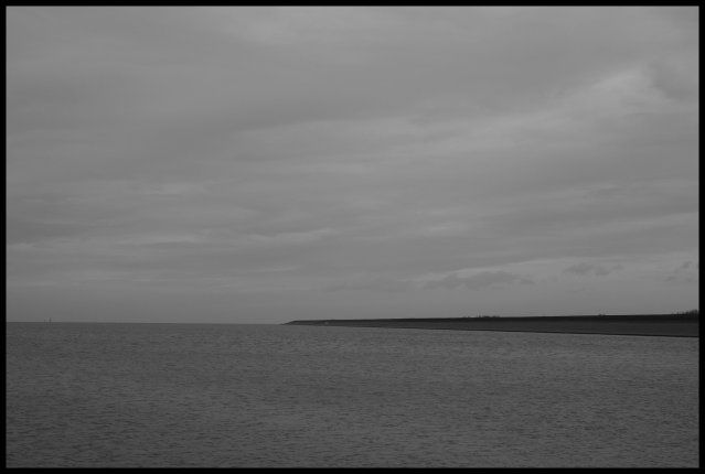
Firstly, as an entry to 'dead end', I like the overall greyness of the image. This is a bleak image pointing off to nowhere through the North Sea. One thing I would note is that the title just says it is a dead end; to me, the image had more impact on finding out that it is actually the northernmost part of the Netherlands.
The composition is good.
I seem to find that my eyes wander over the photograph, as though searching for something to follow or land on. Even minimalist and surreal photos tend to have a followable flow/line, or points of interest.
At first I was going to say that maybe you could play with the shadows and highlights a bit, and bring more depth to the image. It would be the 'stereotypical' thing to do to add more interest to the photo overall.
However, being honest, I don't think that this image has those components that make an eye catching photo really pop out, and creating a really flat, stark and empty image puts it into a different category of interest. Unfortunately, it is not a category that seems to appeal to a large audience, and dpc is based on popular vote.
-- Mariana (funnylooks)
Feel free to PM me for questions/comments on the critique. (-:
|
|
Comments Made During the Challenge  |
|
|
11/12/2005 04:57:41 PM |
this is a nice idea but....
blacks good, but where are the whites? Hence the phrase Black and White.
comp nice, texture nice, dof nice, lighting bland, not very interesting |
|
 Photographer found comment helpful. Photographer found comment helpful. |
|
|
11/11/2005 02:12:11 AM |
|
Alot of negative space, this would benefit from some object to draw the eye in to the photo. |
|
| Photographer found comment helpful. |
|
|
11/10/2005 05:32:53 PM |
|
very minimalist.. i liked it.. |
|
| Photographer found comment helpful. |
|
|
11/10/2005 09:14:43 AM |
|
It seemed there were not a lot of good photos in the dead end challenge. Unfortuantely yours rated among the lowest for me. I just find the photo particularly boring...there's nothing there to look at and the black and white makes it void of any interest whatsoever. Better luck next time! |
|
| Photographer found comment helpful. |
|
|
11/09/2005 01:23:05 PM |
not me..i live on a hill ;-)
the minimalistic compostion is nice but the contrast too weak imo |
|
| Photographer found comment helpful. |
|
|
11/09/2005 12:37:00 PM |
|
I like the pure simplicity of your photo. I wish there was a bit more contrast overall, but again, I like the composition. |
|
| Photographer found comment helpful. |
|
|
11/08/2005 11:00:59 PM |
|
Too dark. More contrast would have made this a better picture. |
|
| Photographer found comment helpful. |
|
|
11/08/2005 06:05:53 PM |
Perhaps a little flat in tonal seperation but certainly a nice idea. Adjusting the highlights would work better for me but you cropped very well... :)
|
|
| Photographer found comment helpful. |
|
|
11/08/2005 02:05:38 PM |
|
| Photographer found comment helpful. |
|
|
11/08/2005 01:02:06 PM |
|
Way too flat, needs some color or contrast |
|
| Photographer found comment helpful. |
|
|
11/07/2005 10:41:25 PM |
|
The large empty sky and water spaces with the peninsula breaking them up make for and interesting pattern and composition. I'd like to this with some more contrast to distinguish the sky and water regions more. |
|
| Photographer found comment helpful. |
|
|
11/07/2005 03:19:58 PM |
So surreal...so simple.
This proabably won't do to great in the challenge...but I like it a lot. 9 |
|
| Photographer found comment helpful. |
|
|
11/07/2005 12:20:28 AM |
|
Interesting concept, though it would benefit by having more contrast. |
|
| Photographer found comment helpful. |
Home -
Challenges -
Community -
League -
Photos -
Cameras -
Lenses -
Learn -
Help -
Terms of Use -
Privacy -
Top ^
DPChallenge, and website content and design, Copyright © 2001-2026 Challenging Technologies, LLC.
All digital photo copyrights belong to the photographers and may not be used without permission.
Current Server Time: 07/01/2026 09:02:47 AM EDT.