| Image |
Comment |
| 08/09/2007 08:37:16 PM |
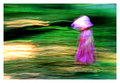
moving right alongby timfythetooComment: The yellow-white streaks really make it sparkle, and the bonnet makes a very cute addition. A very sharp image would have been dull by comparison. |
 Photographer found comment helpful. Photographer found comment helpful. |
| 08/08/2007 05:44:06 PM |
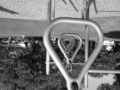
Monkey Barsby allizoeComment: Less than perfect sharpness and slightly askew horizon line make me think you took this while hanging upside down instead of taking the easy way out and just flipping an image over after the fact. Extra point for effort. Also, nice set of repeating elements. |
| 08/08/2007 05:41:17 PM |
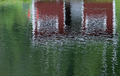
House reflectionby hajekaComment: Nice choice of subject. Although reflections often do better with perfectly still water, this one comes across like an oil painting because of the ripples. |
| 08/08/2007 05:39:58 PM |
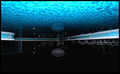
fish out of waterby GmitComment: Wow! Technically wonderful and beautiful upside down composition. It gives a calm feeling along with a sense of being in a science fiction movie. 8 |
| 08/08/2007 05:37:41 PM |
|
| Photographer found comment helpful. |
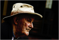
| 08/08/2007 03:35:52 PM |
- Candid Character Study -by kevrobertsonComment: As one of your 15 highest votes, I saw this as an interesting portrait that captures character and sets a mood, but I also thought the darker face shadows hide detail that would have been good to have.
No comment from me during voting partly because I am a newcomer and was still trying to calibrate myself in voting (being clear internally about why I think what I think makes it easier to be constructive). As the recipient of some helpful comments already, I appreciate how useful they can be. |
| Photographer found comment helpful. |
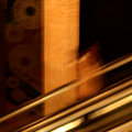
| 08/08/2007 10:28:04 AM |
Amusement @ the Fairby annigComment: I usually avoid going on that ride because it makes me feel exactly like that image. The blur reveals just enough identifiable elements to convey a story given the explanation, but it works pretty well as an abstract too. Message edited by author 2007-08-08 10:28:31. |
| Photographer found comment helpful. |
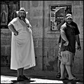
| 08/08/2007 12:20:13 AM |
"Take a look at the guy"by AranchaComment: When this one popped up during voting, I laughed out loud. Great fit with the title. And nicely done black and white conversion. I had it in my top ten for this challenge, and still do. |
| Photographer found comment helpful. |
| 08/08/2007 12:16:48 AM |
I Am Waitingby JudiComment: Excellent shot, and even more appreciated finally getting to see the notes about how you got it. Can't understand why the average rating wasn't higher - I put it easily in the the top 10 for sharpness, composition, and fitting the theme. |
| Photographer found comment helpful. |
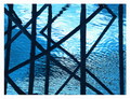
| 08/07/2007 11:39:12 PM |
day 6 - going-up croppedby GinaRothfelsComment: Interesting. Removing the brighter stuff on the left in the original helps make this more dramatic to my eyes. Having the upright post appear a lot thicker this time catches me by surprise, and seems to reduce the sense of motion. I see that you are keeping a square crop, but I wonder why. Cropping the original to a vertical rectangle might keep the post looking thinner, and allow the gold diagonals to be longer, but at the price of giving up the square format. Still, I like both versions, each in its own way. |
| Photographer found comment helpful. |
Home -
Challenges -
Community -
League -
Photos -
Cameras -
Lenses -
Learn -
Help -
Terms of Use -
Privacy -
Top ^
DPChallenge, and website content and design, Copyright © 2001-2025 Challenging Technologies, LLC.
All digital photo copyrights belong to the photographers and may not be used without permission.
Current Server Time: 08/02/2025 01:31:18 AM EDT.