|
|
| Image |
Comment |
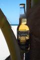
| 05/07/2002 07:50:00 PM | La Cerveza Mas Finaby elliottwhitleyComment: nice composition, and i like th back lighting that shows the beer, but it could benefit from a little light reflected on to the label |
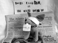
| 05/07/2002 07:26:00 PM | Hostage Situation!by albapeteComment: cute idea, but i don't get the connection between the newspaper and the ransom note, oh I get it, it's to prove the date the picture was taken, okay but I still want to see the note arranged more artfully, maybe at an angle in the foreground |
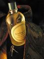
| 05/06/2002 01:53:00 PM | An Eye For Detailby hokieComment: Beautiful lighting and composition. I detect the work of someone who's done this before (hence the eye for detail). Nice job. 10 for concept, and 10 for execution. Bravo |
| 05/06/2002 01:46:00 PM | This one's for you ...by pnichollsComment: Good concept, there are several improvements that could be made: 1) level the horizon line, 2) put more light on the product, 3) light the beer from behind to make it look wetter (this can be done with a mirror behind the glass turned at a 45 degree angle and light thrown into it), 3) frost the mug before shooting, 4) be ready to trip the shutter immediately after dumping a full can of beer into the glass to catch the head bubbling up over the rim. Beer is hard to shoot and you did a pretty good job of catching it foaming up, but it needs to be more to sell. |
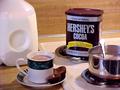
| 05/09/2002 05:24:00 PM | Warm and Chocolateyby ohsmomComment: good idea for an ad, could be improved by simplifying the layout, try removing an element or two. actually, if you just composed a tight vertical of the hershy's can with the pan of cocoa in the foreground it would work better |
| 05/08/2002 05:39:00 PM | Wanna Tire?by heritconComment: does a picture of an advertising sign constitute and advertising picture? even if it did this shot could be much improved by adjusting the brightness so the sign was easier to see |
| 05/08/2002 05:45:00 PM | Canon digital photography - for the beauty in lifeby ssComment: interesting idea that could be improved by having more light on the product, as it is my eye darts back and vorth between the girl and the lens, by emphasizing the lens more with better light, that might not be a problem |  Photographer found comment helpful. Photographer found comment helpful. |
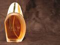
| 05/07/2002 07:22:00 PM | Realmby shortredneckComment: dramatic composition, i like that you left space on the right to put ad copy, but it needs to have a little more care taken in lighting, specifically the product name is hard to read and the top is distractingly shiny |
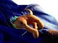
| 05/09/2002 05:15:00 PM | Dog ate your homework?by defrostedComment: Okay, so I don't get the ad concept, that's fine, photographically this is fairly nice, good composition, color, focus etc. |
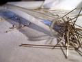
| 05/06/2002 08:39:00 AM | salt that stingsby ritaardComment: Interesting image, good lighting, composition, DOF etc. I fail to see what it could possibly be advertisiting. |
Home -
Challenges -
Community -
League -
Photos -
Cameras -
Lenses -
Learn -
Help -
Terms of Use -
Privacy -
Top ^
DPChallenge, and website content and design, Copyright © 2001-2025 Challenging Technologies, LLC.
All digital photo copyrights belong to the photographers and may not be used without permission.
Current Server Time: 08/23/2025 10:55:29 PM EDT.
|