| Image |
Comment |
| 04/14/2004 11:13:05 PM |
Holding up the worldby geewhyComment: I like your interpretation of the challenge and I like the soft focus of the image. Nice work :-) |
 Photographer found comment helpful. Photographer found comment helpful. |
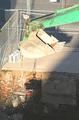
| 04/14/2004 11:11:43 PM |
Green Giantby zwhitleyComment: The cross between light and dark hurts this image. Leaves the light area a bit overexposed. It also seems a bit over sharpened. |
| Photographer found comment helpful. |
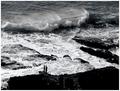
| 04/14/2004 11:08:24 PM |
Staggering Beauty ... Indomitable Strengthby mocabelaComment: I really like this image. I don't care for the title at all, but I don't vote based on that. I use the title only when I can't understand what an image stands for. In this case, I think it does well all on it's own. Maybe that's because of what the ocean means to me personally. As much as blue water looks great crashing against rocks, I think your choice of b/w enhanced the feeling of strength and/or power. |
| Photographer found comment helpful. |
| 04/14/2004 11:04:13 PM |
|
| Photographer found comment helpful. |
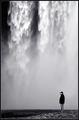
| 04/14/2004 11:03:25 PM |
Pouring down by heidaComment: Wow... this is a really interesting composition. I like it. I really like the use of b/w as well. You do have some hot spots on the water that you might try to fix by dodge/burn on your final image.
Edit: From my laptop those hot spots looked worse. On my CRT - it's not a problem. Message edited by author 2004-04-21 08:38:45. |
| Photographer found comment helpful. |
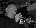
| 04/14/2004 11:01:02 PM |
Mind Blowingby pgattComment: Either this is really noisy from a low light situation, or it was out of focus and you tried to correct it by oversharpening. I think the use of b/w is good and I like how you showed the strength needed to blow that horn. |
| Photographer found comment helpful. |
| 04/14/2004 10:56:07 PM |
Wheelsby breckinshireComment: Ummm, wheels just ended... I'm not a fan of the composition on this shot. |
| 04/14/2004 10:54:01 PM |
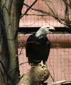
Strength of a Nationby dixonp1Comment: This bird doesn't look the least bit real. Whether it is or isn't... I don't like being able to see cage in the background. A shallower dof would have really helped. |
| Photographer found comment helpful. |
| 04/14/2004 10:51:02 PM |
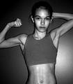
The Source of Her Strengthby librodoComment: Composition, lighting, expression and mood - excellent. Very well done. That said, my comments for improvement: It's a tad bit overexposed on the hand and rosary. |
| Photographer found comment helpful. |
| 04/14/2004 10:44:34 PM |
Don't mess with my daughter.by bobdaveantComment: I really like the pose, the look on her face. I think the choice of b/w was a good decision. The lighting on her body works well also. I don't like the bright spot on the wall behind her and I wish the image were bigger. |
| Photographer found comment helpful. |
Home -
Challenges -
Community -
League -
Photos -
Cameras -
Lenses -
Learn -
Help -
Terms of Use -
Privacy -
Top ^
DPChallenge, and website content and design, Copyright © 2001-2025 Challenging Technologies, LLC.
All digital photo copyrights belong to the photographers and may not be used without permission.
Current Server Time: 07/21/2025 10:33:37 AM EDT.