|
|
| Image |
Comment |
| 02/21/2010 10:01:21 PM | Hawaiian Sunsetby ElisiumComment: Here's your critique as requested! :D
Hawaii is beautiful. The sunsets are amazing, but very overused. This is done fairly well. The contrast in the palm trees, the clarity of the clouds in the sky, and the sun. The reason this didn't score higher is probably sense people are just sick of seeing Hawaiian sunset photos, all exactly like this. Also, the halo around the sun kind of detracts form the image rather then enhances it. If I were to have taken this photo, I would have tried to avoid the lens glare and put something more interesting in the photo as a silhouette over trees, trees just aren't interesting enough to work as the subject of the photo here, and they take up a very small portion of the photo, the rest is covered in sky. It's not a bad photo, but why exactly am I looking at it? Good job, beautiful scene, DPC'ers have just seen way to many fo these over the years. Hope I was helpful! :D
-  ColemanGariety ColemanGariety
From the DPChallenge Critique Club
(message me if you have any questions) |
| 02/02/2010 10:42:14 PM | Looking for Godby alpharichComment: Your critique as requested! (:b)
Oooh! Very interesting shot. The "One in 7 Billion" is presented very nicely here, with the rows of seats and soft-focus stained glass window above portraying many figures. I really like the entire feel of the image, but editing has done some strange things to the lighting on the wall. That can be easily fixed and is no compositional error. there is one however that really bothers me, the angle and crop. No matter how I look at this I can't get over the angle at which you took this. I love the detail on the person, the colors, the rows, that glass above, but I always disliked off-center church shots. As the entire building is very symmetrical, (I am assuming) I find it odd that you chose to stand off to the side in taking the picture. Also, the modern lights in the upper left and right take you out of the mood just a little. Changing your camera angle could have helped make the photo more interesting by leaving out those lights and getting in closer to the subject a bit. overall, great shot, there are just some compositional and technical errors that need to be fixed. otherwise, great idea, creativity, and coloring. 6/10
- ColemanGariety - Message me if you have any questions! :D
The DPChallenge Critique Club.. |
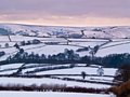
| 01/22/2010 12:56:26 AM | Winterscapeby tembaComment: Here's your Critique & Feedback as requested! :D
This... is stunning. The magnificent colors and contrast bring out so much lovely detail in the hills and along the roads. It's just a beautiful landscape shot. I've always found landscape shots a tad boring, but for this, I can consider an exception. The overall hue of the photo gives a warm feeling while still portraying a cold winter landscape after a snowstorm in England. Your subject certainly caught the attention of your fans and some obvious giveaways in the photo help its connection to the challenge "Signature Style"
I must say however I do dislike the crop you've done here. I would appreciate this photo much more if there was a little more then half of the sky shown here, and the bottom of the image was more of the water. I'd love to see you capture more reflection of the hills in the water, this would add a great deal of contrast to the image, adding to the impact and could possible raise your score to a low 6. The better you can capture that lake/river, the more you can get a gradient of textures ranging form the sky to the ground. Also, the clouds above the horizon are a bit dull and, as I said before, take up a bit to much of the photo. They can be cropped out a bit on top.
Finally, your contrast is great, I'd only love to see more of it. The faded tones on the trees don't add much to the photo for me, but that's just a personal opinion. overall, great work! Your subject really worked with the challenge as you showed the same scene of a previous image you posted, but in winter, adding a little twist, I like that a lot. Message me if you have any questions on the critique, I hope I was helpful! Keep it up! :D
- ColemanGariety
The DPChallenge Critique Club |  Photographer found comment helpful. Photographer found comment helpful. |
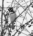
| 01/06/2010 12:21:26 AM | Chickadee and berriesby snafflesComment: Greetings form the Critique Club! :D
First of all, great shot, very disappointing you didn't get at least a 5.5. But when life gives you lemons... blah, blah, blah. The first thing I notice in the photo is the bird, kudos for that, and the slick, lustrous berries really are icing on the cake. The pin-drop white background and DOF in the branches really just takes me away. Congratulations on that, but I can tell you the first major flaw here is the flat lighting on your bird. The problem with this is that your bird is the subject and your shooting for a bird challenge. The chest of the Chickadee is almost flat gray, taking loads away from the overall impact of the photo. In addition to that, the bird is annoyingly grainy, a tad out of focus, and all the black ares of the head wash together, disallowing you from seeing the bird's eye. Your background looks great, it finishes the image off with a nice touch everyone looks for in an image. The big problem here is that your subject, the Chickadee, looks like you cut & pasted it in there form another photo. I'm guessing that's why you got such a low score on one of the best photos in this challenge. Fantastic composition and lighting, but the dynamics on the subject and the detail quality on the image in general is very poor, especially on the Chickadee. Sorry about your low score, but I was just looking through your portfolio, and the composition on those pictures is amazing! You've got a great eye, I'll be looking forward to seeing more of your work. Hopefully that helped you! if you have any questions just message me.
- ColemanGariety
The DPChallenge Critique Club | | Photographer found comment helpful. |
| 01/06/2010 12:02:16 AM | Longtime Seeking by PascalComment: Needs a crop in from the top about 5 pixels... That way you can't see the ends of the sticks! :D
Fantastic photo! | | Photographer found comment helpful. |
| 01/05/2010 01:21:19 AM | | | Photographer found comment helpful. |
| 01/05/2010 01:19:58 AM | feed me, swing me by murataxuComment: Greetings from the Critique Club!
Before I start... Love the title, it just fits the image so well and gives you this feel that helps communicate your subjects perspective. The first major problem I see here is motion blur. The best way to avoid that in your lighting situation would to be to raise your ISO to 400 and your shutter speed up to 1/200 sec. That way you'll be able to capture your subject sharp as a tack. Next, we have that large pillow thing down in the corner (?), not exactly sure what it is but it detracts from the photo by setting the general balance of the photo off. This image in particular will probably look best with the two left-side edges of the photo empty. Mom fills the two on the right, the kid is your subject between mom and the left-side border, and then it would be nice not to have that tarp/balloon thing over there, and the wooden structure seems a little close to the corner for my taste. In general photography, when objects are that far away and really unneeded in the photo, the best composition will try not to put them in the corners, as it's the most prone spot to detract attention from the subject. The tilt really makes the photo interesting, in conjunction with the swinging kid, it's just priceless, and the expression on his face, it really just leaves you in the moment. Great idea, great title, near perfect composition, you just have some technical errors that could have been done differently and a lot of motion blur on the subject. The whole background is a little distracting to the photo the way you had it set up, so rather then shooting straight on, you could have tried shooting at an angle from above or below. And because of the way you took it, I would recommend cropping in from the bottom left a bit. One last thing, your lighting situation was a bit dull, no easy way to change that except in Post-processing. Truthfully, this should have gotten a higher score, probably somewhere around a 5 or 5.5, I just don't think most voters associated this with love, though it certainly is a very prominent form of it in our culture. Good job, just try shooting at a higher shutter speed in the future, and shooting at and angle that can compositionally situate your subject in the photo. Keep it up!
- ColemanGariety
The Critique Club |
| 01/04/2010 11:01:25 AM | | | Photographer found comment helpful. |
| 01/04/2010 01:22:28 AM | | | Photographer found comment helpful. |
| 01/03/2010 10:13:32 PM | From The Depthsby SenayComment: Here's your critique and feedback as requested! :D
I must say, this is a very cool shot. The DOF (Depth of Field) and contrast together create that darkening effect as the focus gets shallower through the image. The Purple colors against the black is beautiful and the texture on the end of the black strands just makes the whole photo pop. Congratulations, there's just a few things that could've been done differently. First of all, as you noted, the end of the purple strands are very blown out, this takes away from the photos impact. Also, the crop along the bottom seems a little tight, I'd like to see some more empty space below the furthest down stands. Also, image quality and detail is a little low, I believe this came form a combination of your lens, sharpening in Post-Processing, and the overall image grain coming from your colors and 800 ISO speed rating. In the future you might want to try putting your light behind a screen or using a reflector so the brighter parts of the image don't get blown out as the rest of the image is brought into midtone. Also, shoot with a 50mm or 100mm macro lens to capture as much detail as possible. And in post processing, use one of the many Noise Reduction tools such as Noiseware Pro, Noise Ninja, or NeatImage. Those are very useful filters that can be applied to virtually any photo graph and are allowed in basic editing here on DPC. NeatImage is free, but I personally recommend Noiseware Pro. To wrap this up, great photo, the reason it didn't get something more like a 6.0 or 6.5 is because of the blown highlights and image grain, reducing the photos impact and detail. Great photo none the less, keep it up! :D
- ColemanGariety
The DPChallenge Critique Club
P.S: You had me stumped, I thought it was a tooth brush! | | Photographer found comment helpful. |
Home -
Challenges -
Community -
League -
Photos -
Cameras -
Lenses -
Learn -
Help -
Terms of Use -
Privacy -
Top ^
DPChallenge, and website content and design, Copyright © 2001-2025 Challenging Technologies, LLC.
All digital photo copyrights belong to the photographers and may not be used without permission.
Current Server Time: 08/01/2025 08:19:24 AM EDT.
|