|
|
| Image |
Comment |
| 07/22/2010 01:53:29 AM | Perfect product placementby herfotomanComment: Maybe it's just me (and it seems like it is), but this shot deserved a score more along the lines of 6.3 or 6.4.
+1 for cleverness in the title
+2 for excellent and creative crop/composition
+2 for beautiful imagery, quality and detail on the subject
+2 for good subject posture and expression
-1 for blown highlights on his hat
Fantastic. It's good, real good. This deserves "a longer look" from the voters. You were cheated. Part of it may be the "product placement" in the title, people didn't get it, and/or didn't think it fit perfectly with their description of he challenge.
I faved this, and I don't fav much.
ETA: Need to see more detail, sharpness, and/or focus on the coke can and the guy's face. Message edited by author 2010-07-22 01:54:59. |  Photographer found comment helpful. Photographer found comment helpful. |
| 07/16/2010 10:00:00 PM | Caught in the Crossfireby MeMex2Comment: Greetings from the Critique Club!
Alright, first thing I think of when looking at this is "antique". That's good since I'm assuming that's the feel your going for. The tones, hue and detail all play into this and were done very well. The muted tones on the guns are beautiful.
The real start of the photo is the model. His expression, the button on his shirt, the number on the glass projected onto his face, all icing on the cake. The guns going back seem infinite, and really make the shot fantastic. Great work!
The first thing I can see here is that the photo is a bit too grainy for my taste. Maybe that was intended, but I think, there could be a bit less.
Secondly, The tones on the subject seem a bit TOO muted. Just as on the bottom-left gun, there could be a tad more contrast.
That's all I can say. Great work, fabulous photo, and this definitely deserved a higher score.
- Jackson Gariety | | Photographer found comment helpful. |
| 07/16/2010 08:19:08 PM | silenceby gazdiComment: Interesting shot. First thing I noticed was the the person and her hair does not stand out enough in the photo. Maybe altering the tones of the background or changing your lighting situation would help that. Second, there seems to be a lack of detail in the hair. Maybe it's just out of focus, but I would LOVE to see the same amazing detain you captured on the face to be in the hair.
Nice composition, but the hardest thing about this shot would be the lack of detail in the hair. Otherwise, fantastic! | | Photographer found comment helpful. |
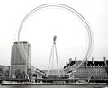
| 07/08/2010 08:37:52 PM | 18 Degrees of rotationby PaulComment: Nice work! I really like this. One thing that i don't like is how the blurred wheel blends in with the building, I would rather it stood out, since it is the main subject oh the photo. I also feel the entire shot is a bit under-contrasted.
P.S Thanks for the "Worth A Longer Look" award. I can't believe the shot got a 5.3!!! O.O | | Photographer found comment helpful. |
| 07/02/2010 06:50:58 PM | His slice of the world.by PrashComment: Nice! This is fantastic if you ask me. Only a few problems. In post the photo has been over-sharpened, the photo is much too grainy, and the background stick out too much. I would like this shot more if it has a black background, and the quality was a bit better. Nice job though, really great. | | Photographer found comment helpful. |
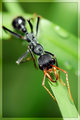
| 07/01/2010 04:22:10 AM | stalker by rozComment: I've always loved his shot. The detail on the bugs mouth is outstanding! You'll always be the best a insect photos roz. + 1 fav | | Photographer found comment helpful. |
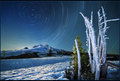
| 07/01/2010 12:17:39 AM | Daybreakby CuttoothComment: Way low reso, jpg artifacts, blurry, if the digital file was in better shape, I would have given it a 7 or maybe an 8 | | Photographer found comment helpful. |
| 06/23/2010 10:05:20 PM | | | Photographer found comment helpful. |
| 06/12/2010 04:31:27 PM | The Endby LVicariComment: A bit much pp... but otherwise, a very cool subject and setup. | | Photographer found comment helpful. |
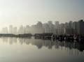
| 06/12/2010 01:26:29 AM | Progression by zeuszenComment: Love the crane in the background. Nice contrast of humans and nature. Harbor could symbolise the transition between the two. Nice use of fog, great colors. Symmetry just makes this shot what it is, and how the sky matches the water, brings out a bit of infinity in the shot. This is amazing, and almost flawless! :D
FLAW: Looks like some jpg artifacts on the right side, may come from save for web, compression, or crop, rotation, and possibly resolution reduction.
Otherwise, fantastic. 9/10 (if I could have voted on it) and a fav from me. (winks and a very reassuring way) | | Photographer found comment helpful. |
Home -
Challenges -
Community -
League -
Photos -
Cameras -
Lenses -
Learn -
Help -
Terms of Use -
Privacy -
Top ^
DPChallenge, and website content and design, Copyright © 2001-2025 Challenging Technologies, LLC.
All digital photo copyrights belong to the photographers and may not be used without permission.
Current Server Time: 08/02/2025 11:05:25 PM EDT.
|