| Author | Thread |
|
|
07/22/2010 01:53:29 AM |
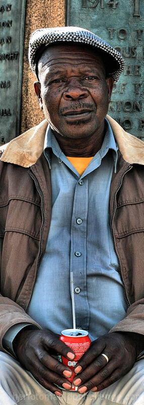
Maybe it's just me (and it seems like it is), but this shot deserved a score more along the lines of 6.3 or 6.4.
+1 for cleverness in the title
+2 for excellent and creative crop/composition
+2 for beautiful imagery, quality and detail on the subject
+2 for good subject posture and expression
-1 for blown highlights on his hat
Fantastic. It's good, real good. This deserves "a longer look" from the voters. You were cheated. Part of it may be the "product placement" in the title, people didn't get it, and/or didn't think it fit perfectly with their description of he challenge.
I faved this, and I don't fav much.
ETA: Need to see more detail, sharpness, and/or focus on the coke can and the guy's face.
Message edited by author 2010-07-22 01:54:59. |
|
 Photographer found comment helpful. Photographer found comment helpful. |
Comments Made During the Challenge  |
|
|
07/11/2010 06:40:17 PM |
|
I had this one marked a 6-- was going thru to comment today so I got to study the image more... WOW! I was wrong! Moved up to a 9! Great detail, great color!, great contrast! Awesome image! |
|
| Photographer found comment helpful. |
|
|
07/10/2010 01:28:11 PM |
|
I like the back-lighting and the color composition. The crop appears initially a bit rough, but works with the "pillar" in the background. The title also appears a bit rough, but unfortunately I couldn't find anything to make it work for me. (not voting) |
|
| Photographer found comment helpful. |
|
|
07/10/2010 10:45:39 AM |
|
Not sure about the product placement or what you're suggesting with that. I do like the long vertical frame and leading lines. |
|
| Photographer found comment helpful. |
|
|
07/10/2010 06:23:59 AM |
|
You know you captured the face well. IMHO, a crop would have worked out nicely. |
|
| Photographer found comment helpful. |
|
|
07/06/2010 04:51:25 PM |
|
I'm not wild about the crop on this |
|
| Photographer found comment helpful. |
|
|
07/05/2010 12:26:15 PM |
|
Well, not perfect. We'd have seen the product name if it had been... :-) |
|
| Photographer found comment helpful. |
|
|
07/05/2010 12:31:14 AM |
|
dimensions too odd for a portrait... Cropping out the sode would have helped and it's not "perfect" product placement since you cannot see the brand. |
|
| Photographer found comment helpful. |
Home -
Challenges -
Community -
League -
Photos -
Cameras -
Lenses -
Learn -
Help -
Terms of Use -
Privacy -
Top ^
DPChallenge, and website content and design, Copyright © 2001-2026 Challenging Technologies, LLC.
All digital photo copyrights belong to the photographers and may not be used without permission.
Current Server Time: 07/16/2026 11:51:39 AM EDT.