|
|
| Image |
Comment |
| 01/03/2010 08:48:24 PM | Duotone Macroby 777STANComment: Here's Your Critique and Feedback as requested! :D
The goal of the Puzzle Macro Challenge was to create an interesting, detailed, piece of photographic art without presenting exactly what the viewer was looking at. You did a very good job of hiding your subject in the photo, but overall the isn't very eye-grabbing. You made up for your relatively simple subject with color, Depth of Field, lighting and luminosity. The colors are outstanding, probably the best part of the photo. Next to that is the luminosity of the tarp and the brown stripe, almost giving it a glow-effect.The depth of field is fantastic and make the difference between a 4.4 and a 5.4! A combination of those three factors really makes the photo pop, come off as a painting, it's very, pretty. There is one major factor that kept me from voting this a 6. This would be the fold in the tarp in the upper-left. For me, had that continued onward, you wouldn't have that diagonal drop-off of the tarp taking the focus away from the luminous brown-stripe. Your score would've been higher had the tarp been in a slightly different position when you took the photo. In colclusion, there's only so much you can do with a tarp in photography, and you did just about as much as could be done with this subject. Hope that was helpful to you!
-  ColemanGariety ColemanGariety
The DPChallenge Critique Club |  Photographer found comment helpful. Photographer found comment helpful. |
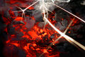
| 01/02/2010 05:01:19 PM | Burning!by jotagaComment: Here's your Critique and Feedback, as requested! :D
This is by far one of the strangest photos on DPC this week. Based on the original image you posted in the description, this is only a small portion of the image of a cigarette you took with your camera. Overall, it's a fantastically composed shot, but since you cropped in so tightly from the original shot, you get quite a bit of motion blurring on the embers of the cigarette.The original shot appears to be all in focus, but as you look deeper, the only hing that's truly in focus is the spark. The more of the full-focus spark you can show, the more my interest grows on this photo. This can be fixed by using a stronger macro lens or a reverse-lens technique so you don't have to crop-in so much, exposing the blurry elements of the cigarette embers. Also, there are many different ways you couldn't cropped this. And I personally feel showing a bit of black above the top of the cigarette and off to the right a bit would've raised your score, and still not have exactly exposed your "Puzzle." I like the blurry sparks in the background as well, and I'd like to see a crop where you showed the entire spark as well as the cigarette ember, but without showing anything more on the bottom-left of the cigarette itself. There is a lot of interest in what you've copped out and I'd really like to see some of the in the photo. You should aim to show as much of the photo as possible without exposing its true form. I think you would've gotten a much higher score had you used a stronger macro lens and not cropped out the entire spark. overall, the effect comes off as almost lighting. I like it and I think I gave it a 5 or a 6 in voting. This definitely deserved a higher score then it got. Hope I helped!
- ColemanGariety
- The Critique Club | | Photographer found comment helpful. |
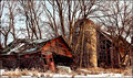
| 12/31/2009 11:35:07 PM | Abandoned to the Snowby davidwComment: Here's your critique and feedback, as requested! =D
Fantastic job! The setting is almost surreal. The only thing I am disappointed in are the trees, they make the picture appear cluttered, and off-balance. The cropping could be done a little better, I'd love to see some white space to the left of the red shed or crop in to that green panel on top to it doesn't seem like the shed just ends improperly. From experience, either leave some padding on the side of leave em' hanging to fill in the rest. Also, I'd like to see more of the snow beneath the shed, since your title is "Abandoned to the Snow" it only seems reasonable. I love the textures on the barn shaft and the HDR'ed looking shed. I also love how the two buildings seem to be sloping in towards each-other, and the pealing red paint on the front of the shed lets the photo come of as almost a dream. Magnificent work, I'm only puzzled by the lake of image quality, if you have Photoshop, try sharpening with Un-Sharp Mask (USM) maybe %100-150, THEN resizing to 800 pixels, THEN Save for Web & Devices with 100 quality? That's something simple you can do to improve the quality of your photos as they appear on the interwebz. Hope I helped!
- ColemanGariety
The Critique Club | | Photographer found comment helpful. |
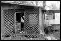
| 12/31/2009 11:22:15 PM | Watch Your Stepby picklenoseComment: Here's your Critique from the critique club, as requested! =D
Very interesting photo. I love the rustic metal in the upper-right, the broken window, the log coming down in the shed visible through the door. TO keep these interesting elements the focus of the image, try not to let the sky get blown out above, that's a bit distracting to me and make sure your shot is in-focus when you take the photo. In an editing program such as Photoshop, you might want to try coping down a bit from the top or in from the left to leave out any un-needed image area to help put the focus on the shed, and sharpen with Un-Sharp mask (USM). A little sharpening would help bring out detail in the wood and metal and try getting in closer with your camera to really bring out the dilapidated elements of this scene. Overall the area has lots of potential, so don't give up trying to photograph it. I love the criss-cross of the wooden mesh and how it's falling apart. The image is a bit busy with branches and leaves, but my eye is directed mainly towards the door of the shed, where the open window is blowing through. The contrast there is very appealing and maybe changing your angle so you could see more of the might have raised your score. I'd love to see more detail on the inside and outside of the shed itself, to draw my attention away from the clutter around it. I personally don't think the B&W adds anything to the photo either, and actually detracts from the images detail. What I would have personally done would be to maybe get in closer and present how rustic and dilapidated your subject is at a different and and shorter proximity. The best photos communicate what the subject is very well, The sharper this image is, the more color it has, the more detail it has, and the more you can bring the viewers attention to the shack itself, the better your outcome will be. Try going out again and photographing the inside of the shed with higher contrast, and make dead sure you and the viewer will both know what you're trying to communicate and how run-down this shed is. Hope that helped, and I'd love to see your outtakes and if you decide to go back there, message me. :)
- [user]Coleman Gariety[/user]
The Critique Club |
| 12/24/2009 05:36:25 PM | | | Photographer found comment helpful. |
| 12/18/2009 01:07:59 AM | SWOOSH!!!by ColeyComment: Still one of my all time favorites on DPC, amazed it didn't win a ribbon! | | Photographer found comment helpful. |
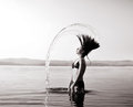
| 11/28/2009 05:29:12 PM | La Tour Eiffel - France by MelethiaComment: I believe that in French, you would say "Tour de Eiffel" meaning Tower of Eiffel, but none the less, fantastic photo, congrats on your high score! | | Photographer found comment helpful. |
| 09/30/2009 01:44:49 AM | | | Photographer found comment helpful. |
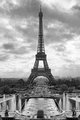
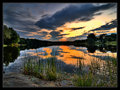
| 09/19/2009 01:40:07 AM | Poquetanuck Coveby bassboneComment: Another amazing shot in HDR II. Good job, colors are spectacular along with reflections and textures. 7/10 | | Photographer found comment helpful. |
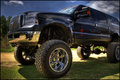
| 09/16/2009 10:39:50 PM | Ready to Rumbleby brumer0Comment: Truck is blurry and quite dirty, and I cant really tell what is HDR'ed here. 5/10 |
Home -
Challenges -
Community -
League -
Photos -
Cameras -
Lenses -
Learn -
Help -
Terms of Use -
Privacy -
Top ^
DPChallenge, and website content and design, Copyright © 2001-2025 Challenging Technologies, LLC.
All digital photo copyrights belong to the photographers and may not be used without permission.
Current Server Time: 08/03/2025 05:49:42 PM EDT.
|