| Image |
Comment |
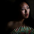
| 01/19/2009 10:34:37 PM |
Calmnessby robsComment: I love the pose and expression. However, I'm just a little confused with the left side of the frame. Also, the shadows in the background (and everywhere, actually) are kind of distracting. Excellent lighting on her face/neck, though! |
 Photographer found comment helpful. Photographer found comment helpful. |
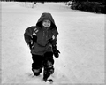
| 01/19/2009 10:27:15 PM |
I Am Child.by kashiComment: I absolutely love your title!!! 8 - mainly because of the title, and his expression completely fits. |
| Photographer found comment helpful. |
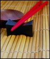
| 12/29/2008 03:27:24 AM |
Sensu by MAKComment: I like your composition here a lot. It leads me off the frame following her gaze. The only thing is, I think I might have liked the fan to be on the bottom left of the frame so as to balance the image because so much weight is on the right. Otherwise, I really like the soft focus and dramatic light. 8. |
| Photographer found comment helpful. |
| 12/29/2008 03:21:54 AM |
|
| Photographer found comment helpful. |
| 12/29/2008 03:07:53 AM |
Rainby LonzComment: I love the movement in this image. The slow shutter speed definitely enhanced this! |
| Photographer found comment helpful. |
| 12/29/2008 03:04:07 AM |
Hot Teaby peterComment: I really like this photo. The green compliments the black very well and I think the depth of field does an excellent job drawing me into the leaf. The tri-color border is really bothering me, however. |
| Photographer found comment helpful. |
| 12/29/2008 03:02:39 AM |
Land of the Rising Sunby bobonacusComment: I really like your border in this photo. The centered composition works as well. I just wish there was something more, though. |
| Photographer found comment helpful. |
| 12/29/2008 02:57:20 AM |
Chop Chopby ChefbozComment: Good concept and composition. I'm finding it hard to focus on one specific area of the image, however. This is a little frustrating as my eye is wandering around a lot. Good idea though. |
| Photographer found comment helpful. |
| 09/29/2008 12:06:54 AM |
jby jegerComment: This is a great idea and a great image! I can't believe it didn't score higher. This should have been a top 5! Awesome job! |
| Photographer found comment helpful. |
| 09/03/2008 01:03:49 AM |
where toby whiteroomComment: This is a phenomenal shot! I couldn't agree more with everyone else's negative space comments.
How'd you get the overexposed look without overexposing the subjects using only basic editing? I've been trying to get this look using only basic for quite some time now and have had no luck... it couldn't hurt for the overexposed challenge right now, either. ;) |
| Photographer found comment helpful. |
Home -
Challenges -
Community -
League -
Photos -
Cameras -
Lenses -
Learn -
Help -
Terms of Use -
Privacy -
Top ^
DPChallenge, and website content and design, Copyright © 2001-2025 Challenging Technologies, LLC.
All digital photo copyrights belong to the photographers and may not be used without permission.
Current Server Time: 08/17/2025 12:41:43 AM EDT.