Critique Club
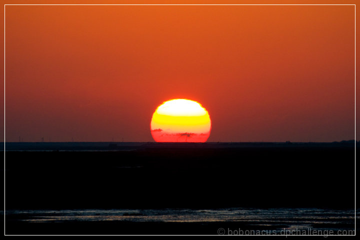
Nice, simple composition. The center composition works for the sun, but the horizon is in odd position for me. I would like more sky from a personal perspective. From a technical perspective the placement of the horizon is limiting, and often works better on the upper or lower third. The color of the sky is smooth and warm, the sun is difficult because of the blown highlights. It appears that some of the voters found the image soft, but I suspect that is from the haze and the nature of the sun. Overall, I find the image pleasantly simple and warm, but was probably deemed a shoehorn by the majority of voters.
Cheers,
Ben |







 Add photograph to your favorites
 Add photographer to your favorites

 Photographer found comment helpful.


