| Image |
Comment |
| 02/16/2004 11:03:53 AM |
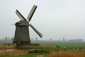
Wind Conquers Waterby AzrifelComment: Lovely shot the green grass, foggy horizon the sheep, hay, fence all of it paint such wonderful scene. Looks like holland? |
 Photographer found comment helpful. Photographer found comment helpful. |
| 02/16/2004 10:50:26 AM |
Three of choiceby heidaComment: Nice shot, not sure how I feel about the bottom of the photo being left in would like to so a version with it cropped out. |
| Photographer found comment helpful. |
| 02/16/2004 10:48:16 AM |
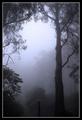
Trees: Natural Airby dinnComment: The small tree in the bottom has a very dark trunk, it does not look like it fits in the shot, I really wish it were not in the photo it is distracting to an otherwise gorgeous and moody shot. |
| Photographer found comment helpful. |
| 02/16/2004 10:29:40 AM |
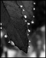
Hoar Frost and Holly by dsidwellComment: very well done, again...congrats,
p.s. did you glue on the frost like that ? (just kidding : ) ) Message edited by author 2004-02-16 10:30:40. |
| Photographer found comment helpful. |
| 02/16/2004 12:39:25 AM |
|
| Photographer found comment helpful. |
| 02/15/2004 11:55:24 PM |
|
| Photographer found comment helpful. |
| 02/08/2004 01:35:00 PM |
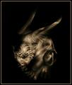
Out of the Nightby JasonComment: Greetings from the CC, well you have certainly produced a photo with some emotional content, granted its a bit of a creepy feeling that it gives me, but hey its a feeling! You have done a very good job on this shot IMO< not too much to critique, The lighting certainly serves to add a feeling of 'evil' as does the composition it really seems like this gargoil is creeping out of the nite shadows. Even tho it is a fairly central comp, the subjects positioning still makes for an interesting comp. The border even works well for your shot ( i generally hate borders) it is subtle yet adds a containment for the solid black bckgrnd. Very nice job, creepy but nice, I will leave him alone now : )
keep up the good work! and happy shooting! |
| Photographer found comment helpful. |
| 02/08/2004 01:08:53 PM |
Fire, light the way.by moviemanComment: HI and greetings from the Critique Club, welcome to DPC too. I have to admit when I first saw your shot while voting I dont recall seeing the man in the background, I was too focused on the white light, I do like it considerably more now that I have noticed him. But I think my initial oversight is worth noting, I think allowing your subjects to compliment each other is probably important. The light source here is very overpowering. I think however that you do have good technical aspects working here, good low ISO creating no noise in dark image. Nice sharpness too...
I hope that you stick around at DPC there is lots to learn, welcome and happy shooting!! |
| Photographer found comment helpful. |
| 02/08/2004 01:03:13 PM |
The Katana's War Paintby brett2004Comment: Hi and greetings from the CC. Good choice for your ISO setting, for a dark image there is no visible noise that I can see, I do like that you used 'colored' light I think that was a good and creative idea. And your light choices is certainly IMO where the interest of your shot lies. The reflection of the red and the shadow of the blue are points of interest to me. I would of prefered if the red on bottom was not cropped so tightly. I think technically this shot is well done, I am wishing for a bit more of a wow with perhaps the composition, the sword on a more intense diagonal perhaps making it look like it is 'stuck' into something? May have helped. My other more critical comment is about subject choice, i think it is good to ask does this subject have a wide or limited interest to people? Just a thought, good work and happy shooting! |
| Photographer found comment helpful. |
| 02/08/2004 12:56:38 PM |
Power of Lightby BAMartinComment: Hi greetings from the CC, I will start with saying that your title works very well. I am wondering if you were to have set your ISO to 100 if you would lf a got a little less noise in the shot (tho it is not a lot of noise this would of helped it IMO). My second consideration would be the compostion I feel aside from the image being a bit too 'central' it is also a bit too tightly cropped, this does not bother me quite as much on the bottom, tho I would likie to see a bit more room on the top. The lighting while leaving the image slightly dark, does not leave it so dark that details are obscured which is good. I think you have done well to fit topic, i.e paint with light. Keep up the good work and happy shooting! |
| Photographer found comment helpful. |
Home -
Challenges -
Community -
League -
Photos -
Cameras -
Lenses -
Learn -
Help -
Terms of Use -
Privacy -
Top ^
DPChallenge, and website content and design, Copyright © 2001-2025 Challenging Technologies, LLC.
All digital photo copyrights belong to the photographers and may not be used without permission.
Current Server Time: 08/14/2025 11:12:28 PM EDT.