|
|
|
Showing 321 - 330 of ~1531 |
| Image |
Comment |
| 05/16/2006 12:11:54 AM | It's like water off a Ducks Backby trainComment: Hi Greetings from the CC,
Not a bad image, I like that you have managed to get light in each ducks eye, that is important in wildlife shots. But, I think some things that could help may be, leaving some room for the ducks to go into, they all seem to be converging on the left, moving out of the shot, yet we do not know why? They do not have any where to go, and it leads the viewer out of the picture. I try to use as a rule of thumb if I photograph something ordinary I try to get it doing something extraordinary, if I photograph something that is extraordinary than it can just sort of 'be' there and can probably get away with it. Just some thoughts, hope they help. Happy shooting. |  Photographer found comment helpful. Photographer found comment helpful. |
| 05/15/2006 05:45:47 PM | As Cold As Any Stoneby PassionsGoldComment: Greetings from the CC, well hmm this is an odd but interesting photo. I do like it, it makes me laugh a little, so it at least provokes some feeling, not often done in most shots. I think from a technical point of view if you had moved your subject to the left 1/3 of the photo It would of really helped, would of also created an interesting dynamic btween the guy and the ele. I am not sure what angle you have taken this at, probably standing up, but had you perhaps squatted down it may have made him seem even grander. Not a huge range of tones in the black and white rendering but I think would of been good if the white portions were not quite as bright, especially his chest area, maybe could dodge it a bit?
I like the shot, sorry you did not do better, keep up the efforts!
|
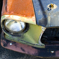
| 05/15/2006 02:58:41 PM | One man's Junk is another man's Treasureby gliphixComment: Greetings from the CC, well this image certtainly fits the 'cliche'. I am sorry to say this car would be in my 'junk' vs. treasure dept. What I do like is the color combo, tho I think I would of bumped up the saturation and contrast a little more to give it a bit more punch. I like the tight crop. What I think it lacks most is sort of a wow factor, it is not a bad photo really it just lacks any real passion wow. I guess if you were doing a photo shoot for junkyards or serious car buffs this may be a more intriguing shot. Hope that helps!
Keep shooting, I look forward to seeing more pix from your grat part of the world.
|
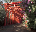
| 05/15/2006 02:52:46 PM | Red Religionby adyusComment: Greetings from the CC.
Well, this image has a lot of potential, but I think there are a few things that may have helped it. Perhaps retaking it at a time of day when the light was more even/golden so that the light is not so splotchy. Or perhaps (tho not for this challenge) dodging the bright spots may also help. I would also consider cropping it much tighter cutting especially from the bottom and the right. I think this would give the perspective aspect of your photo much more strength.
Hope that helps, Happy Shooting keep it up!
|
| 05/15/2006 02:45:52 PM | Blues and Greens in 3/4by banmornComment: Greetings from the Critique Club
Well, these colors certainly give the shot a sense of rhythm and movement. My criticisms would be that I would of cropped more from the right side, The cruve in the top of the vase IMO would be better cropped out I find it a distracting line. There are also some odd horizontal lines going thru the vase and I am not really sure what they are from, I think I would like the image more if they were not there. This image makes me think of the 60's. Congrats that this image did well. | | Photographer found comment helpful. |
| 05/15/2006 02:40:34 PM | Shuffleby harmsusmcComment: Greetings from the Critique Club!
This is a great shot (especially for a stock type of photo). It is clear as to what the subject is, the black background really helps to make it jump out aat you. The motion blur in the cards also another great way to show the movement that is happening.
My only possible criticism would be that the light on the thumbs is a little overexposed, after shooting could dodge them a bit to balalnce out the light or while shooting use a greater aperature (higher number)
Over all very well done congrats on your well placed finish!
Keep shooting!
| | Photographer found comment helpful. |
| 05/13/2006 03:46:09 PM | The face ( fashion and make up )by facesastheycomeComment: Greetings from the CC
Hmm... well o n the plus side I like your subject, I like that her eyes really stand out and the splash of pink color on her skirt. You have also done a very good job getting a blurred effect/ DOF
I think you did poorly cause this is more of a portrait than PJ.
I am not sure that this compostion really works for me either. It is sort of different and creative, but I find myself wanting to turn my head to even her out. I think I would of liked it more if she were completely upside down vs. slanted. Or perhaps cropping a little bit tighter especially on the top and left about 1/2 inch.
Just some ideas. |
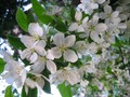
| 05/13/2006 03:39:47 PM | Wedding.by Carpe DiemComment: Greetings from the CC.
I think this shot is ok. I think what it lacks is WOW factor. It is sort of well, boring. The light is average the composition is average. If you shoot white flowers, maybe bring some black fabric as a backdrop and then you have a drama. Also you may just try and get some golden light, waiting til sunset or sunrise and shoot with the light directly on subject vs. behind it. What I DO like is the blurred flowers on the right in the background finding an angle to shoot by which all of the background is blurred would also take away those really overexposed white areas.
I am being very critical cuz you said you were new and wanted to know. So I want to give you somethings to think about, that being said, the shot is sharp and you have really gotten close to your subject and you did pick something of beauty to shoot...all pluses in my mind. Keep up the good work and the 'wow' part will come : ) happy shooting! | | Photographer found comment helpful. |
| 05/13/2006 03:32:53 PM | Street Kidby danica22Comment: Greetings from the CC.
I love this shot! The expression on this boys face to me is so 'boy' it says I am darn cute, I am mischevious, I am happy, it is so filled with pure emotion. I really think this is the kind of shot that you would see in life or time magazine depicting human emotion. It also ( I have only travelled to africa) to me says something that I see everytime I go to kenya or zambia that despite adversity and suffering and loss and poverty that africans have an ability to smile and find joy and acceptance in things that most north americans would crumble under. ( just an outsiders interpretation) I also think that you did a good job with the exposure as it is hard to photograph black people in that bright african sun.
I like the pose and composition as well. Nicely done, I wish you had done better. | | Photographer found comment helpful. |
| 05/13/2006 03:25:37 PM | High Temperatures and Spring Rain Flood Valley Floorby cools98Comment: Greetings from the CC. I really like this image, I think the long exposure dramatically adds to the feeling that this is flooded and that things are being washed away. I think that is the strongest element of this photo in my opinion. I also find the subtle water lines of the current serve to really draw the viewer into the photo. I also think that you did well to place the horizon line as you did.
The only thing I think would add to it is if you had some kind of an object in the top right area of the water, maybe a kids ball washed away or something with a splash of color. Just an idea. Overall nicely done!!
Keep up the good work. | | Photographer found comment helpful. |
|
Showing 321 - 330 of ~1531 |
Home -
Challenges -
Community -
League -
Photos -
Cameras -
Lenses -
Learn -
Help -
Terms of Use -
Privacy -
Top ^
DPChallenge, and website content and design, Copyright © 2001-2025 Challenging Technologies, LLC.
All digital photo copyrights belong to the photographers and may not be used without permission.
Current Server Time: 08/07/2025 12:51:36 AM EDT.
|