| Image |
Comment |
| 08/25/2003 04:27:07 PM |
|
| 08/25/2003 04:25:53 PM |
|
 Photographer found comment helpful. Photographer found comment helpful. |
| 08/25/2003 04:24:01 PM |
Two Outs, Bottom of the Ninth by EddyGComment: I wonder if you took a step to the left, to get only the score board in the background how it would be. I think you would have a much stronger image, perhaps try cropping out the 'lines' on the sides? |
| Photographer found comment helpful. |
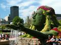
| 08/25/2003 01:31:42 PM |
Mosaicultureby nathaliedooComment: Well, the subject here is what gets you points, very interesting find. Photographically though, might have worked better in portrait mode, hence blurring the distracting people and buildings in background. May have tried to crop out the forground people a little more, esp the 1/2 guy and the peoples heads on the bottom. just thoughts again nice find. |
| 08/25/2003 01:27:58 PM |
|
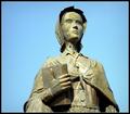
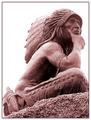
| 08/25/2003 01:26:57 PM |
Timeless Warriorby slgardnerComment: While generally I don't like frames or strak white backgrounds, in this instance I think the frame helps to offset the starkness of the white. I do quite like your compostion and choice of monuments (i am partial to native folks : ) ). Well done. |
| Photographer found comment helpful. |
| 08/25/2003 01:23:48 PM |
Sam Houstonby jab119Comment: The lightening and the color of the sky contrasted with the white monu. is what works in this image IMO. The tree is also composed in a way that does not distract from the image and adds to it IMO. |
| Photographer found comment helpful. |
| 08/25/2003 01:22:27 PM |
Canada - US Relations 1923by zeuszenComment: I like the luminescent feeling, esp in the bottom half of this shot. The bottom half has a 'glowing' feeling to it. While in some ways it is like a second image (which some may find distracting) the leaves on top almost appear to be part of the actual monument vs. background. They give it an enhanced 'roman' feel IMO vs. 'can/u.s' feel. I like the detail that your technique seems to enhanced, making an othewise flat image 'pop'. |
| Photographer found comment helpful. |
| 08/25/2003 12:10:23 AM |
Naivité?by dsidwellComment: Well, I think photographically this shot is not great, but I love your title and the statement you are making. |
| Photographer found comment helpful. |
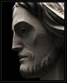
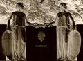
| 08/25/2003 12:00:48 AM |
Father and Sonby arnitComment: What an odd yet enjoyable shot. Curious how you did it. Be sure to tell when it is over. Looks like a layer? |
Home -
Challenges -
Community -
League -
Photos -
Cameras -
Lenses -
Learn -
Help -
Terms of Use -
Privacy -
Top ^
DPChallenge, and website content and design, Copyright © 2001-2025 Challenging Technologies, LLC.
All digital photo copyrights belong to the photographers and may not be used without permission.
Current Server Time: 08/08/2025 01:32:46 AM EDT.