| Image |
Comment |
| 06/24/2003 06:45:14 AM |
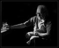
When all has been said and done by jjbeguinComment: Great pic, I really like the way it is lit. With the relaxed edting rules I might have burned in the arm and the front of the shirt and neck a little though. 9. Good luck, Todd. |
 Photographer found comment helpful. Photographer found comment helpful. |
| 06/24/2003 06:42:51 AM |
|
| 06/24/2003 06:42:13 AM |
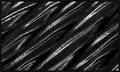
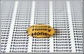
Five Speedby GordonComment: This is my personal favorite this week. It is simple yet effective. My only criticism would be thelight section in the top left. I would have made this either lighter or darker. So either more obvious or get rid of it all together. Great shot though.
Good Luck, Todd. |
| 06/23/2003 12:12:31 PM |
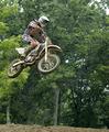
Flyingby FranziskaLangComment: Seems you beat my motocross shot afterall! I've had a look at your other shots and they look great. It is a fun subject to shoot don't you think? Well Done!
Todd. |
| 06/19/2003 09:32:06 AM |
Sports Illustrated by RiderGalComment: Well done Talya, congrats on the ribbon. But far and above that well done on getting the editing work. Sitting in on a major sporting event and shooting it is where the real thrill is here. Stick with it, you have talent and a good eye for capturing the action, I have no doubt you will be very successful in the sports photography area. As it is an area that also interests me I look forward to seeing more of your work. |
| Photographer found comment helpful. |
| 06/16/2003 12:43:07 PM |
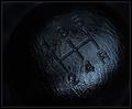
gooby jbruno1397Comment: Critique Club
Hi Johnothan,
intersting image and choice of cropping. It is certainly abstract and I think it probably scored lower than it should have. I like the design.
One thing that does detract from the image is the couple of little white spots on the inner two swirls. I take it that the big white spot is the reflection of the lamp you used to light the picture. I think it both adds and detracts from the image. Firstly I think it adds something to the surface effect giving a sense of the irregularities in the surface, though at the same time it is distracting and probably cost you a few votes. It seems fairly grainy which may have been the effect you were going for. Personally I think I would have perhaps used a longer exposure to lift the image a bit and moved the lighting source out of the direct line of the shot.
Perhaps a longer exposure at a lower ISO would have reduced the grain. Finally increase the saturation to make the colours a bit more vivid.
Compositionally, I think it is a good abstract and thew swirls do lead your eye to the centre of the image.
I think it would be worth reshooting this to see what else you could get out of it.
Overall I think a few technical and compositional changes would have resulted in better scores for this image.
Thanks for sharing your image and keep shooting.
Cheers,
Todd. |
| 06/11/2003 09:11:09 AM |
|
| Photographer found comment helpful. |
| 06/09/2003 12:52:44 PM |
whispers and giggles by ursulaComment: Well done Ursula, I think this shot really conveys both a sense of sound and also mood. Great shot, definately deserved a ribbon. |
| Photographer found comment helpful. |
| 06/09/2003 12:21:54 PM |
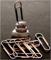
Clip Artby hawkidaComment: I think the title is clever, not sure the globs of blue-tack are that appealing..... I think you are on the right track though.... good luck, Todd. |
| Photographer found comment helpful. |
| 06/09/2003 12:05:48 PM |
deskylineby kenboComment: nice shot, it certainly has an office feel to it. Good Luck, Todd. |
| Photographer found comment helpful. |
Home -
Challenges -
Community -
League -
Photos -
Cameras -
Lenses -
Learn -
Help -
Terms of Use -
Privacy -
Top ^
DPChallenge, and website content and design, Copyright © 2001-2025 Challenging Technologies, LLC.
All digital photo copyrights belong to the photographers and may not be used without permission.
Current Server Time: 08/04/2025 12:21:56 AM EDT.