| Image |
Comment |
| 08/11/2005 09:56:45 PM |
DSC_0101.JPGby 4ROGGYCHEFComment: The composition works though would probably be better showing the swimmer's feet. Also, you've handled the reflections quite well however as an action shot I don't thing it works. The image portrays no sense of motion, to me anyway. |
| 08/10/2005 03:25:48 PM |
Between Bright and Darkby tonyvComment: Totally agree with phinbob's assessment of this image however I feel that the sense of depth in the image could be exploited more if the image was horizontal rather than vertical. |
 Photographer found comment helpful. Photographer found comment helpful. |
| 08/10/2005 12:11:01 AM |
Feline Eyesby jenesisComment: He's saying 'Don't Mess With Me'. Good colour and contrast. Maybe a little too shallow on the DOF. |
| Photographer found comment helpful. |
| 08/09/2005 11:27:19 AM |
Trist Fallsby JeremyFleuryComment: What works: colour though saturation of the red bridge could probably be increased, flow of the water, contrast and texture
Very serene.
What doesn't work: horizon seems slightly tilted to the left, dead weeds in the foreground are a bit distracting, focus seems a little soft Message edited by author 2005-08-09 11:27:47. |
| Photographer found comment helpful. |
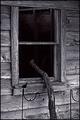
| 08/03/2005 10:50:43 AM |
window1.jpgby nomad469Comment: I like the image however the stick has no purpose (to me). I believe the image would be better without it. |
| 08/03/2005 10:01:32 AM |
|
| Photographer found comment helpful. |
| 07/29/2005 04:07:10 PM |
|
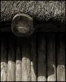
| 07/28/2005 11:19:47 AM |
Hutby aznymComment: The change in lighting is probably a bit too drastic between the lit part at the bottom and the shaded area. If it were more gradual, leading to the texture of the roof area I think it probably would have done better. On some monitors there may have been no detail to be seen in the middle. |
| Photographer found comment helpful. |
| 07/28/2005 10:59:11 AM |
Softby LeeDComment: For this particular challenge the image was probably a bit too subtle.
As an image, here are my thoughts.
Composition: I think you chose a good vantage point and if you look closely there are leading lines in the folds of the blanket.
Exposure: Maybe a bit too high key though the skintone seems right. More light on the blanket to bring out the folds I think may have made for a stronger image.
Impact: Subject matter I think helps here. Very sweet. Good shot for the album. For wider appeal though I think more emphasis on some of the other elements is needed (folds in blanket etc.) |
| Photographer found comment helpful. |
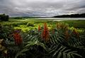
| 07/28/2005 09:45:55 AM |
Rain over the Mohawkby NeilComment: You've captured great depth here. The foreground subject adds weight and colour to provide balance. One thing I would have done is have the main foreground flower more to the right. By its placement it seems to be splitting the image in half. |
| Photographer found comment helpful. |
Home -
Challenges -
Community -
League -
Photos -
Cameras -
Lenses -
Learn -
Help -
Terms of Use -
Privacy -
Top ^
DPChallenge, and website content and design, Copyright © 2001-2025 Challenging Technologies, LLC.
All digital photo copyrights belong to the photographers and may not be used without permission.
Current Server Time: 08/13/2025 11:35:19 PM EDT.