|
|
| Image |
Comment |
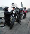
| 12/11/2002 02:42:16 PM | Roadside Repairs (Portrait of a friend)by AzrifelComment: I feel that this shot needs to be rotated clockwise by a few degrees, since the uprights of the roadsigns and buildings in the background distract by being not quite vertical. The subject matter of the shot is good, but perhaps a different shooting position (eg a bit more to the left) would have got you a more interesting composition. |  Photographer found comment helpful. Photographer found comment helpful. |
| 12/11/2002 02:37:08 PM | Yuleby KimblyComment: Very novel use of tree lights- did they get hot? :o) I'm not too sure about the green tone to the shot myself, as it means the green lights don't contrast as much as they could have done - however, it really makes the red lights stand out. Unfortunately, both of the yellow lights are blown out, losing some of the detail there. Overall, I like the composition of this shot, and the idea behind it is good. |
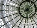
| 12/11/2002 02:31:20 PM | Under the Christmas Treeby YomiComment: Superb photo - very unusual perspective, and good use of the RoT. However, given the concentric ring patterns of this structure, a centred shot might also work well in this case. |
| 12/11/2002 02:29:17 PM | Chasityby connieComment: This is one of a couple of images this week that are too bright, probably due to monitor calibration (using the greyscale below each photo, set the monitor brightness so that the borders between each block are clearly visible). Otherwise, this is a good portrait shot; well lit and nicely focused. |
| 12/11/2002 02:24:21 PM | Abstract Martiniby AleciaComment: Hmm, yes, very abstract, but to the extent that there aren't any main focal points :o/ However, the lines of the glass against the background are good, leading down from the upper corners into the centre., and the colours are very rich and vibrant.
One final thing - the border isn't very even, with the righthand side being wider than the lefthand, and it looks like a filter of some sort was applied after the border was created, as there is a noticable ghosting of it into the main image. Also, since the main background of the image is blue, perhaps a black border would help make it stand out a bit more. | | Photographer found comment helpful. |
| 12/11/2002 02:05:44 PM | Spaghettiby JackoComment: Very creative idea this! I'm curious as to how you lit this, since the four corners of the shot are very yellowed, yet the centre has dark depths. | | Photographer found comment helpful. |
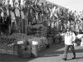
| 12/11/2002 02:02:04 PM | Market Streetby MiekaComment: Nicely composed shot, with plenty of interesting details. However, it all feels very grey, as if it had been converted to b&w without any adjustments. This may be due to your monitor calibration being too dark (check by using the calibration greyscale at the bottom of all photos - you should be able to see the borders between all the blocks), but if not, it'd be worth making the whole image a bit darker and playing with the levels, to add some depth to the blacks if possible. | | Photographer found comment helpful. |
| 12/11/2002 01:55:12 PM | Leading the Choirby crabappl3Comment: Love the expression on this one, nicely timed candid. The positioning of the frame/crop helps add to the fact that she is looking out to the left of the camera. However, it looks as though something like NeatImage has been used, since it feels like the detail in the hair has been lost. | | Photographer found comment helpful. |
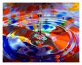
| 12/11/2002 01:51:45 PM | A Splash of Color by RackatComment: Great stopped motion shot this (you could have entered it in both challenges this week ;o). I'm curious as to whether the colours on this are part of the bowl, or whether they are actually in the water itself. |
| 12/11/2002 01:48:46 PM | Morning Shadowby tjuneau13Comment: The mottled-effect of the light coming in (presumably through tree branches) is great, and the blinds are at the right angle too. However, having the chair in shot detracts from the overall image, plus it hides some of the wall being lit, which is a pity. |
Home -
Challenges -
Community -
League -
Photos -
Cameras -
Lenses -
Learn -
Help -
Terms of Use -
Privacy -
Top ^
DPChallenge, and website content and design, Copyright © 2001-2025 Challenging Technologies, LLC.
All digital photo copyrights belong to the photographers and may not be used without permission.
Current Server Time: 08/21/2025 04:55:36 PM EDT.
|