|
|
| Image |
Comment |
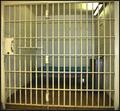
| 03/20/2004 10:13:25 AM | Parallel Barsby DanBennettComment: Lots of parallel lines in this shot, no doubt about that! Just a few suggestions - given that this shot is very yellow due to the lighting, it might have helped to make this one b&w, to bring out the textures. Also, some levels adjustment (bit more highlight, bit less midrange) would also help contrast the bars against a darker cell. Hope this helps! |  Photographer found comment helpful. Photographer found comment helpful. |
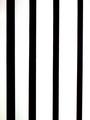
| 03/20/2004 10:03:46 AM | Venetian Blind Linesby jsmileyComment: Well, you've definitely met the challenge topic with this one! However, there's nothing else in the image apart from the lines, so I feel that it doesn't have anything to keep my interest in it. Also, the image is very small, both in dimensions and in file size - you're allowed to use up to 640 pixels in any direction, and up to 150Kb, so you've lost some quality in the compression and lost impact due to the small size. Hope this helps!. |
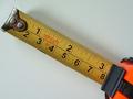
| 03/20/2004 09:58:04 AM | Parallel Lines of Measurementby MrsFuzzButtComment: Good idea, but the final image could have done with a bit more post processing work - cropping the top off slightly would help the tapemeasure line up with the corners, and some adjusting of the levels (eg a bit more highlight) would help bring the yellow out more against the white, and clean the white background too. Also, the photo is only 40Kb out of a maximum 150Kb, so you've lost some image quality in the compression. Hope this helps! |
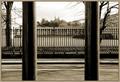
| 03/18/2004 05:23:38 AM | .by KaveyComment: This one looks familiar.. The foreground bars definitely give this shot impact, and the DoF is nice. Pity the clouds above the observatory come out as flat, but we couldn't control the weather ;o) Why call it '.' though? | | Photographer found comment helpful. |
| 03/17/2004 12:21:59 PM | Into The Blueby gandersComment: I remember you taking this shot, and Kavey shouting about the bird :o) Coincidentally, this is the same building as the one in my entry! Good shot overall, but might have benefitted from a bit more postprocessing, esp focus and levels (the bird is a bit blurred, and the colours could be a tad richer). | | Photographer found comment helpful. |
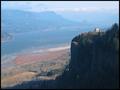
| 01/26/2003 11:43:18 AM | Viewpointby moondoggieComment: Critique Club comment :o)
Composition:
The most striking thing about this photo is the contrast between the area in shadow and the rest of the landscape. This makes the foreground on the right really pop out, thus drawing attention to the building on top of this outcrop - great choice of focal point, by the way.
The lines of the shot lead the eye across the frame nicely, but I'd be interested to see if it was possible to take this shot from higher up (so that more of the river is in view), or slightly lower down (so that the foreground outcrop covers the background river & hills).
Background:
The background is an integral part of this landscape shot, so much is covered above. However, I can add that the sky (and the distant hills) are getting a bit grainy, even with as low an ISO as 50, so perhaps a slightly longer exposure with a narrower aperture would help avoid that, but that really depends on your camera as much as anything.
Camera Work:
Both the focus and the DoF are good on this shot. As for the lighting, as many other people suggested in their comments, it may have been worth going up there at a different time of day (if possible), to get the light coming at a different angle.
FYI, I think you've got your Aperture and Shutter values mixed up - the aperture should probably be F2.0, and thus the Shutter time should be 1/650th sec :o)
Post Processing:
Since you've not provided any details, I can only guess as to what post processing you've done, if any. The mane thing about this shot is obviously the balance between the very dark shadows and the very light, even hazy, sunlit areas - perhaps some (more) levels adjustments would help cool the lit areas, without losing the details in the shadows... but this might not be possible, of course, in which case this is probably the best compromise.
My Opinion:
I personally think that this shot absolutely meets the "landscape" challenge, and is an impressive vista, held together nicely by the focal point of the building. Definitely an above-average shot, just short of being great.
If you have any questions about this critique, please feel free to contact me via the PM system. |
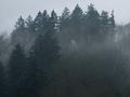
| 01/26/2003 09:40:42 AM | Misty Mountainby SwashbucklerComment: Critique Club comment :o)
Composition:
There are two main lines of trees to this shot - the darker ones slightly to the foreground, and the misty slightly lighter ones in the background. However, since the shot is so gloomy, its very hard to tell them apart, so the depth that the mist should have given is mostly lost.
The trees and mist fill the frame well, but there's no focal point or points in the image, so the eye tends to just wander around, rather than going to any particular point. The lines of the shot are good, but I feel that the shot could do with a bit less of the bottom of the frame, and a bit more sky, which would at the same time put the tree lines on the RoT lines.
Background:
The background is an integral part of this landscape, so I can't say much more than I did in the above.
Camera Work:
The focus and DoF seem reasonable on this shot, considering that its a foggy / misty scene, but without specific camera details (Aperture, ISO, Shutter) I can't really say much more.
Post Processing:
Since you've not provided any details, I can only guess as to the post processing you've done, if any. One important thing to mention is that this shot is only 108Kb, out of a maximum 150Kb, therefore you may have lost a bit of detail by compressing the image down to that size - I always recommend that you try to get as close to the 150Kb line as possible, so that as little detail as possible is lost.
Since this shot is so gloomy (due to the mist), it may have been worth adjusting the levels to get a bit more contrast between the foreground trees and the background trees, which would add more depth to the shot. Also, given that this photo is nearly monochrome, perhaps making it a b&w shot would have helped make it feel more misty.
For an example of what I mean, I took the liberty of downloading and post processing this image myself - you can see the finished result here (I appreciate that this is your copyrighted material, so please PM me if you want me to remove this image from my website).
My Opinion:
I personally think that this shot meets the "landscape" challenge, but it definitely doesn't do anything more than that. The general gloom and lack of any real focal point means that there's nothing in the shot to get interested in, which makes this a below average to average shot.
If you have any questions about this critique, please feel free to contact me via the PM system. | | Photographer found comment helpful. |
| 01/26/2003 09:15:37 AM | Un-Forbidden Fruit by autoolComment: Critique Club comment :o)
Composition:
Very cleverly thought out, and nicely positioned. The crop is slightly odd, since there's very little space between the lower boot and the bottom of the frame, yet plenty above, so perhaps a slightly lower angle/crop would help balance this a bit more... but then again, the space above helps add to the illusion of someone lying there, so perhaps you made the right choice here.
Background:
The background is good - a very empty black, as per the shot its a parody of, but there's a patch of something just above the upper knuckle that's a bit distracting. I find that it always pays to make sure your background is completely spotless if possible.
Camera Work:
The lighting picks up all the details, and the DoF and focus are both pretty much spot on, apart from the upper finger which feels a bit less clear than the rest of the subject.
Post Processing:
Since you've not provided any details, I can only guess as to the post processing you've done, if any. One important thing to mention is that this shot is only 124Kb, out of a maximum 150Kb, therefore you may have lost a bit of detail by compressing the image down to that size - I always recommend that you try to get as close to the 150Kb line as possible, so that as little detail as possible is lost.
My Opinion:
Does this meet the "Humor" challenge? It made me laff, which is more than most did, and it wasn't a huge surprise to me that it did so well... BTW, where did you get the tiny apple & boots from?! :o)
If you have any questions about this critique, please feel free to contact me via the PM system. |
| 01/26/2003 08:58:05 AM | Winter Garden Gazeboby BitzComment: Critique Club comment :o)
Composition:
The first thing that my eye goes to in this image is the gazebo, since it stands out so clearly - exactly what this photo tries to do, which is great. The reflection on the water and the lines of the white bridge to the left give plenty of interest to the centre of the shot too.
However, the foreground branches on both right and left sides are distracting, and dont really help frame the photo - perhaps a closer crop or more zoom would have helped, or maybe a slight change in position (a bit lower?) while shooting.
Background:
The background trees are an integral part of the landscape, which works well, and the bridge/road behind the gazebo doesn't distract. The background sky is very clear blue, but this makes the shot feel a bit flat, since there isn't a sense of depth that a few clouds would add to the shot... but you can't always get the weather you want, of course :o)
Camera Work:
The focus and DoF are good, and all the details are quite clear, but perhaps a slightly shallower DoF focused on the gazebo would have blurred out the foreground branches a bit more, making them a bit less distracting.
Post Processing:
Since you've not provided any specific details, I can only guess as to the post processing you've done, if any. One important thing to mention is that this shot is only 97Kb, out of a maximum 150Kb, therefore you may have lost quite a bit of detail by compressing the image down to that size - I always recommend that you try to get as close to the 150Kb line as possible, so that as little detail as possible is lost.
Apart from that and possibly cropping tighter, it might be worth while adjusting the colour balance and levels for this shot - the shot is quite blue, and could do with a little more contrast to make the island pop out a bit more, and not just the gazebo.
My Opinion:
I think that this photo definitely meets the 'landscape' challenge, but it doesn't really excell in any area, making it more an average shot.
If you have any questions about this critique, please feel free to contact me via the PM system. Message edited by author 2003-01-26 08:58:20. |
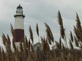
| 01/25/2003 04:25:04 PM | Light Houseby TurcoComment: Critique Club comment :o)
Composition:
The composition of this shot is great - I love the way you've used the foreground grasses with the lighthouse in the background. Also, the way you've got the effect of the wind on the heads of the grasses contrasts nicely with the very solid feel of the tower.
One thing I would suggest with this shot would be to crop/zoom out a little bit more, if possible, or to take the shot further away - this way, the line of the darker area across the bottom of the shot and the tower itself would be nicely on the Rule of Thirds lines.
Another suggestion would be to flip the shot left<->right, so that the tower is on the righthand side, so that the eye leads in from the lefthand corner (the natural start point) across the row of grasses to the tower on the other side.
Background:
The background is an integral part of the composition of the shot, and thus is covered in the above section. In addition, the sky is quite interesting, since it's not a generic clear-blue, but would really benefit from some levels & contrast adjustments, so that the tones within it stand out more.
Camera Work:
The focus and depth of field (DoF) on this shot seem OK, with both the grasses and the tower in focus, but since the shot is small and you've not provided any camera settings info (Aperture / ISO / Shutter), I can't really say much more.
Post Processing:
Since you've not provided any details, I can only guess as to the post processing you've done, if any. Firstly, this image is tiny! It definitely doesn't hit the 640 pixels maximum in either dimension, so the image here is much smaller than it could have been - this means that there is less detail for people to see, and thus makes it harder to get interested in the shot.
Secondly (and due to the small resolution), this shot is only 8Kb (!), out of a maximum 150Kb, therefore you may have lost quite a bit of detail by compressing the image down to that size - I always recommend that you try to get as close to the 150Kb line as possible, so that as little detail as possible is lost.
Apart from all that, it looks like a very gloomy day, which you can either emphasise (b&w might work will in this case), or reduce by playing with the saturation & levels to make it seem brighter.
My Opinion:
This is a potentially very good shot, but needed more post processing work and a little more thought on the framing, so I'd rate it as slightly below average. As for meeting the "Landscape" challenge, it definitely does that, and the buildings in frame integrate into it nicely, rather than distracting.
If you have any questions about this critique, please feel free to contact me via the PM system.
|
Home -
Challenges -
Community -
League -
Photos -
Cameras -
Lenses -
Learn -
Help -
Terms of Use -
Privacy -
Top ^
DPChallenge, and website content and design, Copyright © 2001-2025 Challenging Technologies, LLC.
All digital photo copyrights belong to the photographers and may not be used without permission.
Current Server Time: 08/22/2025 07:21:10 AM EDT.
|