| Image |
Comment |
| 12/11/2002 09:48:04 AM |
?by sjgleahComment: This shot makes me want to know what on earth this sign is for :o) The positioning of the sign within the shot is good, yet the background seems to be too bright - the sign is in shadow, but most of the background is in direct sunlight. Perhaps a different angle could have got more of the shadowed background behind the sign, or a levels adjustment maybe. In addition, a shallower DoF, focused on the sign and blurring the background, might have helped make the sign jump out more as the main subject of the image. |
| 12/11/2002 09:35:10 AM |
BB'sby AnachroniteComment: The lighting and colours in this shot are great. However, there isn't a main focal point in the image, so it lacks any interest after the initial glance. |
| 12/11/2002 09:28:34 AM |
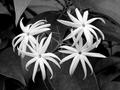
Earthbound Starsby mjcecilComment: I'm not sure about the use of b&w in this shot - it helps make the flowers stand out, yet it doesn't help emphasise any textures, making it feel a bit flat. The lack of a flower in the centre of the cluster makes the shot feel like its in two halves, but the stalk/dead flower that is there just about binds the two parts together. |
| 12/11/2002 09:22:03 AM |
Light Towerby FrooberComment: Hmm.... what can I say about this one... :o) Hmm.... the tower could do with being rotated about 1 degree clockwise, since the main grey/white boundary line is very slightly angled. Other than that, the composition is good, the colours contrast well against the background sky, and the RoT is observed to reasonably good effect. |
 Photographer found comment helpful. Photographer found comment helpful. |
| 12/11/2002 09:10:49 AM |
one yellow eyeby BadPiggComment: The circular markings / highlights on the paper are a good continuation of the circles of the central object, but it really needs a bit more contrast to make them stand out. A squarer crop might also help here. |
| Photographer found comment helpful. |
| 12/11/2002 09:08:26 AM |
Portrait of a Beautyby byetkoComment: Composition of this shot is very good, detracted only by the lighting, which is a bit too bright, especially on the nose and the hair in the upper-right corner. Other than that, it's a great portrait shot. |
| 12/11/2002 09:06:23 AM |
wet leafby shutterflyComment: The colours in this shot are great, giving a good contrast between the leaf and the background. The diagonal of the leaf is also good for leading the eye into the shot, but the waterline along the top of the frame is a bit distracting. A slightly deeper DoF would get all of the leaf in focus, including the nearside, which I think would help this image. |
| Photographer found comment helpful. |
| 12/11/2002 08:57:51 AM |
Light of the Spiritby jmsetzlerComment: Great shot! The angle is perfect, the use of b&w is spot on, and the overexposure of the window works well. |
| 12/11/2002 08:56:11 AM |
Marcoby amonteforteComment: Nice use of DoF, and the lighting is well balanced. However, the expression on the kid's face doesn't create any interest in the photo for me. |
| 12/11/2002 08:52:37 AM |
Lemon DROPSby justineComment: The composition of this photo is good, but the lighting doesn't help highlight the water droplets on the lemon skins, and the crop & angle means that a potentially interesting reflection off the surfacetop has been lost. I'd also suggest using a second light from the righthand side, to help bring some warmth to the colours. |
| Photographer found comment helpful. |
Home -
Challenges -
Community -
League -
Photos -
Cameras -
Lenses -
Learn -
Help -
Terms of Use -
Privacy -
Top ^
DPChallenge, and website content and design, Copyright © 2001-2025 Challenging Technologies, LLC.
All digital photo copyrights belong to the photographers and may not be used without permission.
Current Server Time: 08/21/2025 04:56:47 PM EDT.