| Image |
Comment |
| 06/28/2004 06:20:57 PM |
Photographers portraitby birgirComment: Dramatic alright, but the dour look is a bit much. But you definitely deserve credit for creativity! |
 Photographer found comment helpful. Photographer found comment helpful. |
| 06/28/2004 06:16:57 PM |
Untitledby EddyGComment: Beautifully lit and tasteful usage of background. Still, the image doesn't really grab me. Maybe with a more dynamic pose? But definitely a good contender. |
| Photographer found comment helpful. |
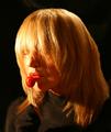
| 06/28/2004 06:09:10 PM |
MyTootsieby neilmwilsonComment: Good idea and interesting dramatic lighting, but the hair obscures her eyes so much that you can just barely tell they are open. If you could actually see her pupils through the hair, this would be a great photo. |
| Photographer found comment helpful. |
| 06/28/2004 09:24:41 AM |
Save a Horse, Ride a Cowboyby L1Comment: Very interesting lighting and composition, but doesn't look anything like human skin. Is this NeatImage gone amok? (Being a Mac user, I'm blissfully insured against making that mistake!) |
| Photographer found comment helpful. |
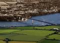
| 06/27/2004 11:36:18 PM |
The other sideby AndelainComment: Great idea! After seeing endless photos that isolate some small object in color, yours is a real novelty. Only thing I'd have done different is to have the desaturation graduated along the bridge, rather than the abrubt change. |
| Photographer found comment helpful. |
| 06/03/2004 10:52:22 PM |
Pale Josephine Reduxby JesuispeureComment: Definitely better! Still very creative, but much more accessable. I particularly like how the photo is centered on her navel, which is one of the less blurred parts, and then the burst of light in the background gives even more feel of motion. |
| Photographer found comment helpful. |
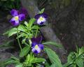
| 06/01/2004 08:09:18 AM |
Incensesby bormicComment: Would have more impact with either more saturated color (maybe selectively boosting the red ember) or in B&W |
| Photographer found comment helpful. |
| 06/01/2004 08:05:15 AM |
Three's Companyby kim100878Comment: Three things could be improved: the head-on light (on-camera flash?) is too harsh for this subject, the background is too distracting (more blurred would be better), and there are compression artifacts (use better quality jpeg setting). |
| Photographer found comment helpful. |
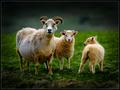
| 05/31/2004 12:50:44 PM |
Family of threeby arnitComment: Oh if only they were in crisper focus! Otherwise such an excellent composition and lighting (Heida, is that your burning of the edges?) - 8 |
| 05/31/2004 12:47:16 PM |
Shed Doorsby undieyatchComment: Good idea, but a tighter crop, loosing the cardboard at the bottom, would give a much stronger composition. |
Home -
Challenges -
Community -
League -
Photos -
Cameras -
Lenses -
Learn -
Help -
Terms of Use -
Privacy -
Top ^
DPChallenge, and website content and design, Copyright © 2001-2025 Challenging Technologies, LLC.
All digital photo copyrights belong to the photographers and may not be used without permission.
Current Server Time: 08/05/2025 11:55:56 AM EDT.