|
|
| Image |
Comment |
| 12/18/2002 02:34:26 PM | Chasityby connieComment: Critique Club Critique
My first reaction to this was ├вАУ what can I say about such a very nice portrait of such a pretty young lady. Then I looked at the comments, and I knew I was right. When you can get conflicting comments ├вАУ too soft, just right; too dark, too bright; etc, then you know you produced what you wanted to.
(1) COMPOSITION (CONTENT) ├вАУ Very well done. For me, this portrait is all about the eyes. You have captured them well, and positioned them well in the photo. All the other elements tend to frame the eyes perfectly. I would not have increased the color saturation at all (as some suggested). This would have just added more points for the viewer's eyes to wander.
(2) BACKGROUND ├вАУ Well done. The softly lit blond hair in upper right nicely balances the white dress on the lower left.
(3) CAMERA WORK ,TECHNICAL ├вАУ Very good. I like the focus. The only minor complaint I have is the shiny area above the left eyebrow and the reflection off the nose. If not for the challenge rules, these could be touched up easily in photoshop.
(4) DIGITAL PROCESSING ,TECHNICAL ├вАУ Excellent, no changes I could recommend.
(5) MY OPINION ON THE PHOTO ├вАУ A very nice portrait worthy of framing.
Jim msp
|
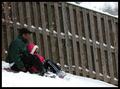
| 12/18/2002 02:12:38 PM | First Snowby BAMartinComment: Critique Club Critique
(1) COMPOSITION (CONTENT) ├вАУ Well composed. I like the position of the sledders in the photo, giving a nice sense of motion from left to right. The diagonal elements really makes the picture ├вАУ the fence, the tilted fence slats, and the bend of the legs. The one bright coat really draws the eyes.
(2) BACKGROUND ├вАУ I like the ├вАЬdull fence├вАЭ, the white snow, and even the dark coat of the adult rider.
(3) CAMERA WORK ,TECHNICAL ├вАУ Looks good to me; everything looks in focus. The fast shutter speed captured the snow flakes well.
(4) DIGITAL PROCESSING ,TECHNICAL ├вАУ No changes I can see. Your exposure and post processing got the snow ├вАЬjust right├вАЭ.
(5) MY OPINION ON THE PHOTO ├вАУ A very good winter picture. You probably suffered in the voting because of the ├вАЬsnapshot├вАЭ reaction of some of the voters (just a child on a sled). But I don├вАЩt believe they really looked past the child at the total composition. For the majority of the voters, you might have also tried a slower shutter speed (and smaller aperture) to get a little blurring of the riders & sled. This would have required some trial and error, I├вАЩm sure. You could have also tried some motion blur by moving the camera left to right with the sled. Each would have produced a different ├вАЬlook and feel├вАЭ to the end result.
Jim msp
|  Photographer found comment helpful. Photographer found comment helpful. |
| 12/16/2002 11:46:03 PM | Grinding Showerby CubComment: Critique Club Critique
(1) COMPOSITION (CONTENT) ├вАУ Very well composed. I like the very well defined diagonal. Clearly shows the sparks in motion.
(2) BACKGROUND ├вАУ The only defect I see is the bright reflection just right of center. Did you have any control of this? The dark area on the right works very well.
(3) CAMERA WORK ,TECHNICAL ├вАУ Very good I like the chosen DOF which just slightly blurs the background. I don├вАЩt think more would have hurt.
(4) DIGITAL PROCESSING ,TECHNICAL ├вАУ No recommended changes
(5) MY OPINION ON THE PHOTO ├вАУ A very good photo. You deserve the high finish. BTW, I did a flip of this by 180 deg in PS . It makes the sparks radiate upward, changing the effect somewhat. That angle would have worked better, imho, if you could have somehow darkened the background.
Jim msp
| | Photographer found comment helpful. |
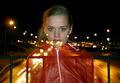
| 12/16/2002 11:30:33 PM | Gridlock'dby arnitComment: Critique Club Critique
(1) COMPOSITION (CONTENT) ├вАУ Quite good. I like her being centered, as the lights then tend to radiate out from her. It├вАЩs too bad the safety bars are so visible, as they detract from the photo. And if she were only a few cm taller, the lights would not hit her lip
(2) BACKGROUND ├вАУ I would have like to have seen more well defined moving headlights; especially on the right, where they appear as one blurred object, except for the red lights.
(3) CAMERA WORK ,TECHNICAL ├вАУ A good job. For this challenge, I might have tried to reduce the flash intensity so her face did not dominate; though it is a very pretty face.
(4) DIGITAL PROCESSING ,TECHNICAL ├вАУ Excellent. No apparent changes needed.
(5) MY OPINION ON THE PHOTO ├вАУ Very good idea and execution. The model tends to dominate, though, and she is not the one in motion. The lights in motion need to be enhanced some.
Jim msp
|
| 12/16/2002 11:14:41 PM | Spiritedby RiderGalComment: Critique Club Critique
(1) COMPOSITION (CONTENT) ├вАУ Very well chosen. The main elements that catch my eye (name & flowers) are in the upper half & centered well. I am assuming you used a zoom blur. Good lighting for the desired effect. Did you try to center the flowers and use the same technique? It might have introduced more apparent motion because of the color.
(2) BACKGROUND ├вАУ Quite good. No real structure, so the eye only pauses briefly on the other elements, like the snow. The rest is dark.
(3) CAMERA WORK ,TECHNICAL ├вАУ Very good job and very good use of a blur using a zoom lens. Nicely centered on the ├вАЬA├вАЭ in Evans. Only minor complaint is the slight tilt of the frame that should have been corrected for in post processing.
(4) DIGITAL PROCESSING ,TECHNICAL ├вАУ I don├вАЩt see any changes I would recommend.
(5) MY OPINION ON THE PHOTO ├вАУ Well done. I would guess that most viewers in a ├вАЬquick view to vote├вАЭ mode missed the subtly of the zoom blur, and thought you may have moved the camera, or used a ├вАЬspecial filter├вАЭ.
Jim msp
|
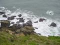
| 12/16/2002 10:57:48 PM | Sea e-motionby bcncrazyComment: Critique Club Critique
(1) COMPOSITION (CONTENT) ├вАУ A good photo of a seaside. Good use of 3 elements ├вАУ grass, rocks & water. Nice diagonal across the frame. Water shows some foaming, hence some motion. However, the content is ├вАЬaverage├вАЭ, hence all the 5├вАЩs & 4├вАЩs. That is, it doesn├вАЩt look like you worked at this, or thought a lot about it.
(2) BACKGROUND ├вАУ The green grass probably is more dominant than you want a background to be.
(3) CAMERA WORK ,TECHNICAL ├вАУ Good. Everything looks in focus.
(4) DIGITAL PROCESSING ,TECHNICAL - Looks a tad ├вАЬdull├вАЭ. Could be brightened up some in post processing.
(5) MY OPINION ON THE PHOTO ├вАУ Good, but not spectacular. I wish you had walked down to the rocks, and shot primarily the rocks and surf. Then you might have gotten a wave washing over a rock ├вАУ which could have been very good.
Jim msp
|
| 12/16/2002 10:45:42 PM | Swam Dunkby BullwinkleComment: Critique Club Critique
(1) COMPOSITION (CONTENT) ├вАУ Quite good. The main object (fish on right) is slightly off center. The motion (of fins) is clearly evident. Excellent colors.
(2) BACKGROUND ├вАУ Good use of blur and color. The background is dark enough for the bright orange fish.
(3) CAMERA WORK ,TECHNICAL ├вАУ You accomplished what I think you wanted to ├вАУ a colorful object clearly in motion.
(4) DIGITAL PROCESSING ,TECHNICAL ├вАУ Looks very acceptable to me. No recommendations for change.
(5) MY OPINION ON THE PHOTO ├вАУ A good abstract, which is what this looks like. I like the color variation. Probably missed the mark with a number of voters, as a lot of voters don├вАЩt appreciate abstract. If you are happy with it, then don├вАЩt change it. If, however, you wanted to show the fish more clearly, you should have chosen a shot with a shorter time; perhaps ├В┬╜ a sec. This would have gotten you a higher score, but may not have been what you really wanted.
Jim msp
|
| 12/09/2002 10:54:52 PM | Nanakuli Blueby CubComment: Critique Club Critique
(1) COMPOSITION (CONTENT) - In my opinion, too dominated by the table, since I think you wanted the blue sky here. On the other hand, the wires, poles, and buildings on the far right detract. It would have been interesting if you had rotated to the right more, trying slightly different alignments. Having her off center slightly would probably help.
(2) BACKGROUND ├вАУ See above. The right hand area should be cropped out.
(3) CAMERA WORK ,TECHNICAL ├вАУ Good focus & DOF
(4) DIGITAL PROCESSING ,TECHNICAL ├вАУ I think a crop along the nearer tree on the right, and above the shadow on the table would make a great difference to this. Try a more portrait look.
(5) MY OPINION ON THE PHOTO ├вАУ I think I get the feeling you were after here ├вАУ but a different cropping might have helped immensely, turning something above a snapshot into more of a photograph.
Jim msp
| | Photographer found comment helpful. |
| 12/09/2002 10:37:53 PM | When I'm feeling blue...by GinaRothfelsComment: Critique Club Critique
(1) COMPOSITION (CONTENT) - Good composition, straight on. I like the idea of using some unusual dress for the subjects. If they were ├вАЬworking├вАЭ with you, I also would have taken a lot more shots in different positions, trying to get a composition that was a little more unusual ├вАУ more fitting for the subjects. Perhaps off center some. I don├вАЩt like the sign over his head. I like their coloring.
(2) BACKGROUND ├вАУ generally good. I like the blue tint. I don├вАЩt like the sign over his head that is so bright, and possibly overexposed.
(3) CAMERA WORK ,TECHNICAL ├вАУ Good. However, too many elements look over exposed, eg, her hat, his hands. Though f/4.4 should be ok. The focus around his face looks slightly off ├вАУ perhaps he moved just a hair.
(4) DIGITAL PROCESSING ,TECHNICAL ├вАУ I assume the over exposure pieces are camera work, not post processing. If you use photoshop, adjusting levels & curves might have helped.
(5) MY OPINION ON THE PHOTO ├вАУA creative piece that could have done better, though I scored it above your average. I think the over bright areas could be toned down some, making this very good. In addition, moving them off center might help also.
Jim msp
|
| 12/09/2002 10:20:43 PM | Waitingby johnmkComment: Critique Club Critique
(1) COMPOSITION (CONTENT) - Almost excellent. You just needed to rotate a little to the left to include the whole man, not half. But you don├вАЩt want to lose the door on the right.
(2) BACKGROUND ├вАУ Well done. I like the simple light colored wall, with the door on the right.
(3) CAMERA WORK ,TECHNICAL ├вАУVery good focus & DOF. Lighting gives a blue mood to the left side.
(4) DIGITAL PROCESSING ,TECHNICAL ├вАУ very good. No changes to recommend.
(5) MY OPINION ON THE PHOTO ├вАУ I like this better than most did. I like the simplicity, and the ├вАЬblue mood├вАЭ coupled with the blue clothes worn by the men. I think if you had captured the whole body on the left, you would have scored much better.
Jim msp
|
Home -
Challenges -
Community -
League -
Photos -
Cameras -
Lenses -
Learn -
Help -
Terms of Use -
Privacy -
Top ^
DPChallenge, and website content and design, Copyright © 2001-2025 Challenging Technologies, LLC.
All digital photo copyrights belong to the photographers and may not be used without permission.
Current Server Time: 08/20/2025 11:46:01 AM EDT.
|