|
|
| Image |
Comment |
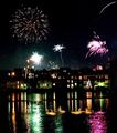
| 01/06/2003 09:26:29 PM | Suspended Christmasby KickDrum5150Comment: Critique Club Critique
(1) COMPOSITION (CONTENT) – Overall, an excellent capture. But I am bothered (in order) a little by: a) the bright headlight trail; b) the lower left side of the walking bridge; and c) the loop of something that starts at the middle and drops below the 2 center lights..
(2) BACKGROUND – Excellent use of the black sky as negative space
(3) CAMERA WORK ,TECHNICAL – Very good; excellent focus & DOF. I hope you tried a couple of different exposures. I would like to see the 2 center light less bright. But the outer edges of the bridge may have been too dark. If you had slid left a tad, would the bridge have blocked those lights?
(4) DIGITAL PROCESSING ,TECHNICAL – no recommendations.
(5) MY OPINION ON THE PHOTO – A beautiful photo, which could have been even better with some tweaks in the composition.
Jim msp
|
| 01/06/2003 09:10:16 PM | At last! I've caught a ride!by kposeyComment: Critique Club Critique
(1) COMPOSITION (CONTENT) – Everything is very centered – the hitchhiker and the horizon. Your title implies a car has stopped, but the photo does not. Not clear if he is walking or hitchhiking (despite the sign). I’d have liked to see him at far right, with a car stopped in the distance at far left (to fit your title). This would also show more road surface, giving a perspective of depth and distance.
(2) BACKGROUND – good. See comments on composition. Horizon should probably not be so centered, even if you changed composition as suggested.
(3) CAMERA WORK ,TECHNICAL – focus & DOF look good.
(4) DIGITAL PROCESSING ,TECHNICAL – no recommendations. Personally, I don’t worry about the jpeg artifacts as one comment did.
(5) MY OPINION ON THE PHOTO – A good idea,meets challenge, but an average “snapshot” – based entirely on the composition.
Jim msp
|
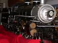
| 01/06/2003 08:59:36 PM | of yesteryearby BJComment: Critique Club Critique
(1) COMPOSITION (CONTENT) – I really like the engine as the focus of the photo. I might have liked to have seen a little more of the front of the engine, including smoke stack and cow catcher.
(2) BACKGROUND – While out of your control, I don’t care for the background in the upper quarter of the photo. And I really can’t tell if the brown object (top, left center) is part of the engine or in the background. Finally, the red sheet should have been straightened and smoothed.
(3) CAMERA WORK ,TECHNICAL – Very good use of DOF; very good lighting.
(4) DIGITAL PROCESSING ,TECHNICAL – I have no recommendations.
(5) MY OPINION ON THE PHOTO – A good photo; clearly meets challenge. I scored it a little better than your average score. I think the red sheet was probably the primary detractor here, though out of your control. Too bad you couldn’t have hung a blue sheet behind the whole engine to clean up the entire background.
Jim msp
|  Photographer found comment helpful. Photographer found comment helpful. |
| 01/03/2003 10:17:26 AM | |
| 01/03/2003 10:15:10 AM | |
| 01/03/2003 10:14:22 AM | Swan Lake in the New Yearby arnitComment: While I can't vote, I think this is a very good shot. Captures the spirit very well. 50-50 with or without the swans and reflections.
Jim |
| 12/21/2002 09:55:33 PM | BB'sby AnachroniteComment: Critique Club Critique
(1) COMPOSITION (CONTENT) – A good abstract (which I generally like), but no single place to focus my eyes. Once I’ve looked at it, nothing really drags me back to it. It would be a great background photo, or computer wallpaper. The lighting effects are very uniform, in part leading to the low interest.
(2) BACKGROUND - None
(3) CAMERA WORK ,TECHNICAL – Pretty good. Good uniform focus. I’d like to see a little less brightness in the reflection. A light coming in at a low angle from the left (right) might have really changed the effect, producing some shadows that added structure. Likewise, a point source would have also changed the effect.
(4) DIGITAL PROCESSING ,TECHNICAL – Looks good to me.
(5) MY OPINION ON THE PHOTO – Well executed, but not of the highest interest. Nothing to make me think about or appreciate. Too uniform (which may be what you wanted).
Jim msp
| | Photographer found comment helpful. |
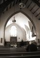
| 12/21/2002 09:40:04 PM | Light of the Spiritby jmsetzlerComment: Free Study 10
Critique Club Critique
(1) COMPOSITION (CONTENT) - I like overall content here, high ceilings and empty space meeting the emptiness of the church ( excluding you). I also like where you placed yourself – on the right side of center, and with a dark shirt. The top of your head is still below the wood in the background; it would detract if it were higher.
(2) BACKGROUND – The clean white walls and ceiling work well with the bright window. I'd like to see a few darker shadows.
(3) CAMERA WORK ,TECHNICAL – Well done. Excellent DOF. My eye is certainly drawn to the highly exposed window. I assume that a slightly less exposure time did not produce the high brightness you wanted; for instance, did a 4 sec exposure still give the eye catching brightness? I would guess it would have also intensified the shadows a little more which I might have liked better. Probably a tough trade off.
(4) DIGITAL PROCESSING ,TECHNICAL – Good change to B&W. It works well here with the dark wood, the geometries of the arches and windows, and with the emphasis on the light from the window.
(5) MY OPINION ON THE PHOTO – I like it. Eye catching and thought provoking. Is the intense light only in the eyes of the one in church?
Jim msp
|
| 12/19/2002 09:39:05 PM | Shaken, not stirred... by AleciaComment: I don't know if you make them or drink them - but I do know this is the best photo here. Print it and frame it - a 10.
Jim msp | | Photographer found comment helpful. |
| 12/19/2002 09:40:22 AM | Empty pool autumn bluesby jjbeguinComment: Critique Club Critique
(1) COMPOSITION (CONTENT) - At first appearance, seems very busy. My eye tends to wander around quite a bit. I seem to be looking for your subject. It’s not until later that I realize the whole canvas is your subject, at least to me. I don’t like the two horizontal lines across the picture, though they are mostly covered; a minor distraction.
(2) BACKGROUND – See comment above. I’m not sure what is the background is, and what the main subject is. It’s hard for me to call the leaves the background
(3) CAMERA WORK ,TECHNICAL – Very good for what you intended. Focus is dead on.
(4) DIGITAL PROCESSING ,TECHNICAL – At first glance, it appears you over saturated the blues. The material under the leaves is too blue for my tastes (I know the challenge is “blue”). But you probably needed to do that to get the blue in the leaves.
(5) MY OPINION ON THE PHOTO – Overall, pretty good, an “artsy” photo, tending to the abstract. I like it. I think it could have been a much better abstract if you had played with the focus some, shooting the leaves well out of focus. Then the over saturated blues would have worked better. It may not have scored better, as the majority of voters here don’t appreciate abstract photos, but I think you may have been happier with it.
Jim msp
| | Photographer found comment helpful. |
Home -
Challenges -
Community -
League -
Photos -
Cameras -
Lenses -
Learn -
Help -
Terms of Use -
Privacy -
Top ^
DPChallenge, and website content and design, Copyright © 2001-2025 Challenging Technologies, LLC.
All digital photo copyrights belong to the photographers and may not be used without permission.
Current Server Time: 08/21/2025 02:36:13 AM EDT.
|