|
|
| Image |
Comment |
| 05/04/2005 09:40:05 PM | |  Photographer found comment helpful. Photographer found comment helpful. |
| 05/04/2005 09:36:10 PM | | | Photographer found comment helpful. |
| 04/09/2003 10:51:39 PM | Aurora by mcmurmaComment: Wow. Best so far, by far. Great composition; technically excellent. I can't wait to see how you did this. A 10 - frame it & hang it. | | Photographer found comment helpful. |
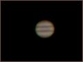
| 01/31/2003 06:27:31 PM | Drops of Jupiter- Trainby marboComment: Critique Club Critique
(1) COMPOSITION (CONTENT) – A fairly centered, single object. I think the photo would have improved by shifting the planet up and to the right some (the infamous rule of thirds guideline). But I think it would help here. What is possibly out of your control is what else gets included. I am thinking specifically of a few stars. Would be the “drops” in the title. You noted that the moons were not included.
(2) BACKGROUND – Without the stars, the empty space is clearly good “negative space”.
(3) CAMERA WORK ,TECHNICAL – For we amateurs, this is a very good photo of Jupiter. For this challenge, almost everybody wants to see the main subject in focus and without noise. The handholding may have hurt a tad at 1/30 sec.
(4) DIGITAL PROCESSING ,TECHNICAL – Looks pretty good to me. You may have improved the image quality by reducing the noise in the image, either via Photoshop or another program like Neat Image. The rules say “Any filter or stand-alone utility designed and used to preserve the integrity of the image and/or reduce the effects of noise, scratches, etc, are permitted. These include but are not limited to the Sharpen, Unsharp Mask, and Dust & Scratches filters, and standalone image cleanup utilities such as NeatImage.”
(5) MY OPINION ON THE PHOTO – You went for a very literal interpretation of the song title – and produced a very good photo of Jupiter. It’s unlikely anyone else here could duplicate it or better it by shooting from home. A very good result on a difficult project. However, as I said above, the clarity of it hurts you in this challenge. The noise and the blur on the outer edge – when compared to the other photos of earth bound objects – reduce the score. If this were a science project, you would have scored high (in my opinion).
Jim msp
| | Photographer found comment helpful. |
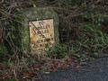
| 01/30/2003 09:56:29 PM | Vintageby auroraComment: Critique Club Critique
(1) COMPOSITION (CONTENT) – Very good composition. Placement of the sign and inclusion of the road is very good. A little more road would not hurt, in my opinion. My only complaint is the large branch that cuts the sign along the diagonal and the lower leaves. I would like to see them removed.
(2) BACKGROUND – Good. Nice color balance to the sign.
(3) CAMERA WORK ,TECHNICAL – Very good. Everything in focus.
(4) DIGITAL PROCESSING ,TECHNICAL – Looks quite good; no recommendations. Color works best here. In b&w you would lose the moss on the sign.
(5) MY OPINION ON THE PHOTO – I love subjects like this. A very nice photo of an historic road sign. However, I think you might go from very nice to excellent if the sign had the (distracting) branches and lower leaves cleaned away. The branches on the sides and on the ground in front as well as the “dirty white” would still give the age you want to show. To do this properly, you should probably do it in multiple steps, taking photographs along the way. Then choose the one that "looks right".
Jim msp
|
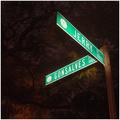
| 01/30/2003 09:40:34 PM | Gonsalves and Jerry Placeby daysezComment: Critique Club Critique
(1) COMPOSITION (CONTENT) – I like the composition of this shot. The eye is drawn to the upper right to the sign. Good balance of color between main subject and background.
(2) BACKGROUND – The background you chose works well, an effective use of negative space.
(3) CAMERA WORK ,TECHNICAL – Focus on the sign is very good. I think your choice of aperture gave you too large a DOF. I think the photo is greatly improved with the tree limbs more out of focus. However, I realize the tradeoff you have in time. Using a f/2.8 for instance for good DOF would have only given you a sec or so for the lighting. Probably too short. Was it really dark when you shot this? Any background light hurts you here. The other “distraction” is the lighting of the leaves just beyond the Gonsalves sign. This was probably hard to avoid, but if you did, the photo looks much better.
(4) DIGITAL PROCESSING ,TECHNICAL – Looks good, no suggestions. It would be interesting to see this in b&w.
(5) MY OPINION ON THE PHOTO – A really nice shot, probably deserves a slightly higher score. I would think that more practice with light painting, and a better choice of sign without the close in leaves, will give you a much better shot next time.
Jim msp
| | Photographer found comment helpful. |
| 01/29/2003 10:44:29 PM | Stop!by JackoComment: Critique Club Critique
(1) COMPOSITION (CONTENT) – The over composition of the photo is quite good. The sign is well positioned and of appropriate size to draw the eye.
(2) BACKGROUND – Good. Does not intrude on the photo. The sky acts as good negative space. Only minor comment would be on the centered horizon. Impact may have been higher with a lower horizon.
(3) CAMERA WORK ,TECHNICAL – Good. Good focus and DOF throughout.
(4) DIGITAL PROCESSING ,TECHNICAL – This was one of the features that sets your photo apart. An artistic interpretation. The final result really draws the eye to the sign, and reduces the whole background to a secondary part of the photo as you intended. If there is a negative here, it’s that the sign is an off –red.
(5) MY OPINION ON THE PHOTO – A very nice photo that attempts to differentiate itself from the crowd, and does so. The only major negative, in my opinion, is the color of the sign – should have been more red. But tough to do under the challenge rules. Deserves a much higher score imho.
Jim msp
| | Photographer found comment helpful. |
| 01/29/2003 10:33:09 PM | The city no one calls homeby mariomelComment: Critique Club Critique
(1) COMPOSITION (CONTENT) – Very good. Sign is placed off center nicely. The city then nicely completes the photo. The relative size of the sign is very good.
(2) BACKGROUND – The city is nicely laid out with respect to the sign. The blue sky acts as good negative space.
(3) CAMERA WORK ,TECHNICAL – Focus & DOF look quite good.
(4) DIGITAL PROCESSING ,TECHNICAL – No real suggestions, looks good to me.
(5) MY OPINION ON THE PHOTO – Nicely chose sign and composition for the photo. The wording of the sign is humorous and eye catching. The major negative for this challenge would be the position of the sun and the lighting of the sign. The photo should have been taken with more light on the sign. That probably was the one item that cost you in the scoring.
Jim msp
| | Photographer found comment helpful. |
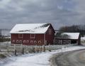
| 01/26/2003 04:09:51 PM | THE BARN IN GLENWILLOWby STEINRComment: Critique Club Critique
(1) COMPOSITION (CONTENT) – If the subject was only the barn, then this is very good. However, for a landscape shot, you have the barn too large and prominent in the photo. This would have been much better if you expanded the photo on the right side, keeping the barn on the left side. Then, with the apparent downhill slope, the eye would start on the left, and follow the road and fence down and right. I don’t mind the centered horizon, as the barn is below center.
(2) BACKGROUND – The cloudy skies are a nice plus to this shot.
(3) CAMERA WORK ,TECHNICAL – Focus and DOF are good. Given the shutter speed you posted, you had more room to pick a smaller aperture (eg f/22) and get better DOF. I don’t know if your camera has an exposure compensation feature you should have used (see below).
(4) DIGITAL PROCESSING ,TECHNICAL – I think this should have brightened in Photoshop ( or the like) using the levels command. With the snow, your camera probably underexposed the original that you should have corrected for. The shadows show, so there is plenty of sun.
(5) MY OPINION ON THE PHOTO – A good picture of a barn that would have become a very good landscape with 1) more area on the right, and 2) a brightening of the picture.
Jim msp
| | Photographer found comment helpful. |
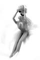
| 01/24/2003 09:02:29 PM | Head Up!by RemieComment: Critique Club Critique
(1) COMPOSITION (CONTENT) – Overall, quite good. Everything is generally centered, probably ok. I would like to see a version where the doll is moved to the right a tad, with a little more angle where the legs are aiming more left. I think this would help the overall flow. With the current angles, the head looks too large for the body. Good choice of vertical format.
(2) BACKGROUND – Very good. The white is the right choice, and this is well executed; smooth in all the right places.
(3) CAMERA WORK ,TECHNICAL – Looks good. The top of the head is blown out a little, probably could have done ok with a little smaller aperture.
(4) DIGITAL PROCESSING ,TECHNICAL – Looks ok to me. Good choice of B&W for this one.
(5) MY OPINION ON THE PHOTO – Meets the humor challenge, brings on a smile. So good idea, and well executed.
Jim msp
| | Photographer found comment helpful. |
Home -
Challenges -
Community -
League -
Photos -
Cameras -
Lenses -
Learn -
Help -
Terms of Use -
Privacy -
Top ^
DPChallenge, and website content and design, Copyright © 2001-2025 Challenging Technologies, LLC.
All digital photo copyrights belong to the photographers and may not be used without permission.
Current Server Time: 08/21/2025 01:10:51 AM EDT.
|