| Author | Thread |
|
|
01/29/2003 10:44:29 PM |
Critique Club Critique
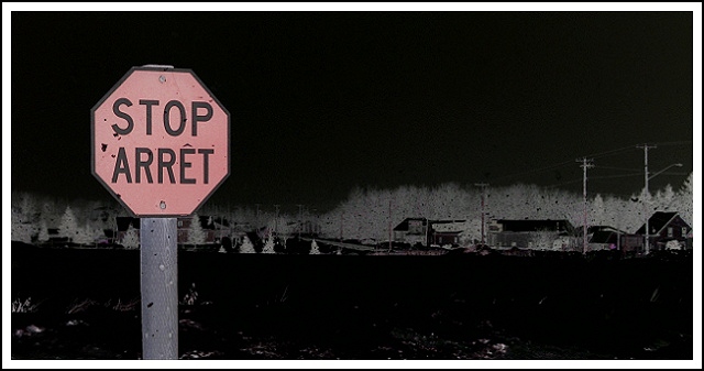
(1) COMPOSITION (CONTENT) – The over composition of the photo is quite good. The sign is well positioned and of appropriate size to draw the eye.
(2) BACKGROUND – Good. Does not intrude on the photo. The sky acts as good negative space. Only minor comment would be on the centered horizon. Impact may have been higher with a lower horizon.
(3) CAMERA WORK ,TECHNICAL – Good. Good focus and DOF throughout.
(4) DIGITAL PROCESSING ,TECHNICAL – This was one of the features that sets your photo apart. An artistic interpretation. The final result really draws the eye to the sign, and reduces the whole background to a secondary part of the photo as you intended. If there is a negative here, it’s that the sign is an off –red.
(5) MY OPINION ON THE PHOTO – A very nice photo that attempts to differentiate itself from the crowd, and does so. The only major negative, in my opinion, is the color of the sign – should have been more red. But tough to do under the challenge rules. Deserves a much higher score imho.
Jim msp
|
|
 Photographer found comment helpful. Photographer found comment helpful. |
Comments Made During the Challenge  |
|
|
01/24/2003 08:26:02 PM |
|
Spooky stuff. A bit sinister for my taste. But what the hey, it's a different style with it's own speaks. Like a bittersweet licorice kiss. Grows on you after a while. Unusual and inspiring. |
|
| Photographer found comment helpful. |
|
|
01/24/2003 10:34:50 AM |
|
i don't like how this was made to look in photoshop, it's really clear though |
|
| Photographer found comment helpful. |
|
|
01/24/2003 10:07:19 AM |
|
Nifty colorshift. Lack of positive color rendition makes it difficult to rate the photo technically. Creative. |
|
| Photographer found comment helpful. |
|
|
01/24/2003 01:52:03 AM |
|
| Photographer found comment helpful. |
|
|
01/22/2003 10:46:01 PM |
|
really interesting effect...I like it...What did you do or how did you do it is more like it |
|
| Photographer found comment helpful. |
|
|
01/21/2003 03:29:38 PM |
|
Initially I marked this down, but now I come to comment on it I have decided I quite like it! It certainly makes the sign stand out. |
|
| Photographer found comment helpful. |
|
|
01/21/2003 04:00:38 AM |
|
Wow, nice effects. I love the background in this one. |
|
| Photographer found comment helpful. |
|
|
01/20/2003 02:21:50 AM |
|
Uh, I wouldn't have taken that route but you pulled it off nicely!! Cub |
|
| Photographer found comment helpful. |
|
|
01/20/2003 01:14:19 AM |
|
The grain and the washed-out color are problems for me here. |
|
| Photographer found comment helpful. |
Home -
Challenges -
Community -
League -
Photos -
Cameras -
Lenses -
Learn -
Help -
Terms of Use -
Privacy -
Top ^
DPChallenge, and website content and design, Copyright © 2001-2026 Challenging Technologies, LLC.
All digital photo copyrights belong to the photographers and may not be used without permission.
Current Server Time: 07/01/2026 12:14:30 AM EDT.