|
|
|
Showing 331 - 340 of ~1067 |
| Image |
Comment |
| 11/24/2003 12:32:10 AM | |  Photographer found comment helpful. Photographer found comment helpful. |
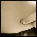
| 11/24/2003 12:30:03 AM | GUESS What I Found?by GeneralEComment: Gotta love when kids find their belly button. This would have been a 9 from me, but the dirt under the kids fingernail is so genuine, it gets a 10. Great lighting and toning! | | Photographer found comment helpful. |
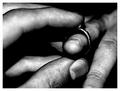
| 11/24/2003 12:29:29 AM | "Will you marry me?"by jonpinkComment: There is something very rustic about this. Almost like this is happening in a coal mine, or something. I love the toning, etc. 10 from me. |
| 11/24/2003 12:28:41 AM | What's up? by sahkoComment: Lighting, perfect. Background, perfect. (I really like how it grades to a slightly darker tone at the top!) Composition: actually, I think there are a few things to be done about the positioning of the subject in the frame, but I can't quite place my finger on what it is. Maybe I'd like to see the whole blue ramikin. Idea: perhaps the best of the challenge. Overall, this is a 10 from me. | | Photographer found comment helpful. |
| 11/24/2003 12:26:40 AM | Peek-a-Boo!by trainComment: Excellent idea. The bug is exactly the same color as the foliage (as I'm sure you intended it to be). It took me several seconds before I even saw it, and then I was surprised! That's what got a 10 from me. | | Photographer found comment helpful. |
| 11/24/2003 12:25:56 AM | Around the Cornerby fdpiechComment: Honestly, I never get sick of these Manikin shots, when they are well done. The idea here is fabulous, the focus is spot on (as I think it has to be for the good manikin shots), and the reflection of their legs on the ground is a detail that cannot go unnoticed. This shot is a 10 from me. |
| 11/23/2003 07:52:19 PM | This Old House by the Lakeby HRoxasComment: Greetings from the Critique Club!
I really like this shot. Compositionally, the only thing I don't like is something you can't change - the tree that seems to be growing out of the top of the house. But that's a minor thing. Your colors and saturation are perfect, and I like the contrasting green and blue. As some mentioned below, this would probably also be nice in Black and White. Great choice of subject!
Steve | | Photographer found comment helpful. |
| 11/21/2003 10:48:38 AM | Morning Coffee and Prayerby EmerauldeComment: Greetings from the Critique Club!
This is a difficult shot to critique, because I can't quite tell what you were going for here. Your plane of focus seems to be very thin, and it looks like it hits the cup about half way down, causing everything to look out of focus. The colors are all very drab (perhaps black and white would have been better) and the lighting is not spectacular. The dirty cup does nothing but distract me from viewing the shot as a whole.
In short, the idea is good, but the execution needs some help.
Steve
|
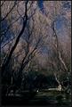
| 11/20/2003 03:55:12 PM | Sacred Groundsby heidaComment: Greetings from the Critique Club.
I really like the composition of this shot. I like how the branches of the trees frame the whole scene, and they seem to interlock. Unfortunately, I think that the darkness of this image makes it difficult to see details, especially at the bottom. Under some circumstances, that may be fine, but there are some objects near the bottom that are very distracting; there are some very small bright objects that the lighting doesn't let me identify. Rather than enjoying the shot as a whole, I find myself squinting to try to figure out what those things are at the bottom. | | Photographer found comment helpful. |
| 11/19/2003 10:53:34 PM | College's Porcelain Godby brianlhComment: Greetings from the Critique Club!
Let's get right down to business. We won't even discuss the score, because we both know why this shot did so poorly, and I'm sure you expected it to. But, it isn't always about the score.
You have portrayed a strong feeling here. Your shot is clearly stout with the humor factor, which seems to be what you were going for. Your composition is great, and I love the negative space at the top. The angle you have used for this shot gives this throne a very "royal" feel. And the post processing makes it fantastic. I can't imagine that a "regular" shot of the toilet like this would have quite as much impact on me.
Basically, I love this shot, and though I didn't see it during voting, I would have scored it quite highly. My favorite part is the way the tile on the wall transitions from black to white, clearly giving context to the toilet. A shot like this will probably never do well on DPC, but I love to see it.
Oh yeah, as for meeting the challenge, I'm sure lot's of low votes came from that. As for me, I think that if this is a sacred place to you, then I am no one to say you are wrong.
I hope to keep seeing great work like this from you!
Steve | | Photographer found comment helpful. |
|
Showing 331 - 340 of ~1067 |
Home -
Challenges -
Community -
League -
Photos -
Cameras -
Lenses -
Learn -
Help -
Terms of Use -
Privacy -
Top ^
DPChallenge, and website content and design, Copyright © 2001-2025 Challenging Technologies, LLC.
All digital photo copyrights belong to the photographers and may not be used without permission.
Current Server Time: 08/04/2025 11:59:26 PM EDT.
|