| Image |
Comment |
| 08/27/2004 01:38:45 PM |
Lukeby biggood53Comment: Good pose and concept. The flash lighting and the resulting red-eye and flat detail make it look rather like a snapshot. Also, I would prefer that his feet weren't cut off. |
 Photographer found comment helpful. Photographer found comment helpful. |
| 08/27/2004 01:36:04 PM |
La Femmeby ScantyNebulaComment: Love the braids, the specs, and the high key lighting. I kind of wish the top of her head weren't cropped off and I'm not nuts for the desaturated look of her skin. |
| Photographer found comment helpful. |
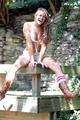
| 08/27/2004 01:34:37 PM |
Togetherby midnightride2Comment: Nice soft lighting and focus. I don't care for the woman's expression or pose. She doesn't appear comfortable being photographed in this manner. |
| Photographer found comment helpful. |
| 08/27/2004 01:31:07 PM |
Suite pour violoncelle.by BiduleComment: Nice take on something that has been done before. I don't care for the selective desaturation, however, as it evokes a rather cold feeling where there should be warmth. Also, I think it would have been nicer if the model's hair weren't unkempt. |
| 08/23/2004 05:53:20 PM |
Meby ScreechingtonComment: Kind of an odd pose and point of view. This view doesn't really create much interest (for me) in terms of drama and form. My feeling is that it should have been cropped to eliminate the area of neck and hairy chin which is kind of just cut off at the frame for no real reason. |
| 08/23/2004 05:51:00 PM |
Elizabethby LegatoMuzicComment: Nude? It's a cute photo but she isn't nude. It's a bit overexposed on her left side but perhaps you intended that? |
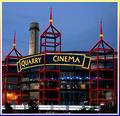
| 08/20/2004 04:33:04 PM |
Picture Show Magicby SandyPComment: This is a good subject and a good start. However, I feel like you should have waited for it to be completely dark and used a tripod to really capture a stunning shot of this building. Another suggestion is to crop out the bottom portion of the building and the trees since they add nothing of viewing interest, in my opinion. My final suggestion would be to take the shot from slightly left or right of the building to really capture the angularity of the three sections jutting out from the building. From this nearly straight on point of view, they get somewhat 'flattened' out. This might have the added benefit of eliminating the "Alamo" tower which attracts the eye away from the main subject with little reward. |
| Photographer found comment helpful. |
| 08/20/2004 04:31:37 PM |
Ouchby arnigunnarComment: Neon? The yellow on that bandaid doesn't look like neon or day-glo to me. It's a rather muted and pale lemon color.
Returned to edit critique....
I like the lighting on the foot and the dark background. I find the narrow, horizontal cropping a bit awkward for the subject matter which suggests a vertical format with perhaps two-thirds of the negative space leading away from the point of the foot for a more dynamic composition. I'm not sure there is enough going on here in terms of form and space to make this a really compelling photo for me. |
| Photographer found comment helpful. |
| 08/20/2004 02:51:50 PM |
Father & Childby RoosterComment: I am happy to state that I didn't underrate this photo. ;-D I notice I gave it a 7 and along with an enthusiastic comment. |
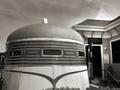
| 08/20/2004 01:35:35 PM |
The Modern Dinerby melismaticaComment: Originally posted by Tucci:
Just a friendly suggestion...forget about the hue/saturation....use LEVELS to really get control over your contrast. Try making a LEVELS adjustment layer. Also to easliy and precisely correct color in your images you need to use the CURVES dialog. Set your RGB values to 10, 133 and 245 respectively (black, grey and white) then use the eye dropper and sample those colors in your image and the color will correct itself. Finally use the UNSHARP MASK with your image at full size... set pixels to 1.5, threshold to 4 levels and anywhere from 80 to 130 percent should do the trick and add some clarity to your shots. |
Thanks for the very good advice. I actually started using the Levels recently after stumbling across some advice in a book. I hardly ever use the brightness/contrast adjustments and now I only use Levels to achieve satisfactory black and white images.
I will try the other things you suggested in the future. I've never used unsharp mask because, frankly, I haven't a clue how. :-D One of these days I'll get me a good PS book!
For now I have some guidelines which I'm going to copy and past for my files. Thanks a bunch! |
Home -
Challenges -
Community -
League -
Photos -
Cameras -
Lenses -
Learn -
Help -
Terms of Use -
Privacy -
Top ^
DPChallenge, and website content and design, Copyright © 2001-2025 Challenging Technologies, LLC.
All digital photo copyrights belong to the photographers and may not be used without permission.
Current Server Time: 08/31/2025 07:54:49 PM EDT.