| Image |
Comment |
| 04/28/2004 09:09:02 PM |
well-proportioned sodaby unikornComment: This would have been more effective if you isolated a single bottle. And what the heck is that other thing off to the side? Without the title it doesn't reveal much about proportion. |
 Photographer found comment helpful. Photographer found comment helpful. |
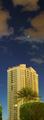
| 04/28/2004 09:07:09 PM |
Straight on till morningby sixmacsComment: How does this reveal proportion? Like the sky, hate the building. Hate the palm tree and shrub in front of it even more. |
| 04/28/2004 09:05:54 PM |
|
| Photographer found comment helpful. |
| 04/28/2004 09:05:28 PM |
California Torchby photomComment: LOVELY! You've managed to make yet another close-up of a flower look astounding and original. This says more to me about perspective than proportion but I like it so much, who cares? |
| Photographer found comment helpful. |
| 04/28/2004 09:03:51 PM |
Bows Come In All Shapes & Sizesby crisComment: The subect leaves me cold. I'm utterly uninterested in the idea of bows coming in different shapes and sizes. Who cares? The bows aren't doing much but sitting there in the middle of the frame.
Adendum: Sorry I was so blunt in my commenting. I must have been feeling really cranky by the time I got to this photo. Here's a more objective critique, as if you care what I think, at this point. :D
I think I was responding as much to the title as the actual image. I must have been feeling very literally minded that day. The colors in the bows are nice but I think this arrangement could have been thought out a bit more carefully. The direction of the light creates a harsh shadow and creating a lot of distracting hot spots on the bows. I actually thought you used a flash because of the dark shadows and the rather cold cast to the overal image. Positioning them smack in the center of the frame like this creates a lot of uninteresting negative white space and makes for a rather static composition. A possibility might have been arranging them in a container (a glass bowl perhaps?) like a floral or fruit arrangement, along with a few more bows (as long as it's an odd number). The white background is kind of a harsh contrast to the jewel colors of the bows. A rich, drapey fabric might have worked well. I'm still not nuts about this photo but that is just one person's opinion and you can just tell me to pound sand if you want. But now at least I've given my reasons why it doesn't work for me. Sorry for being
mean about it earlier. Message edited by author 2004-05-08 00:36:39. |
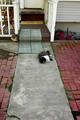
| 04/28/2004 09:01:13 PM |
Lazy Dayby nathankComment: Cute cat. Not a great photo. Sorry. The cat is too far away to draw the viewer in. I experimented with cropping out the porch by scrolling up but it still didn't work for me. You need to be closer to the cat's level and the cat needs to be in sharper focus. |
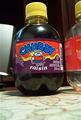
| 04/28/2004 08:59:11 PM |
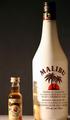
25 OZS Shortby Rando D300Comment: This is a nicely lit shot, I'll give it that. It could be my imagination but the horizon line looks a bit off-kilter. I'm bothered that the bottom of the bottles got cut off. I think this would have made a stronger statement if the labels were the same. |
| Photographer found comment helpful. |
| 04/28/2004 08:57:05 PM |
|
| 04/28/2004 08:56:19 PM |
|
| Photographer found comment helpful. |
| 04/28/2004 08:54:10 PM |
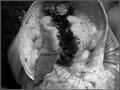
snailby grzegorzComment: Eyew! What is this?
Was what I said before I scrolled up an noticed the title. This doesn't reveal anything to me about proportion. I'm not loving it as a macro shot but then I'm not a fan of macro shots. |
Home -
Challenges -
Community -
League -
Photos -
Cameras -
Lenses -
Learn -
Help -
Terms of Use -
Privacy -
Top ^
DPChallenge, and website content and design, Copyright © 2001-2025 Challenging Technologies, LLC.
All digital photo copyrights belong to the photographers and may not be used without permission.
Current Server Time: 08/24/2025 02:04:12 PM EDT.