| Image |
Comment |
| 05/03/2004 07:05:19 PM |
Abstract Foundby amsmythComment: This is a photographic representation of something that has an abstract appearance. The photo itself is not abstract. Way off the mark in terms of meeting the challenge. As a photo, on it's own merits, its pretty boring other than as a factual recording of an interesting stump. |
| 05/03/2004 07:02:32 PM |
|
 Photographer found comment helpful. Photographer found comment helpful. |
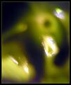
| 05/03/2004 07:01:48 PM |
Lightby MonaComment: There isn't a lot going on here. There is good use of negative and positive space and the colors harmonize but the grainy quality isn't working hard enough and those hot spots are just distracting. |
| Photographer found comment helpful. |
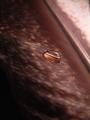
| 05/03/2004 07:00:23 PM |
Daedalus Weepsby sherComment: A great deal of the space below the water droplet is going to waste. Cropping would help this quite a bit. I like how the lines are repeated in the reflection. |
| Photographer found comment helpful. |
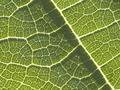
| 05/03/2004 06:59:00 PM |
Veinsby RtwoComment: This looks a little fuzzy to me, A bit mroe contrast might have made it pop. |
| 05/03/2004 06:57:54 PM |
Blue Frostingby adrenalindreamComment: This doesn't really pop in a fresh or interesting way. The colors are nice not strong enough to make a cohesive statement. It lacks any other strong design element such as line, negative space, contrast... |
| Photographer found comment helpful. |
| 05/03/2004 06:52:26 PM |
|
| 05/03/2004 06:51:17 PM |
Come to the light...by jmleliiComment: This really stretches the idea of 'abstract'. There really isn't anything abstract about this skyline photo. There is no real strong design element happening in this image. It is a decently composed skyline and the lights around the houses at an interesting element but not in an abstract design sense. Technically, the focus could have been quite a bit sharper. There is a light of detail loss in the water. Low score is based mainly on failing to meet the challenge. Asthetically, it is a reasonably pleasing shot although not outstanding. |
| 05/03/2004 05:39:59 PM |
two colors or perhaps moreby eirasiComment: This is a good strong composition. The verticals are asymetrical which displays good design sense. The picture was framed dead on so the lines are truly vertical and the planes flatten out completely. Nice texture, good color. Looks like a great abstract painting. One of my favorites so far. |
| Photographer found comment helpful. |
| 05/03/2004 05:38:19 PM |
good morning, Angie!by ursulaComment: I think that black blob at the top could have been cropped out but overall this is quite successful. |
| Photographer found comment helpful. |
Home -
Challenges -
Community -
League -
Photos -
Cameras -
Lenses -
Learn -
Help -
Terms of Use -
Privacy -
Top ^
DPChallenge, and website content and design, Copyright © 2001-2025 Challenging Technologies, LLC.
All digital photo copyrights belong to the photographers and may not be used without permission.
Current Server Time: 08/25/2025 12:53:37 AM EDT.