| Image |
Comment |
| 09/30/2006 10:37:48 AM |
Rain Cometh...Hopefullyby dacrazyrnComment: Nice capture of the clouds and careful composition. It doesn't quite grab me though. Maybe in black and white and taken from a more dramatic point-of-view? If you had gotten low to the ground and shot up at the post it would have created a very different mood and a bit more interest for me. |
 Photographer found comment helpful. Photographer found comment helpful. |
| 09/30/2006 10:35:20 AM |
Catching leaves floating down the Streetby mattforbesComment: Very nice. I like her outfit...simple, classic, evocative of childhood. I like the color contrast of the green boots with the dark ground and her violet dress. I'm wondering if this could have been warmed up a bit though. It appears very blue. Of course, that can help to create the mood but I feel like her skin tone could be warmed up a tad. Just a tad. This shows thoughtfulness in composition--very simple background, interesting placement of the child in a vertical frame. I kind of wish she were looking into the camera---her eyes are at perfect placement in the center of the upper third of the frame that it seems like when we look there we should meet her gaze. I would have likely given this a 9 or 10 if she were meeting the viewer's eye. |
| Photographer found comment helpful. |
| 09/30/2006 10:30:16 AM |
Waiting the rain for the challengeby Rino63Comment: Maybe you should have entered a different challenge if you couldn't find a way to shoot rain. Can't say this meets the challenge.
In terms of the quality of the photo---I kind of like the point-of-view but I feel the composition is really cramed. The chair is too close to the wall and could be angled a bit more toward the right of the frame. I think a horizontal frame would have made for a better composition. I feel like there needs to be some space to the right of the seated person. I don't like the contrasty area at the bottom left corner of the frame. I generally like the look that contrasts between shadow and light create but this is sort of awkward placement. There doesn't seem to be consideration of that quality in the composition of this photograph. |
| Photographer found comment helpful. |
| 09/30/2006 10:24:24 AM |
Dark By Rainby carloComment: The tree has a pleasing shape. The composition looks a tad cramped at the left edge to me. I don't know what the surrounding area was like but I feel like a horizontal frame might have been a more interesting choice. I feel like the tree needs some space on either side...the composition needs some expansiveness. |
| Photographer found comment helpful. |
| 09/30/2006 10:22:03 AM |
R E F R E S H E Dby NaldComment: I kind of wish the entire leaf was in focus. I know that is difficult to achieve with a macro shot. The blur at the bottom of the leaf bothers me a bit. However, I like the elegance of the curve of the leaf and the negative space created by the simple black background. |
| Photographer found comment helpful. |
| 09/30/2006 10:20:41 AM |
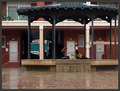
The continue playing in spite of the rainby pasaroComment: This has potential. The kids are a bit too small in the frame for the viewer to really connect. What I like more is the composition formed by all the verticals---the pavilion supports, the building supports and the doors. If the focus was sharper and the color a bit more saturated I think I might really like this. |
| Photographer found comment helpful. |
| 09/25/2006 06:45:47 PM |
Take a guessby eye has not seenComment: This image just isn't drawing me in enough to make me want to spend a lot of time figuring out what it is. While you may have succeeded in creating a shot that fools the observer it doesn't provide much in the way of asthetic interest for me. |
| 09/25/2006 06:44:35 PM |
Silken Rainbowby jfwolpertComment: Just a bit too vague and timid for my taste. It does have a bit of an O'Keefe quality to it but the intensity is lacking. |
| Photographer found comment helpful. |
| 09/25/2006 06:43:34 PM |
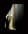
xxby messerschmittComment: Very nice use of shadow and light to create a visually dynamic pattern and good use of negative space. I like this a lot. |
| Photographer found comment helpful. |
| 09/25/2006 06:42:58 PM |
. s . h . o . e .by annasenseComment: This is certainly difficult to make out...however, I don't find that there is much in the way of thoughtful design, i.e, a pleasing or dynamic pattern,harmonious color, something that makes me want to linger with this image. |
Home -
Challenges -
Community -
League -
Photos -
Cameras -
Lenses -
Learn -
Help -
Terms of Use -
Privacy -
Top ^
DPChallenge, and website content and design, Copyright © 2001-2025 Challenging Technologies, LLC.
All digital photo copyrights belong to the photographers and may not be used without permission.
Current Server Time: 08/24/2025 07:21:58 AM EDT.