| Image |
Comment |
| 05/11/2004 02:04:11 PM |
A New Look for Piggyby scalvertComment: I gave this a four. The pig sculpture is whimsical enough without the hat, which reduces it to 'cutesy pie-ness" (a matter of taste, I know). In terms of technical details, the framing is good and keeps the subject simple. The depth of field needs to be shallower to blur the background which is very busy looking in terms of texture. The pig is a bit overexposed. The textural details of the concrete are quite washed out except for the part of it that received less sunlight. The lighting has an overall harsh quality. |
 Photographer found comment helpful. Photographer found comment helpful. |
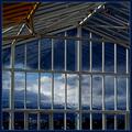
| 05/11/2004 01:57:58 PM |
A New Perspectiveby jjbeguinComment: I gave this a four. The scenery beyond the bars of the window is nice but those bars really aren't working hard as a visual element. For one thing, the main vertical bars have very distracting reflections. The roof also creates a very large, very distracting reflection. The simple monochromatic color scheme, one thing this shot had going for it, is interrupted by the section of rusty roof supports in the top left corner. |
| Photographer found comment helpful. |
| 05/11/2004 01:55:04 PM |
Sleepy Nurseryby trying2bstillComment: I like the light shining through the trees and on the pavilion but I gave this a four because the rest just doesn't add up to much. I'm referring to the boring sidewalk, the fence with the its blah brick column and the equally blah stacks of concrete pavers. One stack of pavers that is particulalry well lit draws the eye straight to the truck in the background. A suggestion would be to try again with a vertical format so that you put the interest where it is supposed to be -- on your subject. |
| Photographer found comment helpful. |
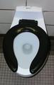
| 05/11/2004 01:49:56 PM |
When You Gotta Go, You Gotta Goby frychiknComment: I get that this is a place you've never taken photos, etc, but you could have put a bit more thought and care into the composition. This looks like you stood over the toilet and snapped. It's very tilted ,for one thing, and there is zero visual interest. I believe any subject has potential to be a good photo but this isn't showing us a toilet in a new way. We've all seen this view of the loo. I gave it a four. |
| Photographer found comment helpful. |
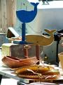
| 05/11/2004 01:46:11 PM |
Captain, there be whales...by sixmacsComment: I like the whales in terms of topical interest, color, and shape. However, by placing them in this visually distracting environment you've reduced them to just one more aspect of the clutter. Better to have isolated them against a simple background. This looks like it was taken in the office of an antique dealer or eBay seller (from one who knows ;D). I gave it a four. |
| Photographer found comment helpful. |
| 05/11/2004 01:42:15 PM |
G4by moviemanComment: The thought that comes to mind when looking at this photo is,"How desperate do you have to be for subject matter before you turn to something as dull as this?" Technically, I guess it's not too bad a shot but it is very very boring in terms of color, texture, tonal contrast, and topical interest (I like my Macs too but, jeesh!) You could have possibly added interest to this by framing the Apple log in one of the lower corners rather than at the center edge. I gave this a three. |
| Photographer found comment helpful. |
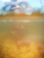
| 05/11/2004 01:36:53 PM |
Underwaterby GeneralEComment: I gave this a three for major technical problems. I'm not sure if you actually took this under water (with your camera in a plastic bag, maybe?) or just through glass. At any rate, it is really blurry and uninteresting. Three-fourths of the frame are taken up with fuzzy neutral color and absolutely no detail to speak of. The top fourth of the frame has a bit more variation in terms of texture and color but it is still too blurry to be of any real visual interest (beyond trying to figure out what it is. |
| Photographer found comment helpful. |
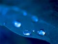
| 05/10/2004 08:39:04 PM |
Early Morning Dew Dropsby KonadorComment: Really great shot. Good mood, nice capture of the beads of water. I gave it a six because I think it could benefit from much tighter cropping. |
| Photographer found comment helpful. |
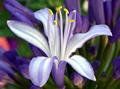
| 05/10/2004 08:37:43 PM |
My first flower pictureby TrollManComment: If this is your first flower shot it's a really great effort. I gave it a six because I'm not nuts about the horizontal format for this subject. I love the how the yellow of the stamen really zings against the green and purple. |
| Photographer found comment helpful. |
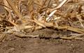
| 05/10/2004 08:35:28 PM |
Natural Camoflaugeby autoolComment: Ordinarily I would give a shot like this a lower score. I decided to look at it from the point of view as a nature documentation. What better way to illustrate the creature's camaflauge than to place it in drab surroundings. I think it could benefit from tighter cropping. I gave it a six. |
| Photographer found comment helpful. |
Home -
Challenges -
Community -
League -
Photos -
Cameras -
Lenses -
Learn -
Help -
Terms of Use -
Privacy -
Top ^
DPChallenge, and website content and design, Copyright © 2001-2025 Challenging Technologies, LLC.
All digital photo copyrights belong to the photographers and may not be used without permission.
Current Server Time: 08/26/2025 07:12:43 PM EDT.