| Image |
Comment |
| 05/30/2004 05:33:55 PM |
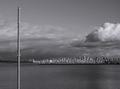
Decoyby zeuszenComment: Very original skyline. Without the pole it would have been a very nice skyline. The pole gives it character. |
 Photographer found comment helpful. Photographer found comment helpful. |
| 05/30/2004 05:25:59 PM |
When The Day Is Doneby zeuszenComment: Oh boy, I can see how this didn't score higher. I love it's simplicity. The texture and the quiet tones tell the story. Lovely. I would buy a print of this. I think my dad would love it.
As for meeting the challenge, this challenge seems almost like it could have been an free study. One can find far more unlikely things in a garage than an old hat. Message edited by author 2004-05-30 17:28:44. |
| Photographer found comment helpful. |
| 05/30/2004 05:21:57 PM |
|
| Photographer found comment helpful. |
| 05/30/2004 05:17:18 PM |
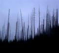
Totemsby zeuszenComment: Very desolate, evocotive scene. I really like the monochromatic scheme. I'm afraid to look at the entries that beat this. :-D |
| Photographer found comment helpful. |
| 05/30/2004 05:12:14 PM |
|
| Photographer found comment helpful. |
| 05/30/2004 05:08:24 PM |
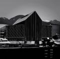
Xby zeuszenComment: I wasn't a member during this challenge so I didn't vote. I believe it was this challenge that decided me on becoming a member because I love where I live and would have loved to have entered this one.
I like the various contrasts in this shot. First there is a thematic contrast between man built structures and natural structures, then there is the visual contrast of the peak of the building being constructed and the peaks of the mountains in the background. From this viewpoint the building looks larger than the mountains. Is this an intentional statement, I wonder, or just a happy accident. I love the inclusion of the Roman numerals, particularly the usage of "X" as a title. Let 'em figure it out or not. |
| Photographer found comment helpful. |
| 05/30/2004 05:01:18 PM |
Specks and the Universe IIby zeuszenComment: I loved the composition of this shot when I saw it. Living in Rhode Island, this is a very familiar scene to me. I can actually 'feel' it from this photo; the way the sand feels at this time of day; wonderfully cool, gritty, and hard under your bare feet. My dogs will wade through these little inlets, whereas the waves intimidate them. I think the only reason I didn't vote higher was I felt the birds were a bit too speck-like. If I had been voting then the way I do now (I go back and revise when I'm done voting) I probably would have upped my score. As it is, I was one of your more generous voters. :-D |
| Photographer found comment helpful. |
| 05/30/2004 01:04:30 PM |
Candlelight Sonataby taterbugComment: This has the potential as great subject matter. Unfortunately, this composition is hurt by the light switch (we really don't want to see something as mundane as a modern light switch in a dramatic compostion such as this) and the dark areas to either side of the frame. Try this again but instead, don't try to get the whole piano in the shot. Move in closer to the lovely scroll work of the music stand and the old fashioned name plate over the keyboards. Just rotating your camera and making this a vertical shot would have eliminated all the distractions I mentioned. |
| Photographer found comment helpful. |
| 05/30/2004 01:01:21 PM |
72 years, 325 Million Light Sourcesby csdivineComment: This subject has great potential for a still-life. This cropping is rather claustrophobic. The lighting is a bit cold and blue for this subject. The background appears to be a rug which places the subject out of it's enviroment. |
| Photographer found comment helpful. |
| 05/30/2004 12:59:24 PM |
Red Orchidsby zoiloComment: I don't think the centered composition works for this shot. The foliage and other blossoms have the effect of leading the eye away from the central flower. The lighting is very flat for the subject. The result is rather drab color with very little texture. Consider placing a single blossom off-center and taking the shot at a time of day where it will be lit from behind, capturing the beautiful translucent petals. If you can manage a blurred background with your camera that is also quite helpful. |
Home -
Challenges -
Community -
League -
Photos -
Cameras -
Lenses -
Learn -
Help -
Terms of Use -
Privacy -
Top ^
DPChallenge, and website content and design, Copyright © 2001-2025 Challenging Technologies, LLC.
All digital photo copyrights belong to the photographers and may not be used without permission.
Current Server Time: 08/28/2025 06:13:45 AM EDT.