| Image |
Comment |
| 05/30/2004 11:26:13 PM |
Illuminated Everlasting Flowersby DoylieComment: I found this composition a bit odd. I couldn't quite figure out what the foil wrapped thing was at the left. It is an obvious light source but I don't think it enhances this photo. |
| 05/30/2004 11:23:54 PM |
LoveLightsby soheilComment: This is a little bit overlit in my opinion. There is very little detail in the shadow and highlight areas of the doll. There is good separation between the subject in the background although it is a bit two-dimensional. As a subject, I don't find this doll too compelling (she is a little creepy looking to me)Other's might though. Good luck! |
 Photographer found comment helpful. Photographer found comment helpful. |
| 05/30/2004 11:21:26 PM |
Brightby rockfishComment: I think one of the obvious light sources was flash. This looks like an image that has been washed of detail because of close-up, front flash. This isn't the best approach to the subject matter which depends on color and texture for its visual appeal. |
| 05/30/2004 11:18:17 PM |
persevering delusionby xburnerxComment: I looked and looked at this photo and I just couldn't quite get what you were going for. I'll describe what I see....A shadow that looks something like a rhinoceros wearing a hat with two blue spots of light where the nostrils would be...and a high heel shoe. I'm pretty sure I'm way off base.
The title didn't enlighten me. I think my problem is once I saw the shadows the way I described I couldn't see anything else. Sorry...
|
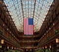
| 05/30/2004 09:05:57 PM |
The Flag in the 'Old Arcade'by bobdaveantComment: This is actually quite a good interior, architectural shot. I would ignore the ones, twos, and threes---wierdness. Your subject is quite obviously centered so there is no real exuse for giving this photo less than a five. I probably would have scored it higher than five personally. I didn't vote on all the centered challenges and didn't see this one.
|
| Photographer found comment helpful. |
| 05/30/2004 08:51:04 PM |
My Wayby ImagineerComment: I really like the simple colors in this. The turquoise and the boy's blond curls haromize beautifully. Add the sharp shadow and the boy's purposeful stride and it is perfect. |
| Photographer found comment helpful. |
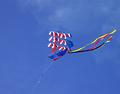
| 05/30/2004 07:34:02 PM |
Go Fly a Kiteby StevePaxComment: Another nice Centered entry I didn't see. IMO this should have placed higher. Nice job. |
| Photographer found comment helpful. |
| 05/30/2004 07:24:39 PM |
scrapby jus6681Comment: This is a beauty. I wish I had voted on all the Centered entries because I missed some very good shots. This has such a feel of traditional photography to it. I hope you make it available as a print. Message edited by author 2004-05-30 19:25:10. |
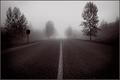
| 05/30/2004 07:21:22 PM |
Foggy Road Homeby PedroComment: This was one of my picks for a ribbon. I didn't get a chance to comment during the voting though. |
| Photographer found comment helpful. |
| 05/30/2004 06:30:22 PM |
Eggs and Morning Dewby mocabelaComment: I loved this shot. I didn't see it until after the voting. I didn't vote on all the Centered entries. |
| Photographer found comment helpful. |
Home -
Challenges -
Community -
League -
Photos -
Cameras -
Lenses -
Learn -
Help -
Terms of Use -
Privacy -
Top ^
DPChallenge, and website content and design, Copyright © 2001-2025 Challenging Technologies, LLC.
All digital photo copyrights belong to the photographers and may not be used without permission.
Current Server Time: 08/28/2025 02:15:32 AM EDT.