| Image |
Comment |
| 06/04/2004 10:48:43 PM |
|
 Photographer found comment helpful. Photographer found comment helpful. |
| 06/04/2004 10:26:51 PM |
|
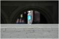
| 06/04/2004 10:22:58 PM |
Litter.by the-O-sterComment: I actually gave this a 5. I liked the brightness of the spot of blue on the label compared to all the neutral background. I saw it as an unpretentious sort of still-life. |
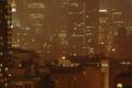
| 06/04/2004 10:18:04 PM |
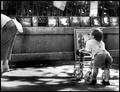
Opposite Worldsby the-O-sterComment: Really good street shot. Very subtle. Maybe too subtle for a challenge unfortunately. People don't tend to spend a lot of time looking for subtleties when they vote. |
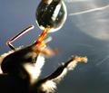
| 06/04/2004 10:14:57 PM |
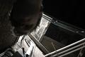
Experimental Mediaby the-O-sterComment: I didn't vote on this but it would have gotten at least a 6 or 7 from me. It shows a very good eye for seeing art in the mundane. The focus could be a little sharper in the rusty area, perhaps, but overall I think it really works. I think I'll put it in my favorites because it so refreshing from most of what I saw in this challenge (I didn't see everything which is why I didn't vote on this). |
| 06/04/2004 10:11:24 PM |
Lost.by the-O-sterComment: I gave this a 6. Technically it has problems (mainly the subjects face being out of focus). But I think it works in a weird way. The background is so confusing the it is impossible to really get a handle on what the viewpoint of the camera was. The out of focus face kind of separates the subject from the environment that has him baffled. Since the title is "Lost" this photo works in the way it was intended. |
| 06/04/2004 07:45:59 PM |
His Viewpointby grigrigirlComment: Originally posted by melismatica:
My only suggestion is crop a bit off the top to eliminate the row of paintings and make her appear even taller in the frame, emphasizing his smallness. |
This placed pretty good but I think it should have done much better. BTW, ignore my stupid suggestion from during the voting. For one thing, I didn't mean the row of paintings (which add a sense of place to the photo) but the paper things at the top, over the paintings. I experimented with this just be scrolling the screen up and it actually does not have the effect I was suggesting. The photo is great the way it is. One of my favorites.
Melissa |
| 06/04/2004 04:47:35 PM |
|
| 06/04/2004 11:55:45 AM |
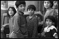
Allianceby melongrindComment: Of course you had to crop their heads otherwise you wouldn't have captured the older girl's protective grasp of her sister's hand or the defiant hand on hip pose (implied by the position of her head and shoulder) of the younger girl. Lovely! I want to see more like this on DPC. |
| Photographer found comment helpful. |
| 06/04/2004 02:33:23 AM |
Look Upby melismaticaComment: Originally posted by basia03:
this image lacks interest. |
Or, to put it in English, you lack an interest in the image. The image doesn't have any feelings on the subject. |
Home -
Challenges -
Community -
League -
Photos -
Cameras -
Lenses -
Learn -
Help -
Terms of Use -
Privacy -
Top ^
DPChallenge, and website content and design, Copyright © 2001-2025 Challenging Technologies, LLC.
All digital photo copyrights belong to the photographers and may not be used without permission.
Current Server Time: 08/28/2025 06:39:20 PM EDT.