| Author | Thread |
|
|
06/04/2004 07:45:59 PM |
Originally posted by melismatica:
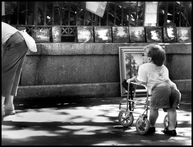
My only suggestion is crop a bit off the top to eliminate the row of paintings and make her appear even taller in the frame, emphasizing his smallness. |
This placed pretty good but I think it should have done much better. BTW, ignore my stupid suggestion from during the voting. For one thing, I didn't mean the row of paintings (which add a sense of place to the photo) but the paper things at the top, over the paintings. I experimented with this just be scrolling the screen up and it actually does not have the effect I was suggesting. The photo is great the way it is. One of my favorites.
Melissa |
|
Comments Made During the Challenge  |
|
|
05/30/2004 11:35:59 PM |
|
This is a very well done photo, not to mention the humor it has. Very good grey tones |
|
|
|
05/30/2004 08:12:04 PM |
|
|
|
05/29/2004 04:46:28 AM |
|
how about cropping out the woman to the left or did you feel she emphasised the guy's size? The picture directly behind him distracts. I don't know if this is a case where the photographer should ask the permission of the subject before taklng the photo? |
|
|
|
05/27/2004 06:43:42 PM |
|
|
|
05/26/2004 01:13:26 AM |
|
The photographer perspective on the bearded guy's perspective is hilarious. Great choice for B&W |
|
|
|
05/25/2004 11:38:12 PM |
|
I love this for a few reasons. It's funny without being condescending to the little person. I don't know if it was intended but his small bum, protruding a bit is a direct diagonal to her bum. This harmony is strengthened by his obvious relish of her assets. :D My only suggestion is crop a bit off the top to eliminate the row of paintings and make her appear even taller in the frame, emphasizing his smallness. |
|
|
|
05/25/2004 12:10:12 AM |
|
amazing candid (?). i love the balance and the composition. b/w a good choice |
|
|
|
05/24/2004 11:35:45 PM |
|
I find this photo very interesting. The candid shot works well. |
|
|
|
05/24/2004 02:20:02 PM |
|
|
|
05/24/2004 11:39:36 AM |
|
this would have looked better if there were more people standing around and all their bodies were cut off at the chest to the height he is, great idea and photo |
|
|
|
05/24/2004 09:00:11 AM |
|
Very nicely done and the black and white adds to it, however the person's butt on the left takes away alot more. This would score much higher if that part were cropped out. 3 |
|
Home -
Challenges -
Community -
League -
Photos -
Cameras -
Lenses -
Learn -
Help -
Terms of Use -
Privacy -
Top ^
DPChallenge, and website content and design, Copyright © 2001-2026 Challenging Technologies, LLC.
All digital photo copyrights belong to the photographers and may not be used without permission.
Current Server Time: 06/29/2026 09:31:36 AM EDT.