| Image |
Comment |
| 12/14/2004 04:47:42 AM |
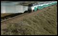
Dynamic Landmarkby TerramarComment: Now you've got me stumped. I'm going to have to find that viewpoint tomorrow at lunch - I work in Carsbad. I'm always trying to find a good, uncluttered view of the Coaster. (I entered a shot of it for a challenge last summer where it crosses the Buena Vista lagoon, but it wasn't much of a picture.) I really love the way you finished up this shot. The softness and subdued color really work well with the normally bland brush. |
| 12/14/2004 04:31:00 AM |
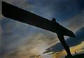
The Angelby BlackdogComment: Wow. This was my highest rated photo for the challenge. The lines and perspective are excellent, not to mention the colors and the great use of shadow. Sorry to see it out of the top 10, let alone under 6.
(Funny, I never noticed the oversharpening "halo", even on reviewing it. Now that I see all the comments, OK, its there, but doesn't seem that obvious to me. Hardly a major flaw, and easily fixed.) |
| 12/12/2004 08:16:21 PM |
Dynamic Landmarkby TerramarComment: Soladad Lagoon, Torrey Pines Reserve, early morning? :) OK, I at least know its San Diego. Interesting take on the theme, and I like the mood. |
 Photographer found comment helpful. Photographer found comment helpful. |
| 12/12/2004 06:40:07 PM |
|
| 12/12/2004 06:38:47 PM |
|
| Photographer found comment helpful. |
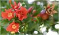
| 12/10/2004 08:09:19 PM |
Pomegranate flowersby MrAkamaiComment: Well, this is way after the challenge, so I don't know if you'll see this, but...
When I'm thinking "centered composition", my eye first moves to the center of the image. In this shot, I see nothing in focus in the center. Off to one side is a flower. To the other side is a pomegranate bud. In the middle - nothing. Another thought: If I'm looking for something as being a "centered composition" - or even "off-center composition", I sort of want to see the subject stand out from its background - preferably with some negative space to focus attention to the subject. That's also missing from this picture - everything sort of blends together.
Hope that helps. |
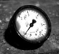
| 12/06/2004 10:31:10 PM |
kp/cm2by HokaheyComment: Less centered would have given a more interesting composition. Good job otherwise. |
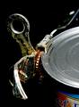
| 12/06/2004 10:28:54 PM |
Can Openerby kyeboshComment: I think it might have been really interesting if the label of the can were completely obscured or in shadow. Its just a tiny bit distracting. Otherwise, the focus is drawn well to the subject. I like the composition. The exposure is good. |
| Photographer found comment helpful. |
| 12/06/2004 02:52:39 AM |
|
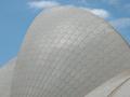
| 12/06/2004 02:52:12 AM |
Anyone For Opera?by 3DsArcherComment: Assuming this is the Sidney Opera House, you get an extra point for finding a view other than the obvious. A little deepening of the blue in the sky might have made it stand out a littel better though. |
| Photographer found comment helpful. |
Home -
Challenges -
Community -
League -
Photos -
Cameras -
Lenses -
Learn -
Help -
Terms of Use -
Privacy -
Top ^
DPChallenge, and website content and design, Copyright © 2001-2025 Challenging Technologies, LLC.
All digital photo copyrights belong to the photographers and may not be used without permission.
Current Server Time: 08/25/2025 09:02:40 PM EDT.