| Image |
Comment |
| 07/24/2003 03:17:44 AM |
Electronic Craze.by surajbharComment: Lighting's a bit harsh, which kind of throws the focus and colors off a little. I assume that's a PDA underneith? It might have been better open, to better display that (since I had to ask). |
 Photographer found comment helpful. Photographer found comment helpful. |
| 07/24/2003 03:15:39 AM |
Sagby casualguyComment: I HATE this trend. But I did think of it too for current trends. Interesting lighting, colors are good, focus is very good. I think I'd like a taller composition, but this is OK - it accents the "offending" area. Good job on the photo (and no deductions for my personal taste). |
| 07/24/2003 03:10:53 AM |
Recent trend in snack foodsby dodobirdComment: You missed the ones I like - just the plain baked potato chips. :-) Good shot, good idea, though not really a standout. Technicals (DOF, focus, lighting, etc.) all look pretty good. |
| Photographer found comment helpful. |
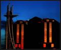
| 07/24/2003 02:45:18 AM |
Modern Architectureby BobsterLobsterComment: By the title, a good subject for the challenge. However, this picture has the problem that the architecture is masked or hidden by excessive shadow and darkness. The composition feels a little random, and it's a bit tilted. Colors are really nice, and asice from some resizing jaggies, it seems fairly sharp. |
| Photographer found comment helpful. |
| 07/24/2003 02:42:38 AM |
Gratuitous Product Placementby brettdComment: Nice idea, nice execution. The only complaint I have is that I think you should have left the background (i.e. the guy) at better in focus, though not totally in focus. Product placement is pretty obnoxious, and often stands out as if to shove everything else out of focus, just not quite this blatently. Other than that, great job. |
| Photographer found comment helpful. |
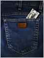
| 07/24/2003 02:38:52 AM |
Safety styleby eikidigiComment: Is that a condom? (Sorry, I'm old enough to have more or less missed that trend, if just barely.) Poking out of a wallet would have been the more "traditional" shot. But this is OK, I guess. The jeans are kind of flat (I assume there's no rear end in there). The pictures kind of dark - not "my monitor needs calibrated" dark, but the colors don't stand out well and the overall feeling is muted. |
| 07/24/2003 02:34:27 AM |
Baby, I'm a star by swaroskjiComment: Good idea as far as the composition goes - I think it misses just a little, but it's a challenging idea, so I'll give you an extra point for "level of difficulty"! What "bothers" me about it is that there's so much of the foreground (blurred) sneaker, that my eyes have trouble settling on the small star in the eyelet. Maybe this was the best it could be, but I wish you could have gotten the eyelet bigger, getting more of the star emblem, and less of the close canvas (and even better if you could get a little more of the far shoe showing on the right). Maybe that's all impossible - but it would have really been cool if you had gotten it. Everything else is good - ligting, color, contrast, focus, etc. |
| Photographer found comment helpful. |
| 07/24/2003 02:27:42 AM |
Remembering 9-11....Patriotism Returnsby vtruanComment: An OK shot. Is the sun rising? I hope so, it would fit the subject better than if it was setting! (I'm assuming by the colors that it is rising.) Composition is OK, if a little tight feeling. I'd like the flag in the more traditional format (i.e. if you flipped the image horizontally). |
| Photographer found comment helpful. |
| 07/24/2003 02:24:03 AM |
Teenie Beeniesby tp-fcpComment: This was one of the ideas I had, but didn't do. This is an OK setup, though it would be interesting to se a larger collection (if you have one). The lighting, colors and focus are all good. No major flaws, just nothing really stands out about the end results. |
| Photographer found comment helpful. |
| 07/24/2003 02:21:22 AM |
Trendy in the 1600sby punkdykeComment: I think the DOF is a bit too narrow. There's just so much of the image that's blurred that my eye just can't quite find a place to rest on. But a good idea for the challenge, the composition is OK (I'd be interested to see the whole thing out of curiosity), as are the lighting and color. |
| Photographer found comment helpful. |
Home -
Challenges -
Community -
League -
Photos -
Cameras -
Lenses -
Learn -
Help -
Terms of Use -
Privacy -
Top ^
DPChallenge, and website content and design, Copyright © 2001-2025 Challenging Technologies, LLC.
All digital photo copyrights belong to the photographers and may not be used without permission.
Current Server Time: 08/26/2025 08:22:53 AM EDT.