| Image |
Comment |
| 04/08/2003 06:32:41 AM |
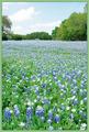
Blues and Greensby GordonComment: Ahhh, how serene and peaceful this looks. Are those bluebells? And are they growing wild in a field or is this a cultivated garden of sorts? Nice portrayal of depth. |
| 04/08/2003 03:01:14 AM |
|
 Photographer found comment helpful. Photographer found comment helpful. |
| 04/08/2003 03:00:20 AM |
Little Pink Housesby Rosie20Comment: There are several problems with this image: it is too bright; the date on the bottom is a big no-no; it should be cropped to show only the house and not the distracting irrelevant background; and the photo should have been taken in front of the stairs so that all horizontal lines of the house are parallel, unless you are trying to achieve a photo with more of a perspective view on the house. Good choice for colour though. |
| Photographer found comment helpful. |
| 04/08/2003 02:42:20 AM |
|
| Photographer found comment helpful. |
| 04/08/2003 02:41:20 AM |
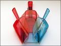
Coloursby bcncrazyComment: Why an orange background? I think a white or black background would bring out the colours of the pencilcrayons better. |
| Photographer found comment helpful. |
| 04/08/2003 02:40:18 AM |
|
| Photographer found comment helpful. |
| 04/08/2003 02:39:19 AM |
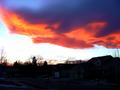
Sunset on a standing wave cloudby cathysappComment: This is a hard photograph to take because of the great variance in light and dark. The bottom half of the photo is either too dark to make out the houses or too light to serve as a silhouette. The visible sky is too washed out towards the left side of the picture. And the colours of the clouds seem almost too intense. |
| 04/08/2003 02:36:24 AM |
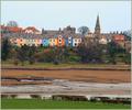
Northumberlandby howzaComment: Very colourful houses. To give this photograph more oomph, I would competely crop out the bottom half of this picutre, as it adds nothing to the photograph, and brighten and increase the contrast (either in camera or with use of an imaging program like Photoshop) so that the colours of the houses stand out more vividly. |
| Photographer found comment helpful. |
| 04/08/2003 02:33:29 AM |
Safely colorfulby tyrkinnComment: I really don't like that chartreuse green wall background. It doesn't offset the beautiful blues and reds of the helmets at all. |
| Photographer found comment helpful. |
| 04/08/2003 02:32:07 AM |
Old Glory Wavesby bruster54Comment: Not a bad picture but suffers from being too small. Make use of the maximum allowable size of 640 pixels along the longer dimension. Also, the colours seem a little muted. Consider brightening and upping the contrast in an image editing program. |
| Photographer found comment helpful. |
Home -
Challenges -
Community -
League -
Photos -
Cameras -
Lenses -
Learn -
Help -
Terms of Use -
Privacy -
Top ^
DPChallenge, and website content and design, Copyright © 2001-2025 Challenging Technologies, LLC.
All digital photo copyrights belong to the photographers and may not be used without permission.
Current Server Time: 08/04/2025 03:41:16 AM EDT.