| Author | Thread |
|
|
04/16/2003 07:15:44 PM |
CC......Hello tyrkinn
Fits The Challenge-Yes, P.S. Great first entry~!!
Composition-Nice..great perspective view.
Background-Okay
My Opinion-Okay it's an art museum so you did very well with the lighting/window reflection there. I think the display is fantastic. I wish they would of used several colors, but ya take what ya get! This is a cool shot. I did admire it during the challenge and voted on it. I'm sorry I didn't leave a comment and glad to have the chance now.
I do think a bit of levels and brightness adjustment would make the colors more true. They seem a bit flat, and of course that may be due to the lighting there.
It's a different shot, I like it. Good find, way to go!!
Message edited by author 2003-04-16 19:18:39. |
|
 Photographer found comment helpful. Photographer found comment helpful. |
|
|
04/14/2003 12:07:00 PM |
Originally posted by K-Rob:
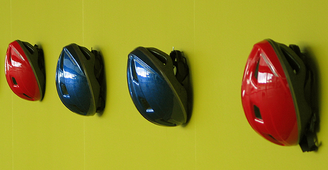
I think red, blue, red, blue (or vice versa) would've given a better effect but I like it a lot none the less. |
This wasn't my setup, and I didn't want to change anything, take the observer point of view if you will....
|
|
|
|
04/14/2003 07:23:25 AM |
This was my first post, and I didn't do much in photoshop this time. Should probably have spent some time on adjusting levels. This setup of the helmets wasn´t done by me, I took the shot at a gallery in iceland, where the helmets were a part of a bigger piece. Thanks for all the comments, they are a great help to me.
|
|
Comments Made During the Challenge  |
|
|
04/12/2003 11:52:46 AM |
|
Very imaginative. Good eye. |
|
| Photographer found comment helpful. |
|
|
04/11/2003 12:50:04 PM |
|
I like it. Simple, yet very powerful (color wise that is). hehe |
|
| Photographer found comment helpful. |
|
|
04/10/2003 07:45:00 AM |
|
Ah very original! Turned out well too, the crop works! The only little disturbing part are the reflections in the helmets. |
|
| Photographer found comment helpful. |
|
|
04/09/2003 04:15:19 PM |
|
I think red, blue, red, blue (or vice versa) would've given a better effect but I like it a lot none the less. |
|
| Photographer found comment helpful. |
|
|
04/09/2003 10:36:29 AM |
|
For some reason I want to turn it 90 degrees to the right. the closest helmet is a little out of focus but you almost got them all, good try. what are the vertical lines in the background? 5 |
|
| Photographer found comment helpful. |
|
|
04/08/2003 02:18:10 PM |
|
nice Idea, it`s a shame the first one is slighty out of focus |
|
| Photographer found comment helpful. |
|
|
04/08/2003 02:33:29 AM |
|
I really don't like that chartreuse green wall background. It doesn't offset the beautiful blues and reds of the helmets at all. |
|
| Photographer found comment helpful. |
|
|
04/07/2003 11:26:26 AM |
|
good pic, could sue some levels/brightness/contrast adjsutment to make the color pop more though. |
|
| Photographer found comment helpful. |
Home -
Challenges -
Community -
League -
Photos -
Cameras -
Lenses -
Learn -
Help -
Terms of Use -
Privacy -
Top ^
DPChallenge, and website content and design, Copyright © 2001-2026 Challenging Technologies, LLC.
All digital photo copyrights belong to the photographers and may not be used without permission.
Current Server Time: 06/29/2026 07:55:26 AM EDT.