| Image |
Comment |
| 01/26/2007 06:40:16 PM |
|
| 01/12/2007 04:53:42 PM |
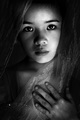
Unabashedby SJCarterComment: Very subtle color added. And while i do think it fits this person, it's not the challenge. vote:4 |
 Photographer found comment helpful. Photographer found comment helpful. |
| 01/12/2007 04:30:32 PM |
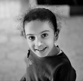
My 'Beloved' Daughterby UAE_GuyComment: I like the idea of contrast.. dark clothing, dark hair against a brighter background. It puzzles me why you didn't go all the way, why is the upper corner dark? It causes the hair to loose its impact, while it helps the photo to eject a very energy-rich feel. She's smiling, looks like she is moving, engaging us actually and the hair helps shouting out 'energy' but you loose quite a lot of its feel because you break it by that one black corner. Why?
Otherwise, love the lighting and the feel you have captured here.
vote:6 |
| 01/12/2007 04:24:24 PM |
Young Mysticby alecnormanComment: I only have one problem: the hand. Why is it there? it comes out of nowhere and to me it is not contributing to the feel of the photo. The lighting, the look, the composition and the clothing work all well together to create a mustic feel. But the hand? vote:7 |
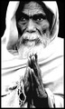
| 01/12/2007 02:06:52 PM |
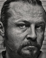
Fading Hopes.by thedarkposeComment: I have looked at this for a while before commenting/voting. You have used a very harsh contrast and i suspect it was your intention. By doing so the clothing is overexposed. I do feel it brings out better the darkness of the skin. The other side is that you have very deep shadows which result in losing the outer eye definition on the eye to the left, which doesn't look good.
Also the beard is overexposed which i personally don't like because you have lost the feel of the hairs here and as such lost the roughness here that you have created by the harsh contrast everywhere else. Overall i think the choice of hard contrast fits, but i would have liked to have seen it used more focused, so it wouldn't be there where it detracts from the feel of the image.
vote:6 |
| Photographer found comment helpful. |
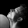
| 01/11/2007 04:30:51 PM |
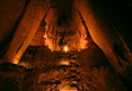
L'Avaleur de Lameby labudsComment: A very loaded image. I like the light on the face, and how it leads to the saw. Also the closed eyes speak loudly.
But i don't like the saw itself.. it doesn't look real. The light seems off, it doesn't look like it has depth (no thickness to its edges) and no signs of use.. i would have loved to have seen a weathered, used saw here. So i do like the feel of the image, at second glance it looses a lot because of the saw. vote=6 |
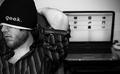
| 01/11/2007 02:59:30 PM |
geek.by sirmallocComment: I very much like the idea. A laptop on the background and a person that is looking away wearing a geek-sign: all very complementary elements. To me personally i feel you could have maybe placed them better. He looks away from us, which fits the geek part, but he also looks away from the laptop, which doesn't fit. Maybe placing the laptop to the left of him (from our point of view) would fit more in the story. vote=6 |
| Photographer found comment helpful. |
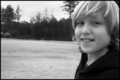
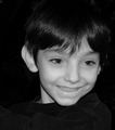
| 01/11/2007 02:55:41 PM |
Little Brotherby chriswithredhairComment: You leave a lot of space next to the portrait, and that can be very good if.. if that part tells me something more, if it adds to the person. Here i see he is on a open area, but how does it relate to him? If i saw some wooden play things around, i could make the assumption that he is laughing because he is playing, but now i know nothing more. So to me it is lost space, which could be used for the person itself.
The light falls hard on the hair. Does he have white-isch hair? That would explain the slightly overexposed part.
I do feel as if you captured a bit of innocence in this shot, but it looses some of its impact because of the non-helping background. vote:5 |
| Photographer found comment helpful. |
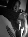
| 01/11/2007 02:01:33 AM |
Serenadeby crazydaisyComment: People (including me) look to the brightest part of a photo.. it is natural. Here you see that that leads to the hand and not her face. I really do like your idea of letting the guitar leading you up to the face, but light should support this and not work against it in my opinion. vote=5 |
| Photographer found comment helpful. |
| 01/11/2007 01:59:39 AM |
Child of Mischiefby KelliComment: Why did you put him to the right of the photo? He looks to the right, and instinctively i would say that the look needs more space on the right to give it more impact on us. Now you break the look in my opinion.
I do like how the black hair goes into the background, connecting the two. At the same time the light gives us enough to feel the texture of the hair. The same goes for the clothing.. nice detail because of good use of light there.
However i don't like the light on his face, meaning it's good on his face, but not eyes or vice versa. The white of the eyes looks darker than the skin, which doesn't feel right. Maybe just a slight lightening of the white in the eyes? Also you have chosen for a very straight forward light, which in this case also means that his ear gets a lot of light. It's a secondary attraction-point because the hair cuts it off of the face and thus you get two points of interest, damaging the impact of the face. If you had chosen to put your light slightly to the right of you, the ear would have been in the shadow and attract less attention.
vote:5 |
| Photographer found comment helpful. |
Home -
Challenges -
Community -
League -
Photos -
Cameras -
Lenses -
Learn -
Help -
Terms of Use -
Privacy -
Top ^
DPChallenge, and website content and design, Copyright © 2001-2026 Challenging Technologies, LLC.
All digital photo copyrights belong to the photographers and may not be used without permission.
Current Server Time: 06/29/2026 12:50:39 PM EDT.