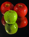
DPChallenge: A Digital Photography Contest You are not logged in. (log in or register
 
Browse Settings
Currently viewing:
Registered Useralexzen

Show comments:

Per page:

Order:

Comments:


Comments Made by alexzen
Pages:   ... ...
Showing 91 - 100 of ~244
Image Comment
Time Travelling
12/25/2007 07:12:36 PM
Time Travelling
by h2

Comment:
Excellent sharpness. Almost looks sci-fi. Too bad about those two signs in the middle. Great exposure.
Photographer found comment helpful.
break
12/25/2007 07:11:25 PM
break
by aimgoldsmith

Comment:
Might have been more powerful not centered.
Photographer found comment helpful.
The S Bend
12/25/2007 07:10:53 PM
The S Bend
by Delta_6

Comment:
Good composition. Flowing 's' curve.
Photographer found comment helpful.
christmas... is around the corner...
12/25/2007 07:10:03 PM
christmas... is around the corner...
by bogdaniciu

Comment:
Cutting the roof off detracts a bit from this photo.
Portal to heaven
12/19/2007 03:47:01 PM
Portal to heaven
by asij

Comment:
Would love to see you re-edit this using all the tools. It deserves the full treatment. Great photo and great imagination and use of flare and long exposure. I know it is very tedious to get it right when you know you cannot use advanced editing. Great job.
Photographer found comment helpful.
Hooked !
12/17/2007 06:55:02 PM
Hooked !
by alexzen

Comment:
Originally posted by magnus:

Hey, I just came across an identical pose in a photo by Lev Dolgachov. It's on the sixth page of his portfolio. So which one of you got the idea first? Either way, very well done!


Oh, I claim no originality with this photo. Clear copy of a cliche photo. Just amazed I could pull it off.
The Little Match Girl
12/15/2007 05:11:06 PM
The Little Match Girl
by snaffles

Comment:
Critique Club :)

Well personally I like what you did, and more what you were trying to do. This is outside of the normal DPC 'box', but I commend you for trying. More us need to do this.

I am familiar with this tale and I think you had a great idea. The main issues with this image are technical. First it is almost impossible to get a good image with such low light. Maybe a 5D would have gotten this, but certainly not a Powershot. The high ISO is going to give you LOTs of noise, the color will be shifted, and you will have lots of motion blur. It is not clear which way the face is moving - but it seems to me it moved one way and then the other. So even though there is movement within the image, it is not clear in which direction.

In post processing you could have tried to remove the noise.

I think in order to pull off a shot like this you would really have to increase the lighting significantly which would have allowed you to use a lower ISO and faster shutter. If I were doing this I would have used artificial light shining up onto the face to emulate the match light. And then used enough matches to preserve the effect that it was the matches that made all that light.

You can over expose (without burning out highlights) and get a sharper image with less noise, and then use levels and/or brightness to reduce the brightness of the image to get the dark effect that you wanted. You would then have a cleaner image, less motion blur. This would take some experimentation with a flashlight or other highly focused light.

But starting with such low light, most all of your options were gone.

Keep trying. Good concept.

Please feel free to use the PM system if you have questions or comments.

Ken
alexzen

Photographer found comment helpful.
A Legend's Throne
12/15/2007 04:55:00 PM
A Legend's Throne
by RulerZigzag

Comment:
Critique Club :)

Challenge

In regards the the challenge topic, I find it difficult to see a strong connection. I would imaging that hurt your score considerably. But let me critique the image itself.

Composition

My first take is that my eye is led very nicely via the perspective of the two buildings. These are strong leading lines. However, once my eye gets to the apparent main subject, I do not know what to look at. The foreground lights take my attention and the last thing I notice is that there is a tree I am supposed to be looking at. Too bad about that angel and trumpet because I think there was some potential in this image. I wonder what your options were on the other side of that display?

Exposure

I think you did a good job given the lighting conditions. Night shots are very difficult. I am surprised you did not use a tripod. You did a good of job of not blowing out the highlights, or at least salvaging them. ISO 1250 of course gave you lots of noise. Some noise reduction (such as Neat Image) could have helped. I find that some very careful noise reduction with subsequent sharpening can do wonders.

Post Processing

In order to make this image successful you would have to really make the tree lights pop. To do that you might have to dodge and burn a bit to reduce the levels of the buildings and increase the brightness of the tree. The tree is lost otherwise.

If you could have just gotten rid of that foreground. I think that is the main thing that is distracting the viewer from seeing what it is you want them to see and experience. Now that the challenge is over, the clone tool could be your best friend in making this what you intended.

Ken
alexzen
Photographer found comment helpful.
Apples! Apples!
12/11/2007 08:30:25 PM
Apples! Apples!
by danielcheong1974

Comment:
Greetings from the Critique Club :)

Composition

Very nice positioning of the apples. The image is begging for more negative space, I believe. The black space on the left is less than on the right. If you gave the apples some room to breathe I think the image would be stronger.

Focus

Great focus and sharpness on the water droplets. The water drops really make this image since the surface of the apples alone are not very intersting.

Great color.

What would I improve upon? The image does very well until it gets down to the middle of the green apple. There is some darkness on the front of the green apple, and more so in the reflection that I do not understand. Not a shadow since it appears you used two lights.

The reflection has less focus, as it should, but it detracts a bit from the overall image. The apples in the reflection are as big as the main subjects but lack the crisp focus and nice water drops. So the reflections do compete a bit.

Two things that might make this stronger:

- leave more negative space
- shoot from a higher angle so that the reflected apples are not as big and allow the main objects to anchor the image more.

But, otherwise a very nice concept, good execution and good post processing.

Please feel free to contact me via the PM system.

Ken
alexzen

Photographer found comment helpful.
Complementary Diptych
12/11/2007 07:17:04 PM
Complementary Diptych
by pipersd

Comment:
Greetings from the Critique Club :)

First I commend for trying something out of the box. A few things that I notice:

Composition

The composition is not very interesting. The line in the middle is not straight and that detracts. I would straighten the image via crop. The lights might do better is they were positioned more clearly on the thirds lines instead of so close to the outside edge.

Exposure

I am sure this was difficult to expose correctly. The blown out highlights from the bulbs detract. This would have had to be caught in the camera.

The image has good contrast and color. If you only did one thing, I would say straighten the image.

Please feel free to contact me via the PM system.

Ken
alexzen

Photographer found comment helpful.
Pages:   ... ...
Showing 91 - 100 of ~244


Home - Challenges - Community - League - Photos - Cameras - Lenses - Learn - Help - Terms of Use - Privacy - Top ^
DPChallenge, and website content and design, Copyright © 2001-2025 Challenging Technologies, LLC.
All digital photo copyrights belong to the photographers and may not be used without permission.
Current Server Time: 08/25/2025 05:52:33 PM EDT.