|
|
|
Showing 981 - 990 of ~3604 |
| Image |
Comment |
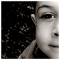
| 03/06/2006 06:01:50 PM | Piercingby pidgeComment: Some lightening around that left eye might have been useful for balance - a square crop lends itself to symmetrical composition. On the same lines, making the eyes level in frame would have made this a more comfortable view - one's first impression is that something isn't quite right about it, and I fear first impressions are pretty important at dpc. Good stuff otherwise, of course, but those minor points might prove more important than one would like. |  Photographer found comment helpful. Photographer found comment helpful. |
| 03/06/2006 05:50:41 PM | DOF x DOFby igoofryComment: Surely, surely this would be better in a portrait crop? It has that dynamic, the diagonal line, and the depth of field to make a shot that would work like that. Entering it in this challenge is simply following the challenge rules, without framing an image to actually work in this quite difficult format. | | Photographer found comment helpful. |
| 03/06/2006 03:21:17 PM | Boy, wonderby jenesisComment: Neatly done portrait - shows complete competence. Lacks any great spark of excitement for me, but a solid entry - unlikely to threaten the ribbons I fear, simply due to the subject matter. | | Photographer found comment helpful. |
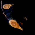
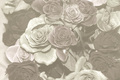
| 03/06/2006 03:17:37 PM | ...the universe betweenby admart01Comment: Kind of interesting to me, in a neo-epxressionist sort of way. Not necessarily my kind of thing, but one must make allowances for personal preferences. My real problem with it is that the square crop seems absolutely arbitrary to this composition. | | Photographer found comment helpful. |
| 03/06/2006 03:14:26 PM | Imagineby L1Comment: Wonderful stuff. Clever cropping which works, marvellous tonality, marvellous expression. No fan of simple portraits but this is, I think, special. Bravo. | | Photographer found comment helpful. |
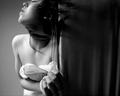
| 03/06/2006 03:04:43 PM | Until Dawnby eyperryComment: from the Critique Club
and I suppose I should say welcome to DPC, as this is your first entry. A nicely assured piece of blacka nd white photography too, and from the reactions you've certainly hit the mark with a few voters here: that may well be the way to move forward here - it depends how you find the experience. There's no qualification for commenting, so you're as likely to get sophisticatede analysis as dumb comments from those who misunderstand, and ribbons tend to be all to most members, I think.
I like this - I don't go mad for it, but I like the assurance it shows. Great light, nice exposure, intersting 'twist', so to speak. I don't know that I'd change a thing - the crop works well for the stylised presentation, the hints at other worlds, both before and after one realises that it's simply a 90 degree rotate of a straightforward shot, are interesting. What I don't like about it is entirely to do with the manner of it, the rather self-regarding feel I get from it; I have little interest in most self-portraits, and those that get through do so usually because of some exterior element. I think there's too much navel-gazing masquerading as art anyhow, and I'm not certain that this is adding anything to my experience. But that is, of course, a purely personal view.
As a judgment, there are of course many angles to take. The personal one is above, but then this is also a first DPC entry, and as someone with considerable experience of this place I hope my view of how it stands relative to other such entries might be useful (and also I want to encourage a distinct artistic vision to remain with us). A brief excursion around the ribbon winners should give a clear idea of how tha place works: but there is something to be said for making your own vision fit with the elements that work well here. A little more stylistic trickery, a little more blatant moodiness, perhaps less firmly pure black and white, and I think you could hit a style the punters would love: now that might make an interesting educational trip. I hope we get to see more from you.
Ed |
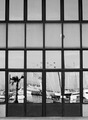
| 03/06/2006 11:08:50 AM | Deflectby BalkanComment: from the Critique Club
To a certain extent, a complicated and difficult submission, and, I think, partially successful. What seems to be you point, from your notes, is lost in the mad rush of voting I think, especially in a challenge with over 600 entries. The image just doesn't have the immedaite impact to grab the passing voter's eye. A couple of things I think would go some way to correcting that: firstly, more detail - this just doesn't have that impression of the finest detail being visible. Whether that's down to your lens, shutter speed causing slight image blur, or what is difficult to say without the imformation. Secondly I think the rigid graphic structure provided by the window frames and doors needs to be absolutely square - the slight distortion towards the top of frame gives the image a sense of carelessness, and is the kind of thing that registers immediately with the subconscious.
The difficult and confising world of mirrors can make for a powerful image - but here I think the reflections work against you - just too confusing and busy for small screen viewing, and the secret of the shot (the invisible photographer) takes too much attention to work out quickly. It would be a great punchline to an image that had already grabbed the attention - this just doesn't have that grab.
A neat idea for the challenge though, despite those points. Shows an understanding of the emphasis duotones/monochrome photography places on the graphic nature of its subject.
e |
| 03/03/2006 12:27:20 PM | To My Lovely Kimberleyby theSajComment: from the Critique Club
A couple of people understood, at least - though far more equally obviously didn't. How to be able to prevent that whilst still being able to submit work of this kind of quality seems a reasonable question.
First and most obviously I think your composition needs work. The suggested idea of filling the frame with flowers has a lot of merit, but also the composition is jumbled a slightly disorganised anyhow. I think you need to find a real focal point for things - that element of your image that you really want ot be the thing to hold the eye, and place that as strongly in frame as you can - the thirds 'rule' is an obvious route to take. Other approaches are to find elements that form lines, or strong shapes, and work your image around that. Also you might use your title more effectively - some mention of 'fade' or 'faded' perhaps might make it clear that this is intentional, without hitting the voters over the head with it.
However, perhaps a touch more care with your processing should be the most effective route. The entire look of this makes me think you've simply moved the black point and desaturated a touch. And of cours, it isn't a duotone, which hasn't helped your score. I get the impression that this isn't a completely serious entry - or at least not the main point. | | Photographer found comment helpful. |
| 03/03/2006 12:02:15 PM | Sweet Innocenseby cools98Comment: from the Critique Club
Being the vindictive soul I am, I ought to tell you about how much I dislike so much of the stuff going on in this shot - I mean, how twee do you want to get? And not only have you submitted one of the dreaded photographs of your children, you've even managed to include the equally-dreaded flower in it, and gone for a particulrly flattering approach too! What's even more annoying, you scored damn well with it!
You see, there's a difference between this kind of nearly-perfectly executed attempt to understand a style, and the kind of guff that lacks any self-consciousness that is so often submitted. I have to applaud you for trying, and succeeding so well. After a quick look around your portfolio and challenge entries I find it hard to believe that this is your highest placed shot - unless you're deliberately trying to achieve the remarkable feat of collected every place from 11 to 20 before breaking in to the stars, HM's and ribbons world ;-)
There are a couple of things I would have considered; firstly, should this really be a landscape format shot? Certainly it works, and even lends a strength compositionally, but would that necessarily be lost with a change of format? I'm unsure, but it would have been my first approach (not that I'm any great shakes as a portrait photographer). Secondly, for all the high-key-ness of it, I wonder if you might happily have taken the shadows a little further to shade? I feel it might have served to emphasise the smoothness of complexion a bit more, bring a touch more depth to it all. I'm not talking about all the way to black, but just a little further ...
There seems, on a minor technical note, to be something not quite right around the eyelashes; but it isn't enough to spoil a very accomplished photograph. I would think you'd be very pleased with the outcome. I'm looking forward to seeing more from you in future challenges ...
ed | | Photographer found comment helpful. |
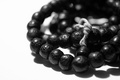
| 03/03/2006 11:08:57 AM | Ohm mani padme hungby beggsComment: from the depths of the Critique Club
It's always tricky to tackles these deceptively simple photographs. I suppose pretty much everything is as you intended, though I'm not completely sure your thinking was absolutely spot-on. There are a couple of elements that I find uncomfortable viewing: primarily the negative space image left, and the fact that the beads run out of image to the right; and the very brightness of that negative space. Noe before you sit with hands on head condemning me for being a fool and not understanding high-key photography, I should say i do absolutely get your point, and in terms of execution from the high-key standpoint it's absolutely spot-on. I'm uncertain though, that it was the right treatment for the subject.
Partly becuase the beads themselves are so dark, partly becuase it's gone so very far into extreme white and thus extreme contrast, I think it asks too much of the eye. There are many worse shots, however, with better scores, so quite what you did 'wrong' I'm at a loss to say. The depth of field thing was probably an issue - many people dislike that one, I know; and perhaps the composition - you seem to have gone out of your way to make the string the focal point of the image (that shift of the beads as a whole slightly out of frame), and perhaps that makes for a difficulty.
I would have expected a slightly higher score - but perhaps the problem really was that there isn't much to say about it? A competently executed image, but with a couple of weird choices the point of which is difficult to determine? Maybe ... | | Photographer found comment helpful. |
|
Showing 981 - 990 of ~3604 |
Home -
Challenges -
Community -
League -
Photos -
Cameras -
Lenses -
Learn -
Help -
Terms of Use -
Privacy -
Top ^
DPChallenge, and website content and design, Copyright © 2001-2025 Challenging Technologies, LLC.
All digital photo copyrights belong to the photographers and may not be used without permission.
Current Server Time: 08/18/2025 06:01:57 AM EDT.
|