|
|
|
Showing 681 - 690 of ~3604 |
| Image |
Comment |
| 07/26/2006 04:10:39 PM | |  Photographer found comment helpful. Photographer found comment helpful. |
| 07/26/2006 06:09:41 AM | Lifelines by e301Comment: Thanks for all votes and comments. Nice to have a companion for my only other red. |
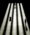
| 07/26/2006 05:58:17 AM | Walk the lineby MarellaComment: Wonderful eye: I would agree that taking the black point so far alos takes the shot a touch too far from the real world, of which it is so plainly part. And perhaps a human element is missing (I know that would make it a different shot, but ...). I can imagine it with perhaps just the end of someone's leg entering or leaving frame, against the white of the big stripes perhaps. Very disappointing rating from the site. | | Photographer found comment helpful. |
| 07/26/2006 05:53:27 AM | Le Louvreby pawdrixComment: I'm very glad this is yours Steve. Perhaps the least commercial shot in the bunch ;-) | | Photographer found comment helpful. |
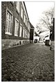
| 07/25/2006 04:50:40 AM | Riverbanksby zmaerdComment: Another beautiful image that i think might get hammered by the challenge police. Hope not, for you. |
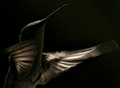
| 07/25/2006 04:49:36 AM | Hummingbirdby Dan_CottleComment: Monstrously good wildlife shot. Lines though? I wonder if enough people will accept it's qualifying for that? It'll do for me, though. |
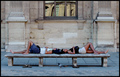
| 07/25/2006 04:45:19 AM | Le Louvreby pawdrixComment: Nice eye, and nice shooting. The pigeon ... well, I'm unsure about it's presence helping or hindering - it's perhaps not quite spot-on dead centre enough to really make the composition, especially given that the two pairs of sandals are already making a nice break in the balance of the image. It might have more impact in black-and-white, which would help emphasise the graphic nature of the shot, and allow you to push the overall feel of brightness in the image, which currently feels a touch dark to me. But despite that, this is the most interesting shot i've seen in this challenge so far. | | Photographer found comment helpful. |
| 07/23/2006 12:17:33 PM | Cleanlinessby perotyComment: Next to Godliness ... well. In such a regular, clean composition, it is fo course the breaking of the regularity that forces the attention, that draws the eye, and that becomes in effect the point. Here that is the blue basket and that open door: there's a parallel of elements there, the cicrcular objects from different angles.
Also, I think in such a simple situation the regularity of the framing also matters - and I think you fall down a little on that: there's a small tilt to the right it seems, and wide-angle distortion affects the verticals to each side, which removes some of the effect of the sqaureness of so much of this - and it's that squareness which serves to make those two circular points so much more outstanding.
The blue basket functions as a strong element because of it's colour in this white world, and is given added weight by that parallel with the door - the only genuinely curved major element in this composition.
Overall, this shows I think a top eye for a composition, and a strong sense of balance of elements within frame: whether that be an instinctive thing, or from much thought doesn't really matter - it works. However, when I come to look for a sense of the meaningful in here - a sense of emotion, or of pertinence, I find I'm struggling. Photography can, I think, do that more than any other 'art'form - and GCI, painting, drawing and the like seem more apt to this kinb of composition. And that is, of course, a personal opinion. | | Photographer found comment helpful. |
| 07/23/2006 07:29:56 AM | ---by ElaineComment: Actually this is more interesting than at first sight: the negative quality of it tends to overpower that I think: the fact that an almost believeable 'real' definition still exists in the poles just brings that extra element to it. The tiny bit of wire bottom left is a shame, but presumably just a little oversight. | | Photographer found comment helpful. |
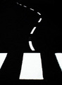
| 07/23/2006 07:23:12 AM | Lines of vibrationby stphqComment: Compositionally, i think I would have tried a more definite diagonal to this: especially for the landscape orientation. This way, a portrait shot would have allowed your to include simply more of your lines, and to present the length of them better. Some more care with light might also help the impact of the image - those reflections aren't helping the overall sense of tidiness, neatness of the shot. |
|
Showing 681 - 690 of ~3604 |
Home -
Challenges -
Community -
League -
Photos -
Cameras -
Lenses -
Learn -
Help -
Terms of Use -
Privacy -
Top ^
DPChallenge, and website content and design, Copyright © 2001-2025 Challenging Technologies, LLC.
All digital photo copyrights belong to the photographers and may not be used without permission.
Current Server Time: 08/13/2025 05:47:35 PM EDT.
|