| Image |
Comment |
| 09/16/2003 06:33:51 PM |
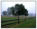
Country in my heartby pitsamanComment: One of few photos to capture the real quality of loss suggested in the challenge title. Beautiful, of course: but perhaps a bit too simple for me to give top marks to - excellently done though. |
 Photographer found comment helpful. Photographer found comment helpful. |
| 09/16/2003 06:30:28 PM |
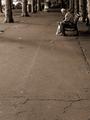
First look at summer snapshots.by jjbeguinComment: I'm sure you'll get panned for the negative space - and indeed it took me a few moments to get the hang of it myself, but the extent to which it adds a feel of isolation, loneliness, to this image is marvellous. Emphasises something which has been missed by almost every entry, which is the longing and sadness implicit in the word Nostalgia. Top work again JJ. |
| Photographer found comment helpful. |
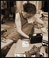
| 09/16/2003 02:45:31 AM |
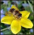
I'm Ready for my Closeup... by BobsterLobsterComment: Top work Bob. Must say I approve of your technique and approach as described in your notes - though i think if you were, say, holding a gin and tonic in the other hand rather than a phone it would improve the shot :-) Congratulations (from someone who spent hours slaving over a shot ...) |
| Photographer found comment helpful. |
| 09/16/2003 02:42:12 AM |
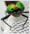
Smily Eyes by JackoComment: Congrats Jacko: everyone said your were going to win, which I thought would be a jinx - great work to avaoid that :-) |
| Photographer found comment helpful. |
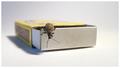
| 09/16/2003 02:40:27 AM |
Thinking outside the boxby e301Comment: Thanks as always for all votes and comments. A few 'answers' :-)
ChrisW - no. Tried a closer crop, and it crowded the image; and anyway, why would I want a dead-centre image?
It isn't a spoof on the forum threads - I hadn't read them.
And as ever, interesting to get such varied opinions from people. |
| 09/15/2003 07:30:49 PM |
The secret life of termitesby jjbeguinComment: Whoa, JJ mon ami - this must be the best photo ever to get last place :-) Love the fact that you got a few 10's though - there is hope here yet. |
| Photographer found comment helpful. |
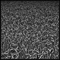
| 09/12/2003 04:52:54 PM |
Wheatby jjbeguinComment: Completely gorgeous - the contrast is just perfect. I'm a big fan of this kind of photo anyway, and it's an area of my own photography that could really do with some work. Lots of things to learn from this :-) Message edited by author 2003-10-02 18:43:38. |
| 09/08/2003 02:38:56 AM |
Balloons! Balloons! Balloons!by kosmikkreeperComment: Never got round to finishing voting, let alone commenting, but this was my personal favourite of those i saw: still quite surprised it didn't finish higher, and for the life of me couldn't see why it didn't. Excellent work Yanick. |
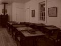
| 09/03/2003 12:31:08 PM |
Way Back to Schoolby DougPazComment: Hey Doug - greetings from the critique club.
Well, everyone commented on it just about, and I'm sure you thought it yourself, but the contrast range is the major issue with this shot: it just cries out for some of those tones to get closer to white (I've just made the same mistake myself, in the repetition challenge, without the excuse of no editing too).
The toning works for the scene, of course, and beyond the brightness/contrsat issue it's a fine shot: evocative - perhaps more of an imagined past than one that seems very real to me. I never trust these re-creation places, always ask myself how diffferent it would be with twenty shouting kids in it, for example (surely never this clean!).
I think it lacks something to kick it into the 6's scoring-wise. Something dynamic, either in subject matter or the way you've dealt with it. It's a very straightforward shot at the moment. Couldn't tell you what that thing is, though :-)
|
| Photographer found comment helpful. |
| 09/03/2003 12:18:42 PM |
Wake me at 3:15by OneSweetSinComment: Seems like every other photo I get to critique is yours, Anna. Here we go again.
The framing of this seems very arbitrary - face dead centre, cut off of the elbow on the fromt leg, it doesn't feel level, but not so tilted that it would be deliberate. The colours and tones of the fur are excellently brought out, but the flash has really flattened out any texture to it, and also left the lighting of the whole thing very uneven - that area of floor top right seems almost black - a sure sign that the flash has washed out any sign of the ambient light. It's also picked up those highlights in the carpet and is making it seem particularly plastic.
The link to the challenge is clear enough for me, though I suspect not for others - that's the usual problem with scores below 4.
Why not get a tripod, and switch the flash off on your camera? I promise you you'll get better results :-)
Ed |
Home -
Challenges -
Community -
League -
Photos -
Cameras -
Lenses -
Learn -
Help -
Terms of Use -
Privacy -
Top ^
DPChallenge, and website content and design, Copyright © 2001-2025 Challenging Technologies, LLC.
All digital photo copyrights belong to the photographers and may not be used without permission.
Current Server Time: 06/20/2025 11:17:51 PM EDT.