|
|
|
Showing 3011 - 3020 of ~3604 |
| Image |
Comment |
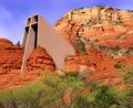
| 11/11/2003 06:24:37 AM | On Solid Rock I Standby ArtifactsComment: Fascinating place - though I'm not sure your depictio of it is all it could be: the light is pretty flat and harsh, and you haven't managed to get any real depth of texture into those rocks to show the contrast with the smooth stone of the church. I guess this is one of those shots best taken with the warm low light of dawn or dusk ... |  Photographer found comment helpful. Photographer found comment helpful. |
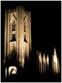
| 11/11/2003 06:18:31 AM | God is in the Houseby NazgulComment: Intersting effect with that uplighting - really like the progression of the shadows on the walls. | | Photographer found comment helpful. |
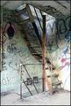
| 11/11/2003 06:16:12 AM | sacred and profaneby SeanachaiComment: Wonder how many will take the time to read 'God Will Forgive' in the graffiti? Not many I fear ... it's a good subject, but I don't think I find your approach convincing - seems an arbitrary angle to shoot from, especially as the graphic elements of the staircase would be stronger from more of an angle - perhaps facing those bottom steps? Also seems either to have been overly lightened or exposed in tthe bottom corner. Intersting effort though. 6 | | Photographer found comment helpful. |
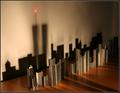
| 11/03/2003 02:20:27 PM | Shadows Of The Past by HomunculusComment: Excellently creative shot - has to be one of those blinding flash of inspiration moments, huh? My only gripe would be about the reflections from the table causing the secondary shadows, but it doesn't seem to have hurt your score too much. |
| 11/03/2003 12:09:12 PM | Frame by Frameby e301Comment: Thanks for those comments - and to Andre, who's put this in his favourites (never expected a compliment like that for this). 4.2xx is a pretty boring score, actually: thought it would be down in the 3's at least :-)
It really makes a difference to get good comments about a difficult image.
Ed |
| 11/03/2003 11:41:50 AM | | | Photographer found comment helpful. |
| 10/30/2003 03:46:38 PM | The Enticing Lights of Soho - Londonby jonpinkComment: Hi from the critique club Jon - doing my bit for rationality etc.
Gave this a 6, which is absolutely my average mark these days, and I don't know that I'd change that. Your own comments I think are spot-on, though I'm not completely convinced about the challenge: many many people took shots that I think would more appropriately have been for a challenge called 'Light' rather than 'Lighting', and i was hoping for more people to use light to shape and define their subjects, rather than go for pretty patterns: there are those here who have the ability, and few did. So within those terms, I didn't think this was out of the ordinary, but within the terms imposed by what was actually entered, it was a little above ordinary - so placing 26th is pretty good.
The colours seem a touch cast - like they've been pushed toward the incandescent spectrum, rather than a 'true' centred spectrum: if the light coming directly through the bottles above the liquids was more 'white' i think the colours would jump more, though perhaps the feeling of a dark bar and a glow from behind the bottles would be lost. It does transmit something of that feeling, of those nights when the barman just seems to be a silhouette, and you can't quite amke out the labels on the bottles, but perhps needs a figure to really do that; as it is, as you say, it's just patterns, and no particular focus.
Ed |
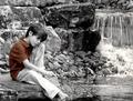
| 10/30/2003 03:32:53 PM | I Wish I Had A Friendby OneSweetSinComment: Right, i've deliberately waited until later than usual to write my critiques, to see if it changes anything, and of course it doesn't.
I like the mood of this one Anna - even though the focus seems to have 'missed', and the rocks behind the child seem more in focus than he is. Plenty og good and useful comments too, which is good to see.
I'd like to see what he's doing with the stick, even if it's just waving around in mid-air, especially as the composition really pulls the focus that way - the movement of the eye from falls, to child, to stick is very natural and it's a touch a shame that the end of the stick isn't there. I think focussing fully on the child, and leaving the bacground to blur out with depth of field would add impact, but perhaps would lose some of the tones of the rocks. The selecive colour thing works, as some have said, to bring the eye to the subject, and works well for that: and it's a trick I mostly don't like at all.
One of your better shots, I think Anna.
ed | | Photographer found comment helpful. |
| 10/29/2003 11:51:51 AM | |
| 10/29/2003 11:49:25 AM | remnantby mcmurmaComment: Pretty good ... early days voting, so i might come back ... | | Photographer found comment helpful. |
|
Showing 3011 - 3020 of ~3604 |
Home -
Challenges -
Community -
League -
Photos -
Cameras -
Lenses -
Learn -
Help -
Terms of Use -
Privacy -
Top ^
DPChallenge, and website content and design, Copyright © 2001-2025 Challenging Technologies, LLC.
All digital photo copyrights belong to the photographers and may not be used without permission.
Current Server Time: 06/21/2025 11:52:44 AM EDT.
|