|
|
|
Showing 2931 - 2940 of ~3604 |
| Image |
Comment |
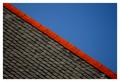
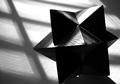
| 12/17/2003 06:20:45 AM | roof lineby deceptiveComment: Now I thought this would win - I guess you placed pretty well, but I was sure I was going to see it on the front page. |  Photographer found comment helpful. Photographer found comment helpful. |
| 12/17/2003 05:52:33 AM | Spoon by e301Comment: Damn - wanted third, to complete the set of ribbons :-)
Thanks for all comments - nothing about noise? - and all votes. I'm surprised by the contrast comment - though I know what is meant.
JJ - indeed nice to meet on the homepage, though as ever you're at least one step ahead ...
I was surprised (and delighted) by this placing; I've switched off my scores on the front page, and so had no idea where this was scoring, and it didn't seem to have enough comments to be rating this highly, and i really thought it was too subtle (or just plain dark) to do so well here. |
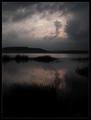
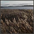
| 12/16/2003 11:58:28 AM | Airolle at duskby jjbeguinComment: wonderfully atmosphereic shot JJ, but I wonder if perhaps your cropping could be improved here? There are three parallels of form going on - the far hills and the furthest bank of reeds, the small clump of reeds to the right and the detached section of clouds by the open sky, and finally the darkest clouds at the top of frame and the bank of reeds in the foreground - all of which add emphasis to the reflection of that area of sky. I wonder if seeing a touch more of those topmost clouds, or less of the bottommost reeds would give a stronger graphic element to the shot? Obviously that would place the horizon dead centre frame, bu in a shot with such parallels I don't believe that would weaken this image as it would so many landscapes ...
Just a thought - but my immediate reaction on seeing this was that the framing seems odd.
ed | | Photographer found comment helpful. |
| 12/12/2003 11:40:36 AM | Giving thanks for the food we eatby WILDBLUEComment: You might put a little more information down as you want a
CRITIQUE
Several obvious points noted in comments: crumbs on the plate, specks of something on the fork, the overly sharp top edge of the fork - which may simply be an over-exposure phenomenon.
I find the composition weird - the angle might have been enough of itself, or the odd cropping out of half the pie, but both together ... what was your point with that? what were you hoping to communicate? It says nothing to me I'm afraid ... and I've looked and looked.
But for me it's the lighting that lets this down most: you're really far too close to your subject to use the on-board flash - that's why the foreground of your shot is over-exposed, and the light falls off so rapidly. The other problem with a shot solely lit by on-board flash is that the light comes from nearly the same direction as you shoot - so almost all potential for texture is removed, and likewise most sense of three-dimensionality. It also reflects back into the camera very easily - look at the very bright pixels here and there, and that awful shadow of the edge of the pie.
Not your best submission, and I think you did rather well to score as highly as you did. I should add, as a non-American, your subject has no emotional resonance to me.
Good luck in future
Ed | | Photographer found comment helpful. |
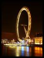
| 12/12/2003 11:23:05 AM | Thankful for the ride of my lifeby jonpinkComment: From the Critique Club ...
as one Londoner to another I guess I hhave to be resonably polite. Several things strike me immediately about this shot ... in no particular order: familiarity, as I work down on the South Bank often; the fabulous look of the water - almost like ice; the false but attractive impression of speed it gives to the eye; and the size of the submission - why only 508 high? It scored pretty well, and I think would have had more impact at 640, or at least nearer to that ... unless you're allowing for those watching in 800x600, but there can't be many of them really.
There's a suspicion of a tilt to the right in the image - just the impression that the wheel is leaning over. May not actually be the case, but it looks like that. A touch distracting from the impact of the shot, for me.
I do like the composition, though it ought not to work by the "rules" - I think perhaps it does because the great weight of the surrounding buildings is kept to the lower part of the frame, allowing the height of the wheel to be emphasised against the sky - it's central, theoretically 'weak' placing horizontally is compensated for by that balance.
Hell, the size bothers me, you know. And only 50Kb too - surely, from that camera, there would have been so much more detail at max size and resolution? You could have had a ribbon there, I think ...
Ed |
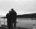
| 12/11/2003 01:11:02 PM | Our Loveby jmritzComment: Greetings from the Critique Club John
This is a difficult shot to Critique - I'm very surprised by it's finishing so high in the voting, and I think that's a triumph of subject over technique. There are a few things that strike me immediately: the dead space in the sky - doesn't even count as negative space as it's not adding anything to the shot: would the shot be worse without it? I think it would be improved, rather. Cutting off the feet is a weird choice - especially cropping or framing so low down the leg. It almost becomes the focus of the composition for me ... what's so terrible down there that he wanted to avoid it? Then there's the odd inclusion of that pole with the bird sitting on it, and part of the bridge ... I can't see the rationale for these elements being here.
I think Azrifel's point regarding the composition is very valid, and well made.
Perfectly acceptable exposure, and I like the surprise element of the backs-to-the-camera thing - and there is a sense of caring in the pose of the two figures.
I think you've done exceptionally well to score as you did. Good luck in future.
ed | | Photographer found comment helpful. |
| 12/10/2003 06:54:02 AM | Trianglesby WILDBLUEComment: Great light. Cropping is a bit violent - especially taking out that bottom corner - and for me you've taken it a little close on the right side too: it gives me the slight feeling that the puzzle isn't really the subject. | | Photographer found comment helpful. |
| 12/10/2003 06:51:41 AM | Faux Floralby LucidLotusComment: Nice subject. The borders of your selection around the pot are very visible (too sharp for an out of focus area), and the pixel scattering in the shadow are a shame - I would have tried to blur tham into the background grey a lot more. lighting and definition on the flowers is very well done. | | Photographer found comment helpful. |
| 12/06/2003 07:29:11 PM | The true privilege of living here.by jjbeguinComment: despite being pipped for the only moderately disappointing 4th place, I was still glad to see this shot placed here: I aways look for your photos JJ, and was beginning to think you'd packed it in after not entering the last two or three challenges.
This two-thirds foreground is becoming distinctive of your work: this one works particularly well I think - perhaps because the lower two thirds divides itself into a near-ground and mid-ground area, so that there's three levels of detail going on. There's something of the combination of brass and steel - which is an enormously photogenic matching of metals - in the colours you've worked with too: just a muted version of the blue/orange complementries really.
Perhaps a grouping of your photo and mine, with the garnish of a few good friends, would be the thing to most give thanks for.
Ed Message edited by author 2003-12-29 09:44:20. | | Photographer found comment helpful. |
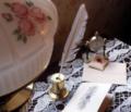
| 12/05/2003 08:24:18 PM | Sending soft sentimentsby drydocComment: Er ... didn't I comment on this already? Oh yeah - in that other challenge. I think it works better here, though the lamp is still annoying - I think perhaps it would work as a framing element better - if you shot more under the angle of the glass of it: to me it's intrusive now. The set-up works well for the challenge other than that, and it is genuinely soft focus, which is rare enough. | | Photographer found comment helpful. |
|
Showing 2931 - 2940 of ~3604 |
Home -
Challenges -
Community -
League -
Photos -
Cameras -
Lenses -
Learn -
Help -
Terms of Use -
Privacy -
Top ^
DPChallenge, and website content and design, Copyright © 2001-2025 Challenging Technologies, LLC.
All digital photo copyrights belong to the photographers and may not be used without permission.
Current Server Time: 06/22/2025 12:44:41 AM EDT.
|