|
|
|
Showing 2781 - 2790 of ~3604 |
| Image |
Comment |
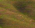
| 02/18/2004 09:53:43 AM | Terracesby bobgaitherComment: Good rhythmic shot, though the central area lacks some definition to me -perhaps as simple as their angle to the light. Some detail lost - almost like impressionism, its hard to make out the facts, just the sense of the terraces. |  Photographer found comment helpful. Photographer found comment helpful. |
| 02/18/2004 09:47:39 AM | Time for a shaveby dickwilhelmComment: Nice idea. Lacks light and shade, and therefore any real texture though: if it weeren't patently obvious from context, these could just a well be little black and grey lines, rather than hairs. | | Photographer found comment helpful. |
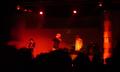
| 02/18/2004 09:40:44 AM | Textures of Musicby deegeComment: Don't understand why this is in this challenge - even were it in focus (and there's no reason, with this kind of event, that it has to be) I don't see that there would be any texture here, not really. Your title encourages me to see a 'different' kind of texture, I think - but I'm afraid I think that is not the point. |
| 02/18/2004 09:39:08 AM | Textureby Dim7Comment: Lost any real degree of detail here, whether from camera, processing, or cropping I couldn't say. Still some texture, but no real feel. |
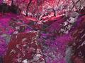
| 02/18/2004 09:38:16 AM | Where Gods playby scwortmanComment: Hue shift and selective de-saturation distracts massively from any texture you might have caught, to my eye. Find it very hard to get past the wacky colours to what is actually going on. It's also a trick I find over-used, a rarely to contructive effect. |
| 02/18/2004 09:36:31 AM | Bear In The Cornerby JamieWillmottComment: Not an interesting subject to me, though you've done it some justice with your photography. Very low contrast - or at least very dark white point. Whether that helps kep the subtlety of the light and the textures or whether you've caught them kind of despite that I'm not sure. Just feels very gray, rather than monochromatic. | | Photographer found comment helpful. |
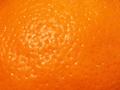
| 02/18/2004 09:34:34 AM | d'orangeby BurgyBoyComment: Lighting doesn't help, really doesn't show the feel of the surface. Other than thst, very little interest here. |
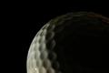
| 02/18/2004 09:33:53 AM | Midnight Tee Timeby mudsharkComment: Close, but in the end just misses. Great capture of the edge of the ball there, but the fade into black is a bit too steep for me. I think there;s a reference to those moon shots we see from time to time, but the placement of the arc of light in this shot is not great compositionally, and things have to be way bright before I see any other surfaces. |
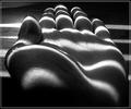
| 02/18/2004 09:31:43 AM | texture of future...by theodor38Comment: Good shot. Mono works well, light is excellent, positioning of the hand in that light suggests the work of the vorticist movement, or of monumnetal sculpture. Slightly extreme, would be my only detraction - other than that I don't actually like the image all that much. | | Photographer found comment helpful. |
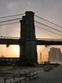
| 02/18/2004 09:26:26 AM | Silhouetteby digitalpinsComment: Nearly great - but your composition baffles me. Why cut off the nearer bench? And having done so, why leave that gap above the bridge? get that bench in, and lose the gap and you have a composition of great balance, a kind of double leading-lines trick that would really hold the eye. Perhaps your title gives the game away though - a silhouette being almost the antithesis of texture in a photograph. However you have caught some elements, in the buildings across the river, and the sidewalk in the foreground. Strong suspicion of it being an accident, given your title, but I score this 7. |
|
Showing 2781 - 2790 of ~3604 |
Home -
Challenges -
Community -
League -
Photos -
Cameras -
Lenses -
Learn -
Help -
Terms of Use -
Privacy -
Top ^
DPChallenge, and website content and design, Copyright © 2001-2025 Challenging Technologies, LLC.
All digital photo copyrights belong to the photographers and may not be used without permission.
Current Server Time: 06/23/2025 03:03:50 AM EDT.
|