| Image |
Comment |
| 05/13/2004 07:45:36 AM |
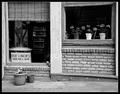
Box Lunchesby sherComment: Intriguing. Has a sense of stillness, a sense of closed-for-lunch (strangely, given the sign). Evidence of heavy over-sharpening, especially around those letters in the sign, and the jaggies on the plant-pot. But I do like tthe composition very much, and that sense of grain. 7 |
 Photographer found comment helpful. Photographer found comment helpful. |
| 05/13/2004 07:38:32 AM |
heaven's forward progressionby xburnerxComment: Well composed shot a rather bland subject - a sense of over-neatening too, as though noise reduction has removed too mich detail whilst going about its business. It's an effect that can be very useful, and it leands an eerie model-like feel to the finished image. Highly competent shot, subject matter does little for me. 6 |
| Photographer found comment helpful. |
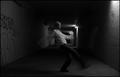
| 05/13/2004 07:34:57 AM |
Lights Outby bruskiComment: Arguably more about the presentation than the photograph, which I'm sure will hurt your score here. Tonality of the lampshade itself is very well done, great movement in the shading, though personally I would have tried to take it a little further, or perhaps even to lose the stalk and switch, so that the black point could be set even darker and emphasise more that shading. Not an easy subject to get so clean - especially shot in natural light (the rflections in the light-bulb are pretty revealing) |
| Photographer found comment helpful. |
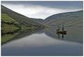
| 05/12/2004 06:55:02 PM |
Away from it allby heidaComment: Lots of stuff to like here, especially the hint of mist on the water. Good composition. A touch too blatantly romantic for me - highly marketable no doubt, and I would suggest highly successful here. kind of advertising industry aspirational, and I personally like a more complex, deeper image. But everso well done, whatever. |
| Photographer found comment helpful. |
| 05/12/2004 06:20:48 PM |
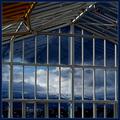
A New Perspectiveby jjbeguinComment: Perhaps they wouldn't accuse my shots of looking like yours if I could ever compose an image like this - they'd just be absolutely certain :-)
There is something affecting in these partial/diagonal compositions - though that blurred and over-reflected lanscape/cityscape adds a new element for this one. |
| Photographer found comment helpful. |
| 05/12/2004 06:12:17 PM |
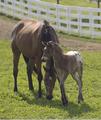
Mother's Loveby shkelly587Comment: Good light, finally - so many people seem to think its enough to just get a shot of an animal, with no thought to other elements of the scene. Not sure about the moment you've chosen though - mother seems more interested in food than her offspring, and the crossing of the two seems a little awkward, compositionally. |
| Photographer found comment helpful. |
| 05/12/2004 06:10:09 PM |
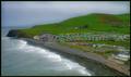
Still & Quiteby agwrightComment: Nothing quite matches the embarrassment of a typo in the title (I've done it myself - even more embarrassingly, two weeks in a row). Rest assured, it can be corrected later :-)
Other than that, a beautiful capture of a good scene ... Perhaps a bit, er, orthodox for me - a bit too much a standard imae, a stock image perhaps. What I personally think it cries out for is some foreground, to add a greater sense of depth to that recession of hills. Technically however, it's evidently competent. |
| Photographer found comment helpful. |
| 05/12/2004 06:03:12 PM |
Freedom of speech.by DufusComment: Shows some of the difficultire of photo-journalism - too many peculiarities in these people (looking at camera, weird cropping, weird expressions). Positioning of the statue is weird. Prominence of the Hotel name almost makes the shot about that, rather than whatever the subject of the demonstration is. Almost weird enough to be about that weirdness itself - but your title, and the concentration of the image suggests otherwise. |
| Photographer found comment helpful. |
| 05/12/2004 05:55:36 PM |
Rising (soccer) starby litboltiComment: Kind of like this, for its sheer oddness and mood. I like the composition, the fact that it makes the image as much about the location as about the figure - provides a nice balance, a nice dichotomy in the scene. I'm sure a different frmaing would have fared better on dpc - balance the figure with the light on the wall that you've half cropped-out to right, and you'd have a much more orthodoxly composed (and equally, more immediately eye-catching) image. I'm glad you haven't - glad there are people submitting not just for the prizes. |
| Photographer found comment helpful. |
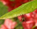
| 05/12/2004 05:51:45 PM |
Mosquito Heavenby ladpupmoeComment: Not quite sure what the problem is (light prbably, it usually is), but there's a lack of detail in the little monster - and even, to a lesser extent in the leaf. Perhaps a sligh camera movement? Cunningly reduced with sharpening perhaps, but there isn't that pop of definition that one would look for. |
| Photographer found comment helpful. |
Home -
Challenges -
Community -
League -
Photos -
Cameras -
Lenses -
Learn -
Help -
Terms of Use -
Privacy -
Top ^
DPChallenge, and website content and design, Copyright © 2001-2025 Challenging Technologies, LLC.
All digital photo copyrights belong to the photographers and may not be used without permission.
Current Server Time: 08/29/2025 10:06:28 PM EDT.