|
|
|
Showing 2241 - 2250 of ~3604 |
| Image |
Comment |
| 05/19/2004 07:30:10 AM | Circles of Colorby cabaComment: Like Naif-school art, and not something that ever held very much appeal for me personally, and certainly not as photography, but there you go. Has a certain appeal in its irregularity I suppose, and well rendered for a very tricky medium given the size restrictions here. But I'm struggling to find good things to say about an image which I don't frankly find anything to hold my interest for long in. 3 |
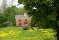
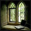
| 05/19/2004 07:23:24 AM | Springtimeby emorgan49Comment: why not crop out the entirety of the tree-trunk picture right? It would leave you with a genuinely centred composition, instead of the halfway-there shot, and would to my eye balance the composition more evenly. Not a bad image at all, but lacking in much real mood, either of drama, or gentleness, or peace. Perhaps needed a different light to caryy it off, or failing that more processing work to give it some punch. As it stands, it is fairly ordinary to me. 5 |  Photographer found comment helpful. Photographer found comment helpful. |
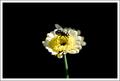
| 05/19/2004 07:20:07 AM | Centred Sunny Centreby gerdagriceComment: Works compositionally, effectively a simple leading lines shot, but none the less effective for that. The glancing light is effective in rendering the shape and texture for the most part, but the image right petals have a muddy quality that might have been lifted with a little bounced fill-light perhaps. Not quite enough fascination to hold my interest for long, but a good shot all the same. 6 | | Photographer found comment helpful. |
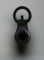
| 05/19/2004 07:17:59 AM | "A picture where the main subject is dead center ... ". Take care ;o)by PatochComment: Blunt, simple, and suitable to a centred composition. The light is almost ideal, although badly let doen by the indistinct end of the barrell - perhaps a little extra light there, from a reflector or even another light source would help. The extremely shallow depth of field helps in some ways, but it is so extreme as to miss the end-sight, and yet there isn't enough detail in the very end of the barrell to hold attention for me. 5 | | Photographer found comment helpful. |
| 05/19/2004 07:15:38 AM | Rosy Centerby KylieComment: Has a weird sensation of not being absolutely symmetrical ... just enough to make it slightly unsettling to look at, like there's some distortion somewhere. Colour saturation hasn't been dealt with terribly well, lots of pixelation in the pinks around the brightest areas. Jaggedness from perhaps over-sharpening on the hard lines too. All that said, it has potential as a geometric image i think, but too many things interrupt the cleanness of the presentation for me. 4 | | Photographer found comment helpful. |
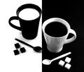
| 05/19/2004 05:41:25 AM | Milk & Coffee by evenendresenComment: All three shots that ribboned in this challenge have this same quality of complementary-yet-opposed subjects. Less complicated image that the others, without the same level of message (how odd to be writing this on dpc...), but nevertheless contains that slightly odd sensation of thinking 'well, they're obviously opposite, but they obviously go together ...' |
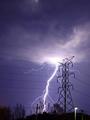
| 05/19/2004 05:35:44 AM | Unbridled versus Restrained by BikeRacerComment: It doesn't actually seem to have been commented on, in a quick glance through, but it's the streetlight that makes this shot for me. The high-voltage lines (which would have been the title had it been my shot) are generally, and certainly in photographic terms, percieved as a bad thing - but here you also illustrate the use we make of that power. It has a message about the use we make of out technology - and not a straightforward message either, suiting a not-straightforward debate. Part of the crowning glory of our civilization, or is the world going to take its revenge? Very pleased to see such a challenging shot win this challenge. Don't suppose the visually spectacular nature of it hurt, either :-) | | Photographer found comment helpful. |
| 05/19/2004 05:09:07 AM | Ancient and Modern by e301Comment: Thanks to all for votes and comments. I had no real plan for the challenge. Link below is to the venue - in itself quite an extraordinary story - in that it isn't actually an ancient building at all, being constructed in 1932. A 'genuine fake' as someone described it.
Bailiffscourt HotelMessage edited by author 2004-05-19 05:43:19. |
| 05/18/2004 05:59:34 PM | The Arrivalby moviemanComment: The large amount of negative space certainly helps to make the centred composition work - good imagination there. I like the incidental, real-world feel of this shot, and the level of detail (especially in the colouring) on the fly. There's something ... kind of casual about the whole thing (in a good way) that I can't quite explain. Speaks of lazy summer days somehow. Must be the light. It's always the light. | | Photographer found comment helpful. |
| 05/18/2004 02:57:30 PM | Self Centeredby arnitComment: Great light - rear-threequarter angle is always effective, and a certain commendable confidence in not using any fill to assuage the crowd. room to breathe in the framing too. composition works, though not sure exactly why. 7 |
|
Showing 2241 - 2250 of ~3604 |
Home -
Challenges -
Community -
League -
Photos -
Cameras -
Lenses -
Learn -
Help -
Terms of Use -
Privacy -
Top ^
DPChallenge, and website content and design, Copyright © 2001-2025 Challenging Technologies, LLC.
All digital photo copyrights belong to the photographers and may not be used without permission.
Current Server Time: 08/29/2025 04:23:53 PM EDT.
|