|
|
|
Showing 2091 - 2100 of ~3604 |
| Image |
Comment |
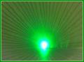
| 08/13/2004 01:15:17 PM | Pot of gold at the horizonby hitendraComment: I seem to be in the middle of a string of crazy abstract shots. There's a simplicity I like here - and a true abstraction - but there are things that suggest laziness of intent and execution that I don't like. The closet thing we have to a horizon, that line that interrupts the flare most, seems rather randomly placed: I would see it horizontal, or further away from that; this hints at a real world, but doesn't remove the idea enough to have impact and so looks un-thought-out. The fade of the colour at frame's edge into that beige nothing kind of shade also seems somehwt without effect (other than to make the suggestion of lacking care). My immediate feeling, and some time does not change this much, is of an uninvolving shot ... disinterest. 3 |
| 08/13/2004 01:10:29 PM | Not Another Railway Track Photo....by 3DsArcherComment: Organisation of the various planes within this shot is a bit disappointing: an amost purely graphic image should, i think/believe, be more careful with the angularity of it's subject. Your positioning of your vanishing point, and your use of colour, seems arbitrary, neither centred nor privileged, and the colour seems under-whelming, could surely have been worked up into something more impactful, or lost altogether. An annoying element is that it appears that a horizontal rather than slightly tilted presentation might have given a much more harmonious composition, placing the tunnel entrance on a much stronger area of the frame. A good idea, though, but needing more work to my eye. 5 |  Photographer found comment helpful. Photographer found comment helpful. |
| 08/13/2004 01:06:34 PM | The High Wayby sfaliceComment: Interesting near-abstract shot. Such images, I think, depend for most of their effect on compositional ideas (and not necessarily simple ones), and i think this desn't quite do enough for me: the various balances throughout seem a touch off - colour, and shape ... I think it's far too heavily dominated by that grand flat dimpled plane running from bottom to top, which releggates the other angles and shapes to incidental elements, rather than encouraging the eye to depart and return from what must be the central 'subject' - the primary visual component - of the image. The inevitable phenomenon of leading lines with such a blatant use of the challenge idea invokes compositional phenomena that simply can't be so easily dismissed: when there's nothing else, our eyes will follow as they are lead. Here, that is just too close to the edge of frame for them not to fall over, out of this world, and on to the next image. You don't entrap me here, though you nearly could. 6 | | Photographer found comment helpful. |
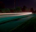
| 08/12/2004 05:27:58 AM | Poof - Into thin airby TikicharmComment: Shots like this are so dependent on your viewer's precise set-up, that I think it's difficult to be sure what exactly you were after. I see a vague roadscape with those lines, but a touch brighter and I see a skyline etc., a touch darker and I see only the hint of a road. Working with such very subtle graduations in the shadow areas is, I think, unlikely to get you a reaction you can really rely on.
For me, it has the beginnings of an impact, but the muted nature of those surroundings confuses things. | | Photographer found comment helpful. |
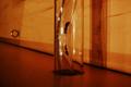
| 08/11/2004 02:56:35 PM | Ant Expresswayby IsaacComment: The intersting (potential) composition, with the slightly threatening parallel of that screw-eye and the tubes the encase the ants, is slightly undermined for me by your crop - I find that I'm having to ignore the right-hand side of the frame to find this image's strength. Like the stand-off of the insects, the sense of another world here, but I'm pretty certain Joe Voter won't agree with me. Sure there's a vanishing point, but off-frame, and not really contributing massively to the image's impact. 6 |
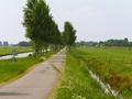
| 08/11/2004 02:45:41 PM | Up Into the Mistby peeceeComment: Nearly a nice shot, but the burning-out of the mist areas is hugely annoying, and not necessary, though admittedly it's a difficult situation to deal with. Besdes which, good compositional elements, especially the sweep of that road through frame, and good colour and exposure (though I still wish you'd had to bring that back, rather than losing control of the sky like that). Good tones. 6 - burn-out loses you a couple at least :-( | | Photographer found comment helpful. |
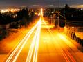
| 08/11/2004 02:40:00 PM | Lights Down the Hillby diegomcnamaraComment: Too long an exposure, I would sugggest, burning out those light-trails too much, losing definition between the red and the white, letting the street-lighting doinate the image, and keeping unnecessary information, such as detail in the houses. Very very head-on composition doesn't add much to it either, for me. 4 |
| 08/11/2004 02:37:38 PM | Going down the hillby MotoCycleBoiComment: Almost greetings-card quality, this - blatant message, though not made to seem mournful, as there's a hint of humour in the guys' steps. Great scenery, although i would have shot to be able to crop out the burnt-out sky, which is always horrible to this eye, when without reason (that I can discern, at least). I would have loved to see it shot ffrom a touch further right, just to separate them from the drop of the hill a touch, they're so nearly in front of it this way, and it crowds the composition a little, and allows no sight of their faces. A bit simplistic to really engage the attention, but rather well done nevertheless. 6 | | Photographer found comment helpful. |
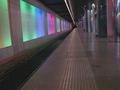
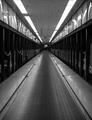
| 08/11/2004 02:24:42 PM | Not a bowling alleyby TuckersmomComment: There are a couple of things I really like about this shot - the graininess, the crazy reflections along the tops of the walls. It's well done - has that dark, bizarre near-science-fiction element off to a t. But it's just a little, well, perhaps obvious, to me? The very rigidity of your composition takes away from it's impact for me. Perhaps I'm just a touch bored with the balance of interesting and obvious that seems to be required around dpc, but I'd like to have seen a slightly more intriguing point of view here, or even a more intriguing crop; perhaps even if you could have got the camera higher, taken the vanishing point up in the frame, it would have less four-square than it does. Nevertheless, far more interesting than most I've voted on so far. | | Photographer found comment helpful. |
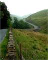
| 08/11/2004 02:19:18 PM | Typical Dutch Coutry Roadby morpurgoComment: The stray head of grass is really annoying here, and surely serves no great purpose, but the thing that gets me is the lack of punch overall in the colours - just as the sky is washed out, so are the greens, becoming close to yellow in many places. The angle of shot you've chosen strikes me as odd - almost everything is in the left side of frame ... I find very little from image right that adds to the impact of this shot. Cropping out (or simply missing) the top of the nearest trees is a cardinal error, especially as there is plently of room at bottom of frame you could happily lose. It seems like a shot that is taken of a scene you know fits the challenge (and indeed, with great potential for a good photograph), but it really doesn't show much insight. That avenue of trees might make a fabulous image if you got in amongst it, and had it converging from both sides of frame, with a low evening light through them. contrast is lacking too - even sorting that out would add enormously to the impact of this shot. Sorry to be critical, but it's what I think. 4 | | Photographer found comment helpful. |
|
Showing 2091 - 2100 of ~3604 |
Home -
Challenges -
Community -
League -
Photos -
Cameras -
Lenses -
Learn -
Help -
Terms of Use -
Privacy -
Top ^
DPChallenge, and website content and design, Copyright © 2001-2025 Challenging Technologies, LLC.
All digital photo copyrights belong to the photographers and may not be used without permission.
Current Server Time: 08/28/2025 07:53:53 PM EDT.
|