|
|
|
Showing 1571 - 1580 of ~3604 |
| Image |
Comment |
| 01/12/2005 04:48:40 PM | The Fountain of Youthby ahazeComment: Good capture, good sense of mood, but almost every sense of composition has been sacrificed to that capture. It's a very fine candid shot of a kid - very fine indeed. |  Photographer found comment helpful. Photographer found comment helpful. |
| 01/12/2005 04:44:36 PM | A River Runs Through Itby mcanyonComment: I wonder if you haven't sacrificed too much, in fact all, detail in that foreground bottom left area in order to capture those reflections in that water. There is some interest in those reflections, but perhaps you've concentrated oo much on them, and excluded too much of the setting, of the context? The sharpening seems a touch heavy - there's a suspicion of halo-ing around the branches, and some jaggedness in the lines too - slightly too high a radius? 5 | | Photographer found comment helpful. |
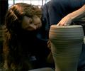
| 01/12/2005 03:48:45 PM | Harry Potterby novaComment: I only wish you could have matched the detail and sense of texture you've caught on the pot in her face; it just seems a little out of focus, or blurred, and a touch too dark. For all that, a lovely study of concentration and artistry - the shaping a moulding of her left hand adds a fine touch. The noise levels might have leant themselves to a black and white presentation, perhaps? | | Photographer found comment helpful. |
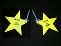
| 01/12/2005 03:46:19 PM | Star Warsby yomanComment: Looking at the various shades of grey in your background, i would suggest that your monitor might be set somewhat too dark. |
| 01/12/2005 03:39:54 PM | Gone with the wind.by arminComment: And I was expecting it to be Mary Poppins, but then no Nanny appeared. I like this, there's a certain lunatic (in a nice way) edge to the composition. A shame that that hedge line couldn't be cleaner - it feels halfway an accidental inclusion (although obviously not) for being so disorganised. The very featureless sky doesn't really help this kind of stuff, either, I think: the very madness of it requires a big bright sky, I would think. I know, you can't choose your weather; but ... well, the image still cries out for it, to me. 6 | | Photographer found comment helpful. |
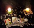
| 01/12/2005 03:35:45 PM | Practical Magicby OFreasierComment: The light, especially in the area of the cards and the knife, is lovely ... but i really wish you hadn't included so very much stuff in the shot. Together with the really very bright candles it makes it a difficult image to look at for long ... there is too much to remove the eye from the cards, and not enough to hold the attention once drawn. Simpler is very often better, and can communicate just as much if carefully composed. 5 | | Photographer found comment helpful. |
| 01/12/2005 03:31:30 PM | Harry Potterby photomayhemComment: I'm sure I won't be the first, but hairy potter, surely? Neatly posed and lit studio image, although I dislike the black table-top, it seems too blank and textureless , and yet contrasts so heavily with the background, almost as though you couldn't choose between black and white. Beyond that, it's too contrived for my taste, and i think the hand-prints and the litle bits of clay overcook things. 5 |
| 01/12/2005 03:27:39 PM | Duck Soup (1933)by Pug-HComment: Pretty neat, and you lighting isn't too bad - there's quite a strong sense of the various textures. It isn't, for me, a very succcessful challenge entry - but I'm struggling to say why exactly: I think it is a question of weak composition in the end: there's a tension between the spoon and the ducks, which actually adds to the strength of the area of frame where the bowl is, and somehow it is that that becomes the central subject - the ducks are weak, die to their central placing, the spoon because of being out of focus, and the bowl seems like the least important part of the image. I wonder if a less horizontal viewpoint might have strengthened the image? Nice try though | | Photographer found comment helpful. |
| 01/12/2005 03:20:06 PM | As Good As It Getsby varshomComment: I'm taking this as a reference to your camera? What is this, from a phone? I just can't vote this kind of quality very highly ... and there isn't anything strong enough for me in the image to push it past that. |
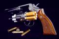
| 01/12/2005 03:17:55 PM | Taking Livesby renaissancemanComment: As a set up for a propaganda image this is ideal. To my eye, your execution of it could have been improved with the use of levels or histogram adjustments to really take that background to black, and probably also by using a softer and more angled light, which I think would help provide a threatening sheen on the gun, and prevent that glare on the bullet. Not an image I like, I'm afraid - it's too straighforward and obvious a message for me, akin to being battered over the head. But neatly done. 5 | | Photographer found comment helpful. |
|
Showing 1571 - 1580 of ~3604 |
Home -
Challenges -
Community -
League -
Photos -
Cameras -
Lenses -
Learn -
Help -
Terms of Use -
Privacy -
Top ^
DPChallenge, and website content and design, Copyright © 2001-2025 Challenging Technologies, LLC.
All digital photo copyrights belong to the photographers and may not be used without permission.
Current Server Time: 08/25/2025 09:35:25 PM EDT.
|