| Image |
Comment |
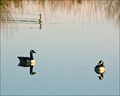
| 02/13/2008 05:52:21 AM |
Rivalsby Bruce_the_RobertComment: Good sense of composition - nice to have filled the top half of frame with something, rather than going with the temptation to isolate these two. It has something interesting to say about the structure of duck/goose, too, almost like an architectural exposition of three-quarter view and head-on. |
 Photographer found comment helpful. Photographer found comment helpful. |
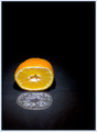
| 02/13/2008 05:49:38 AM |
2UCOrangeby apashackComment: Compositionally sensible image - enough black to give us isolation, but still enough image to see. Light and its treatment seems brutal though - highlights a bit overdone perhaps? |
| Photographer found comment helpful. |
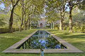
| 02/13/2008 05:48:25 AM |
Blake Houseby EstimatedEyesComment: Quite pleasantly geometrical; the processing feels over-forced though - the shadows are brought so far up that the light feels unbalanced, and there's a fringing to everything that feels unnatural - most especially visible in the edges of the trees against the sky. |
| Photographer found comment helpful. |
| 02/13/2008 05:46:28 AM |
Colorsby MCCullenComment: I'm sure the cloning aficionados would have you 'lose' those cranes. For my part, all i can say is that the composition feels a little forced; I think because the natural line for the eye is from the boat house to the left, and that takes us out of frame pretty quickly. |
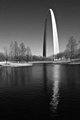
| 02/11/2008 01:12:33 PM |
Reflecting Giantby trevytrevComment: Sunlight on steel always seems to be particularly effective in black and white: maybe it isn't steel, but it has that feel about it. I think I like the graininess - although it has perhaps a sense of being added after the show - could be just because I know that - as it goes against the obvious approach. |
| Photographer found comment helpful. |
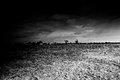
| 02/11/2008 01:10:09 PM |
Fields (Week 2)by booboo_goonComment: The thing about what actually is, arguable, a 'rather boring composition', is that the best of them holds a mystery. perhaps something along the lines of 'why was this shot taken?', or 'what is it I'm missing here?', or simply, 'why do I have nowhere to rest my tired eye?' whatever, this is reminiscent of some early 20th century stuff - Kertesz when still in Hungary, or Capa before the war photography; perhaps even of McCullin in Gloustershire. I like it. although the blackening of frame does feel over done and a little forced, perhaps. It might be subtler without losing any of its impact? |
| Photographer found comment helpful. |
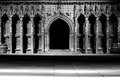
| 02/11/2008 01:06:08 PM |
Lincoln cathedral (Week 1)by booboo_goonComment: Whilst the light somehow slightly upsets the symmetry, I think there's anough strength otherwise for the impact to survive - and what an impact: that arch gaping in the middle of this famous screen like the mouth of hell. almost. Step inside, won't you? Fine work. |
| Photographer found comment helpful. |
| 02/08/2008 08:43:44 AM |
Norwich, January 2008by e301Comment: Originally posted by goc:
this is BRILLIANT !!! this is absofreaking (<-- add this word to your dictionaries people) stunning.
//
g
eta: ok. why 2007? [insert confused smilie here] |
Er, right. Slight numerical error there. Wonder if I can get it corrected ...
You were the first person to notice though ;-) |
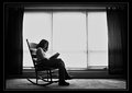
| 01/31/2008 06:42:34 PM |
#2 Passing Time by SonifoComment: Not really knowing what the point of self-portraits is, I have to say I like this; I like the unlikeliness of those boots, as mentioned elsewhere, and I particularly like that you haven't 'corrected' the light through the blinds. What's wrong with it anyway? A little illuminant arrow pointing at the subject ... glory in it, I say. I like the absolute straightness of the curtain pole, too, and the hazed idea of windows behind the curtains - all those layers of increasing restriction of light, like the greatest cinema you never went to.
There's an absoluteness to it too: a stripping down to bare essentials. What more does one need than a favourite chair, a book, and good light to read by? Well, apart from good boots, that is? I'd need a notebook, and a table with a drink. At the very least.
And finally: this is properly black and white photography, to my eye. It's all, absolutely, about light. Does anyone else who looks at this care what colour any of the stuff in this shot is? That carpet could be a livid shade of neon green, for all we know ... this makes this scene be about form - about the rigidity of the windows, the more fluid but somehow obdurate structure of the chair, and finally a certain organic softness in that female form. And if you look at it like that, the boots make absolute sense, do they not? |
| Photographer found comment helpful. |
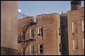
| 01/23/2008 09:19:51 AM |
Under an Urban Moonby muur88Comment: Difficult composition; I'm not sure the colour works well, and I'm not sure about your cropping - it seems you've made that strong vertical image left your guide, but that makes your framing of the building with the figure appear tilted - and just slightly enough for it to seem accidental, and thuis disturbing. |
| Photographer found comment helpful. |
Home -
Challenges -
Community -
League -
Photos -
Cameras -
Lenses -
Learn -
Help -
Terms of Use -
Privacy -
Top ^
DPChallenge, and website content and design, Copyright © 2001-2025 Challenging Technologies, LLC.
All digital photo copyrights belong to the photographers and may not be used without permission.
Current Server Time: 08/01/2025 06:59:37 PM EDT.